Posted on 21 January 2025 by Jeff Fuge | Reading time 2–3 mins
Here’s a question for drivers and Highway Code buffs: when does a national speed limit sign tell you that you are NOT allowed to drive at the national speed limit? Answer: when the national speed limit sign is not a national speed limit sign. Confused? Read on!
Back in the 60s, Margaret Calvert tested and honed the design for the directional signs on the UK motorway network.
She went to RAF Benson, attached versions of the signs to the top of a racing car and had it drive at speeds of up to 100mph past airmen tasked with trying to read what the signs said.
A brilliant way of discovering what worked and what didn’t.
The resulting design scheme for Britain’s motorway networks was followed by one for its A-roads and B-roads, also designed by Margaret Calvert and Jock Kinnier.
Part of this second phase of work was the development of the system of triangular signs to convey warnings, a round ones issuing commands.
Among the most common are the round signs conveying speed limits.
A 2013 government study estimated there were 440,000 speed-limit signs in use across the UK – a figure that has surely grown over the decade or so since (especially when you consider the 1993 figure was 225,000).
While most speed limit signs feature a red circle containing black numerals on a white background, there is one exception.
A round white sign with a black diagonal stripe says you can travel at the maximum permitted speed for the type or road in question: 60mph on single carriageways, or 70mph on dual carriageways and motorways.
Speed limits along any given road can change several times in a relatively short distance. A 60mph A-road may become 40mph approaching a town, then 30mph, then 20mph when you turn off into a residential area. This could then switch to 30mph, 40mph and 60mph as you leave.
If, like me, you drive, you’ll be well used to all of this.
Over the course of a journey, we respond to or ignore a countless number of signs. (I say ignore, as many if not most of the signs we pass aren’t relevant to us or our journey.) And much of this processing is done subconsciously as we are well versed in the language of the UK’s signage system and do not need to consciously comprehend every sign.
Given the system was first created around 60 years ago, you have to say it has worked – and contines to work – brilliantly.
But it’s not perfect. And one of its flaws is a particularly dangerous one.
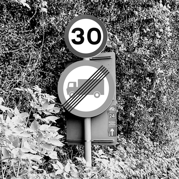
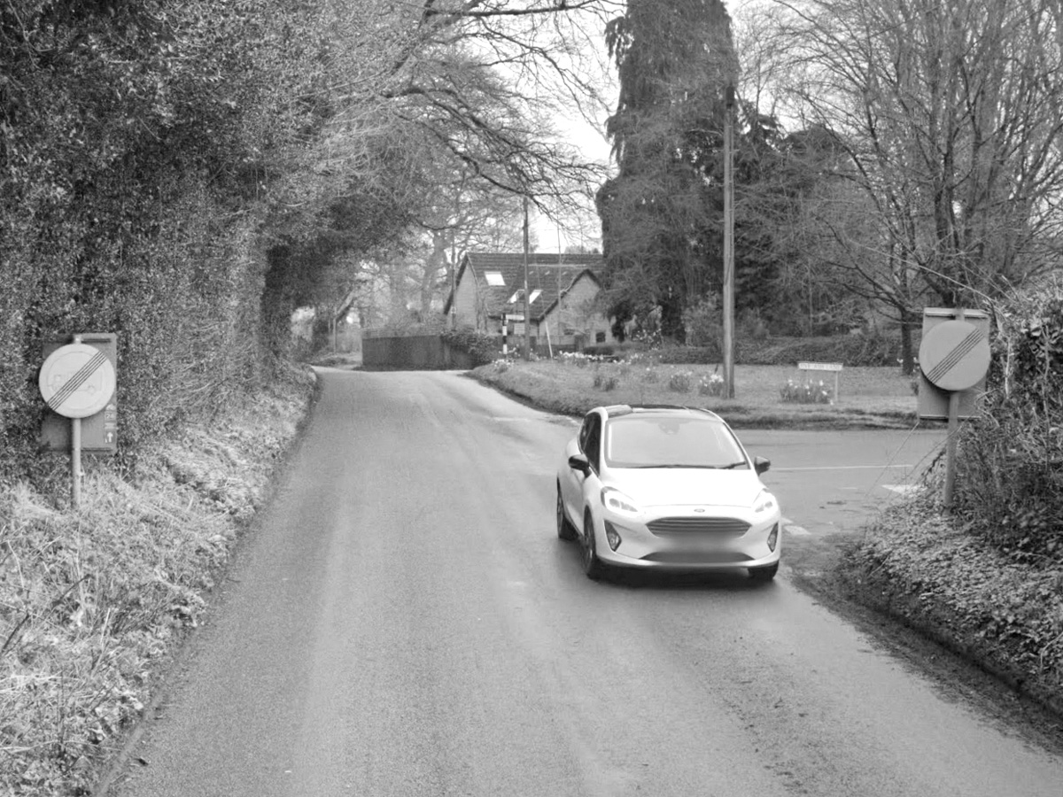
I first encountered it on one of the roads heading to the village where I live. The national 60mph limit applies for a long stretch, but a pair of speed-limit signs change this to 30mph about quarter of a mile before a sharp bend.
After the corner and you almost immediately pass another pair of round signs – the ones in the photo at the top of this post.
What do these signs show? The end of the 30mph limit and a return to the national 60mph limit? It certainly looks like it.
But these are actually signs stating the end a weight limit for lorries. Over time, the circular borders and lorry pictograms have faded, and what remains is a dead-ringer for the national speed limit sign.
People who drive with excessive speed are a problem in our village, just as they are in so many other places. However, on this notoriously fast run-in towards the village High Street, a sign that suggests you’re free to speed up clearly adds to the danger.
A three-part problem
The problem with this particular sign is threefold. First, weathering and age has changed its original appearance from something benign into something potentially lethal.
Second, the sign is an uncommon one. As the saying goes, when you hear hoofbeats, expect horses not zebras. (Reverse that if you’re lucky enough to be reading this somewhere hot, sunny and frequented by zebras.)
The point is when you see a round sign with a black diagonal line across it, you expect it to be one of the nation’s 400,000 speed-limit signs, not something niche whose sole purpose seems to be to tell drivers of lorries over a certain weight that they are at the end of a road they should not have driven along!
Third is time. The placement of these signs just after a bend means you (or your subconscious) have just a few seconds to view and make sense of them.
So, it’s a sign that looks like something else, that appears when it is reasonable to expect it to be something else, and in a situation where you have little time to process whether it is what you think it is or not.
The first issue is more than sufficient to be a danger, but the second and third issues compound the problem.
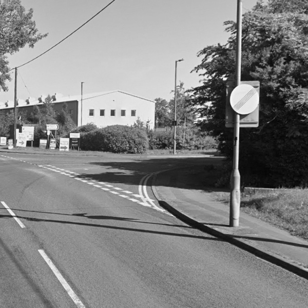
A similar situation manifests itself as you head out of Warminster, our nearby town, on a stretch of 30mph road.
You’ve more time to clock this one as it’s on a straighter section of highway, but the sign appears on its own on the wrong side of the road. So your opportunity to process what it is (or isn’t) is less than if there were a pair of signs.
It seems unlikely that the two only places these potentially dangerous signs occur are all within 10-minutes drive of my home. This must at least be a county-wide problem, and is more likely a nationwide problem.
Fortunately, the solutions are simple.
Two simple solutions
Another instance of an end-of-weight-restrictions sign that is easily mistaken for a national speed limit sign.
First, replace the signs with new ones. And change the material used for the lorry pictogram to a type proven not to fade, and/or give the sign a ‘replace by’ date to ensure it is replaced before the fading risks fatalities.
Second, ensure these signs are always displayed in tandem with ones reminding drivers of the prevailing speed limit.
These simple fixes would help keep road users safe, accurately informed, and on the right side of the law. I think Calvert and Kinnear would approve.
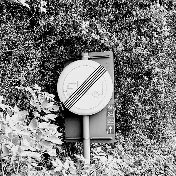
The problem: a worn and ambigous sign.