Posted on 29 October 2025 by Jeff Fuge | Reading time 4–5 mins
Throw someone a tennis ball and they'll hit it. But throw them ten and they'll miss them all. The same applies with communication – and that can be a fatal problem.

The more messages we receive at the same time or in close proximity, the less likely it is that we will engage with or respond to any of them.
In their excellent book Writing for Busy Readers, Todd Rogers and Jessica Lasky-Fink examine this further and show the proof.
In one experiment, they sent two versions of a political fundraising email to over 750,000 potential donors. The first version contained six paragraphs and several compelling facts. In the second version, they cut the email length in half by deleting every other paragraph.
Despite the aggresive editing meaning the email made less sense if read in full (and despite the prevailing wisdom in fundraising being that longer is better) the concise version raised 16% more than the original.
Another test saw researchers providing information 1,500 participants about climate change and offering suggestions for useful action. Some of the participants were provided with a list of 20 easy beneficial actions (such as turning off lights) while other groups were provided with one, five or ten options. On average, each person presented with fewer actions took two actions more than those who received the list of 20.
In the words of Rogers and Lasky-Fink, "It's possible that participants who were provided with 20 suggested actions found the message overwhelming and couldn't decide which ones to perform [and it] simply deterred some from from reading them at all. We don't know the cognitive mechanism at work, but we do know that readers who were given more options were less likely to do any of them."
This poses a challenge to marketers, who often feel compelled to throw more rather than fewer tennis balls into the mix.
"The ad space was costly, so focusing on one message feels a wasted opportunity… can we mention these other things as well? And I know we're emailing people to get them to sign up to the event on Saturday, but can we include these special offers and news of our next store opening, too?"
Yes, but as Rogers and Lasky-Fink have shown, you do so to your detriment. Each additional message is another tennis ball – and eventually your audience will drop them all.
Our inability or reluctance to tease apart the various messages thrown at us, and understand which is the most important or which we should respond to, increases in line with the number of messages.
It's reasonable to assume this is all the more difficult when we are pressured by limited time or increased stress.
Sending you in circles
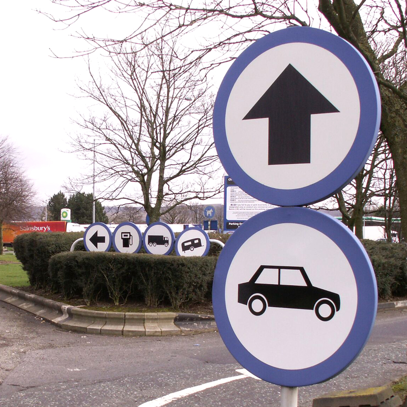
I recall driving into a service station on the M4 back in the early 2000s, just after it had undergone a makeover as part of the new Moto brand. The new branding included new way-finding signage.
Coming off of the motorway and into the service station I was confronted by an array of signs pointing out where the petrol station was, where HGVs should go, where caravans should go, what the speed limit was, where the exit was, and where the car park was.
These signs were often together in groups up or along a pole. I've written previously about the origins of the UK road signage system, including how signs were speed-tested to ensure people could read and understand them
While each of the signs at the service station was clear, the grouping of three or more on a pole – coupled with there being several poles in relatively close proximity – and encountered post-motorway driving (where signs appear infrequently) made the task of reading and processing them exceptionally difficult.
I therefore found myself in the wrong car park and apologising for being there without the requisite caravan. Suffice to say, I was not alone!
I've since discovered that service station signage is a wonky parallel universe of unruly bizarreness across the board, and service stations are lands the government's Traffic Signs Regulations and General Directions (TSRGD) forgot.
OK, in fairness the TSRGD did not forget service stations – it has applied to service stations since 1994. It's actually more that the designers of signage for service stations forgot the TSRGD.
An excellent article on Motorway Services Online takes a wonderfully deep dive into the subject.
Train of thought
Forget everything you every learned about road signage and start again… you're at a service station.
© Motorway Services Online
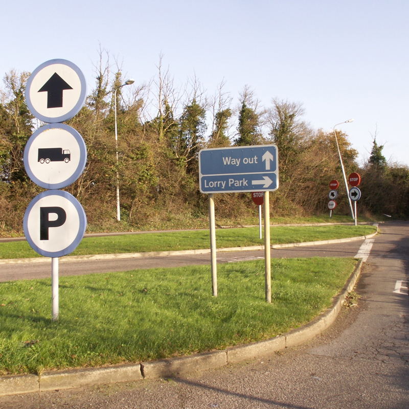
Straight on for lorries and parking (just for lorries?). Who cares… the next sign says something different anyway!
© Motorway Services Online
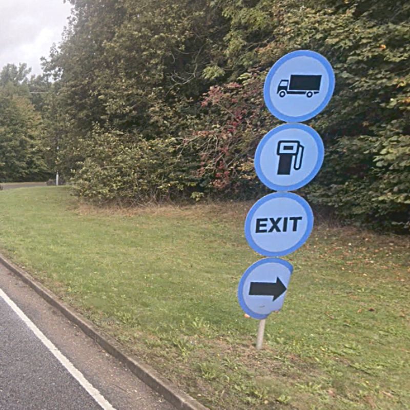
Lorries. Fuel. Exit. Right. So, lorries in need of fuel and the exit, turn right? What about lorries who don't need fuel or the exit? What about cars needing fuel or the exit, do they go this way?
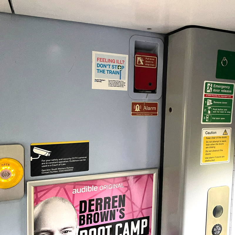
Stood in the vestibule of a crowded train, I was struck by the high number of visual messages there were in and around the doorway. I counted 11.
Some explained the general opening and closing of doors, and what to do and not do near the doors. Others explained how to open the doors in an emergency. Others explained how to stop the train in an emergency. Another contained a paragraph of text about the use of CCTV. Another talked at similar length about not stopping the train if you feel ill. And then there's an advert or two.
Whiling away time on the journey, this gave me plenty to read… and to ponder. Such as, how well do these messages work for people in an emergency?
My fear is that people under immense stress will struggle. The clutter of stickers, text and arrows are highly likely to delay people from taking the action they need at that moment, such as opening the doors and getting out. The result could be fatal.
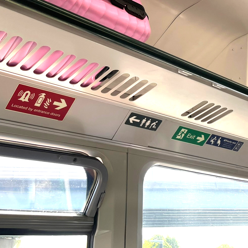
On another trip, I was lucky enough to bag a seat. Looking up, I noticed four signs in close proximity. Each was a different size – a sure sign (no pun intended) they had not been considered as a set, or how they would look or be read when seen together.
One denoted priority seats for older people. Two of the others related to emergencies: one with an arrow pointing in the direction of fire extinguishers and the like, the other with an arrow pointing in the direction of the nearest exit. While arrows on both these signs pointed in the same direction, a sign sitting between them carried an arrow pointing in the opposite direction.
Sitting alongside pictograms of a man, a woman and parent changing a baby, this showed the way to the toilet. Obvious enough while your train tootles its way along the track, but potentially dangerously confusing in an emergency. People plus an arrow could be construed as "people go this way". One arrow pointing one way followed by another pointing the other way could confuse and delay action by precious seconds.
Emergencies on trains are thankfully rare. But that doesn't mean these things should be overlooked. Especially when doing things better is actually pretty simple.
Here's the row of signs I talked about above, together with a better design and more coherent order.
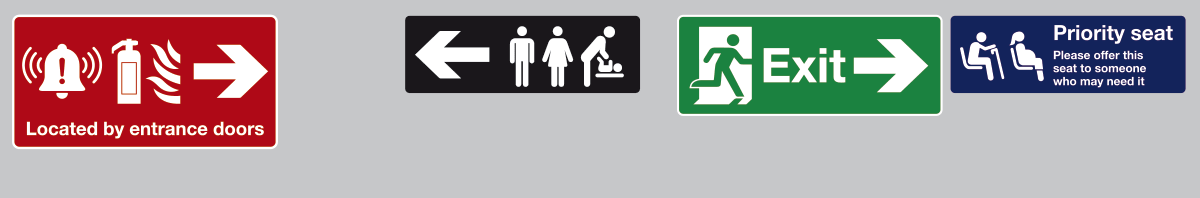
The problem: the four signs in their existing ill-considered and confusing arrangement
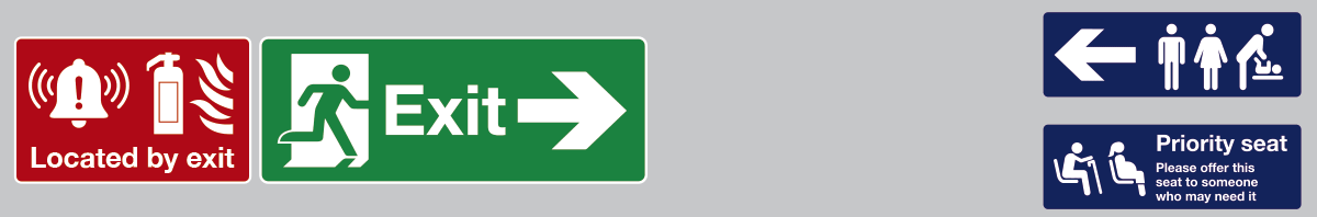
The solution: the four signs rearranged and slightly reworked to prevent confusion
While the solution took only a few minutes to create, it makes some important changes.
The two smaller signs are placed one above the other at the far right, and the toilet sign changed from black to navy to match the priority seating sign. This reduces the visual clutter and suggestion that the different colours must mean different things (which they don't).
- The two large emergency signs are made the same height and placed together on the far left.
- The arrow is removed from the sign denoting the location of the alarm and fire extinguisher to reduce visual clutter and avoid repetition.
- The text below the pictograms has been changed from 'Located by the entrance doors' to 'Located by the exit'. The new text is shorter, works with the adjacent sign which shows the direction of the exit, and avoids the confusion of mentioning entrance on one sign and exit on the next.
A more thorough approach would be for the government to draft and enforce signage guidelines akin to the TSRGD. This could establish best practice and increase consistency across different train operating companies (with adaptations to account for differing positions of items such as emergency stop levers within different types of rolling stock).
Ultimately, however, whether you're promoting a fire sale or directing people to a fire exit, aim to throw one ball, not ten – especially when catching it really matters.
So many messages, I couldn't get them all in the shot.