Brand positioning, brochures and website for a friendly Swindon-based healthcare staffing and staff-training agency.
From 2016
“Your work on our brochure, folder and website has taken Argante Care’s brand to a new level. Our marketing materials look smarter, more cohesive, and consistent. Everything reads clearly and smoothly with a personality that feels friendly but professional. All of this has helped Argante Care stand out in a competitive field, and attract more clients and staff.”
Aries Aquitania, Founder, Argante Care Limited

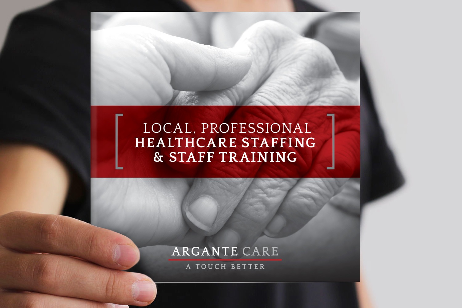
Making Argante’s branding a touch better
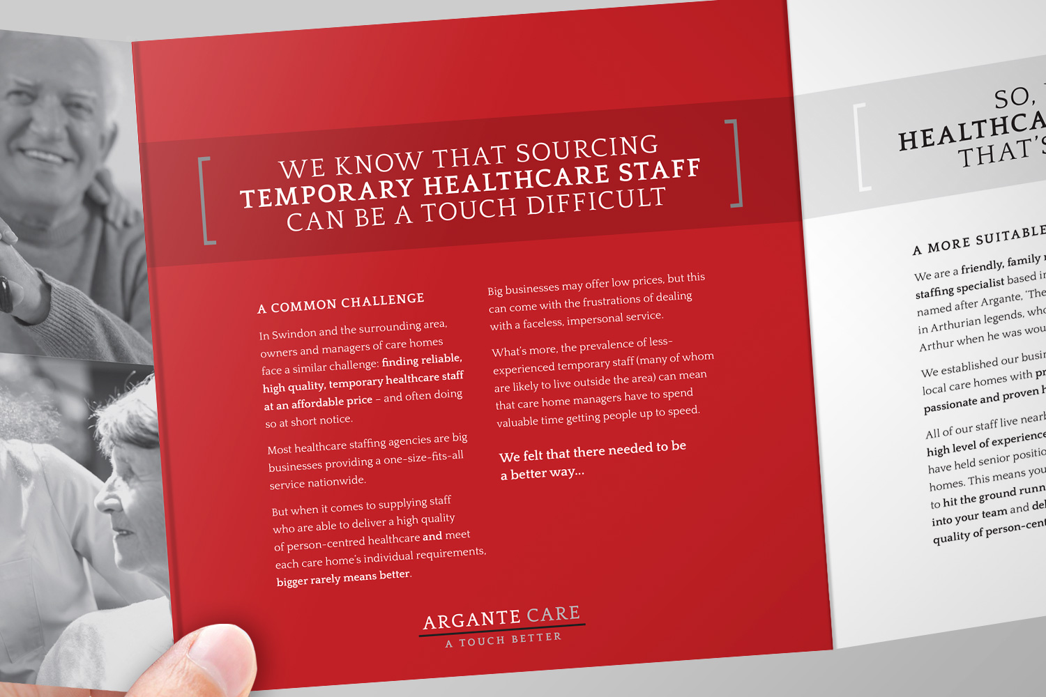
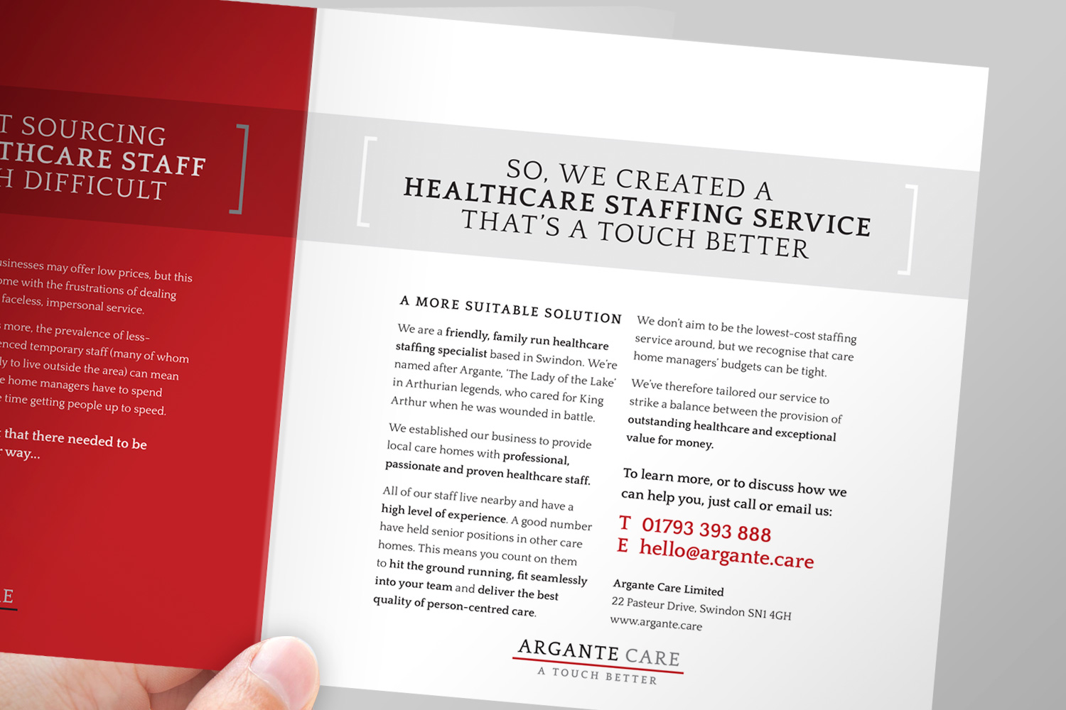
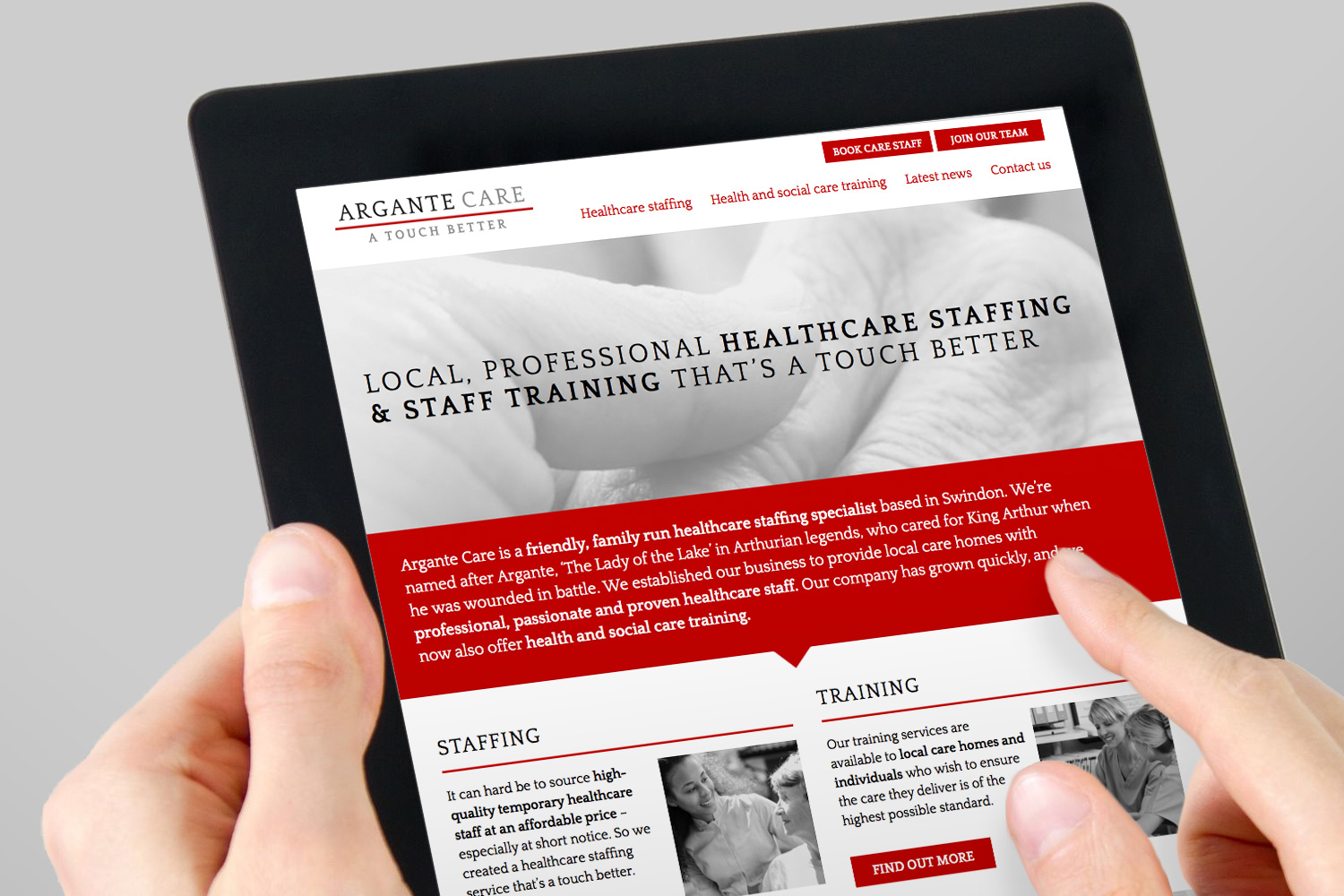
Argante Care is a family run healthcare staffing specialist based in Swindon and covers care homes across Wiltshire. They care deeply about the standard of care they offer. They take time train and place the right people, and offer a more personal service than their competitors (many of whom are large, national agencies).
I created the positioning ‘A touch better’ with the aim of engaging clients, prospects, current staff and future staff in equal measure. The wording reflects Argante’s friendly and professional-yet-humble personality. (Their service is excellent, but being big-headed about it would not be in their nature and could be off-putting.) This confident-but-softly-spoken tone of voice was carried through into the brochure and website copy.
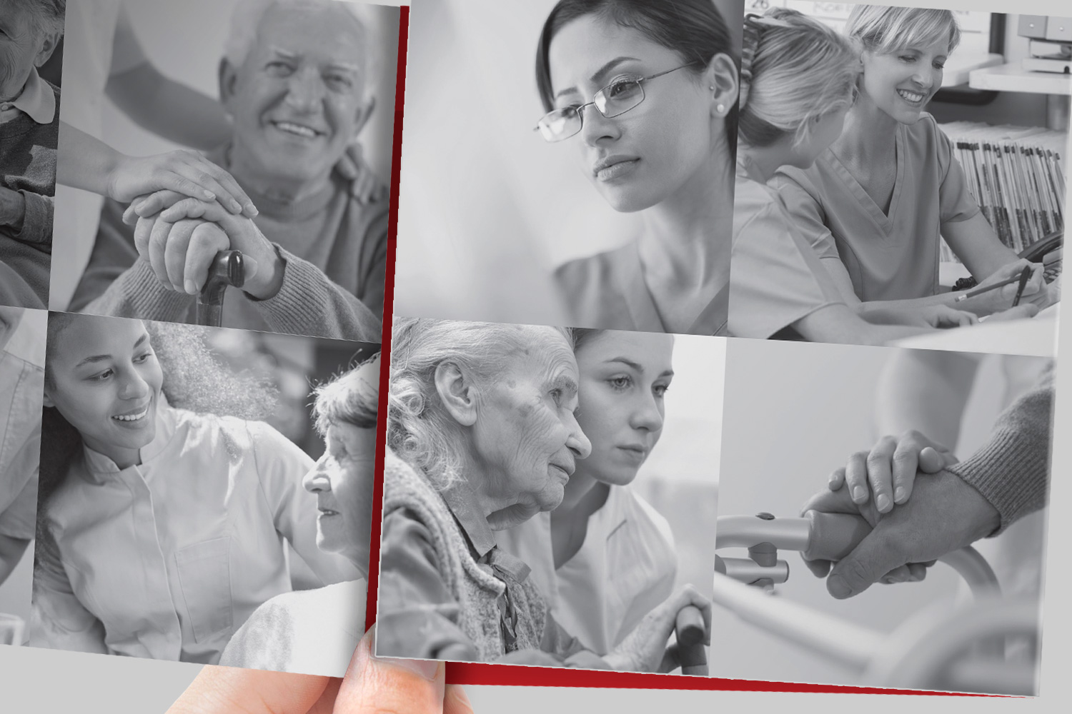
Argante’s exising colour palette was retained but made to work harder than in their old materials, which were predominantly white. In the absence of a budget for a photo shoot, a range of stock images of healthcare staff and the people they care for was used. Key to the selection of these images was their portrayal of personal interaction and caring through touch. The photos were used as black-grey duotones to bring them together as a set and ensure they didn’t overpower the written content.
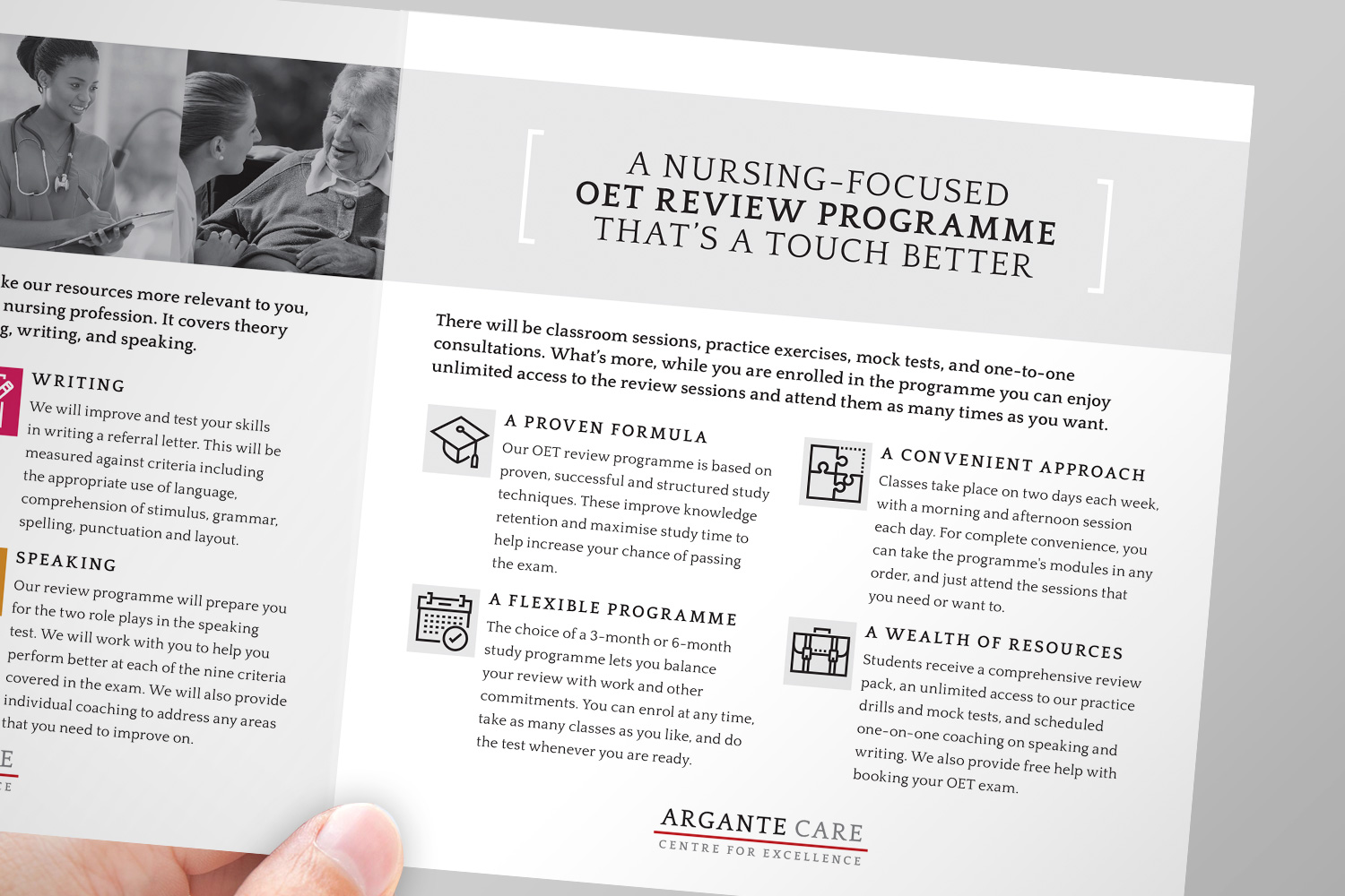
Training brochure and folder
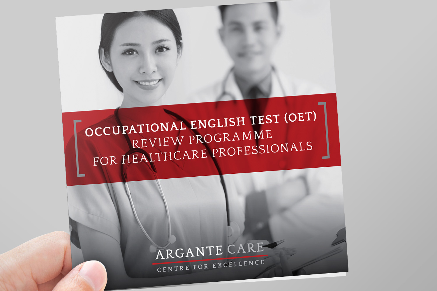
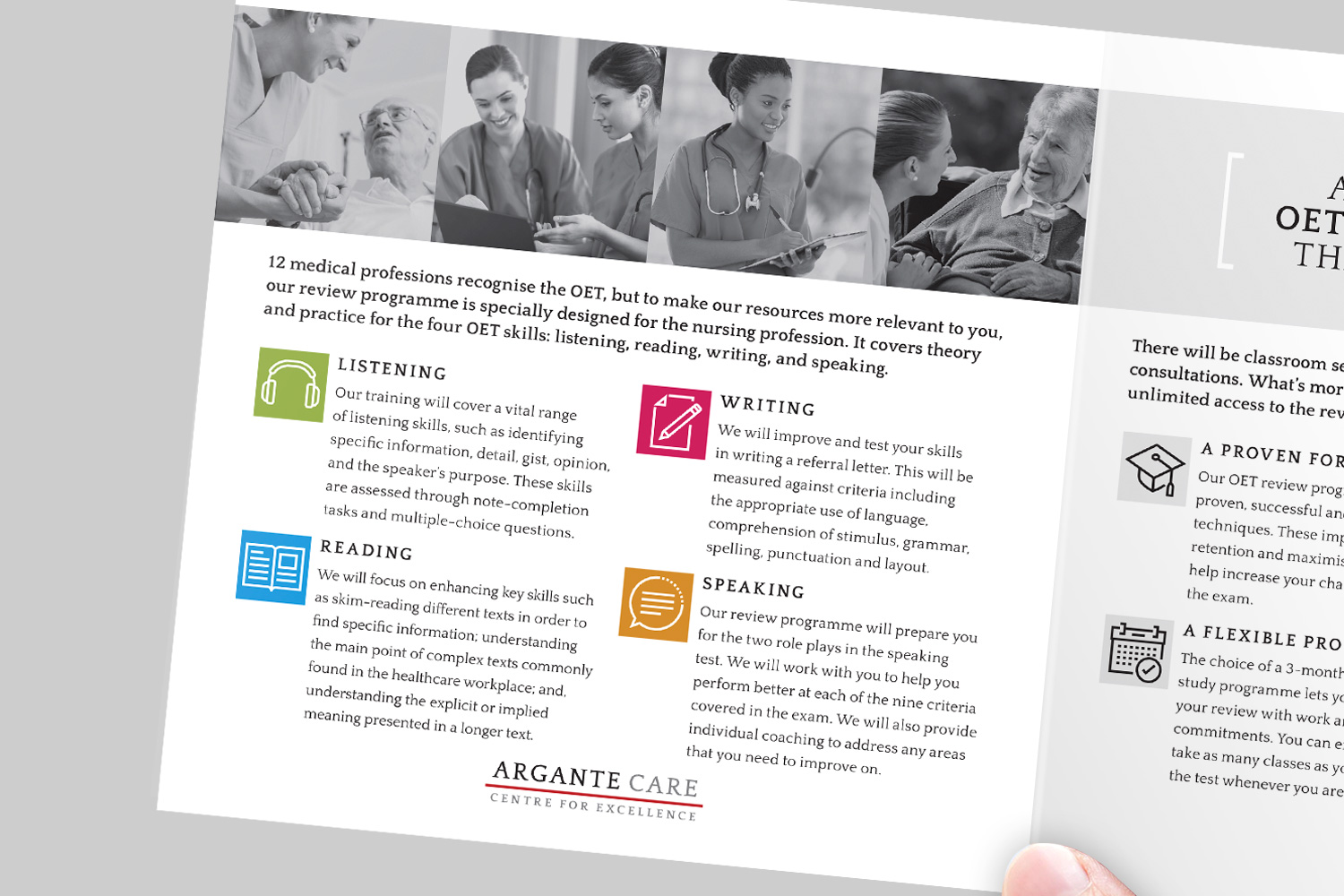
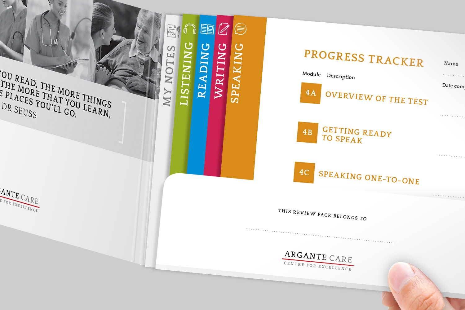
Several years after the initial branding project, Argante established a division of their business focussed on delivering training to healthcare staff – the Argante Care Centre for Excellence. I created a brochure to promote their main Occupational English Test review programme, together with a review pack for for the programme’s participants.
Small things, big difference
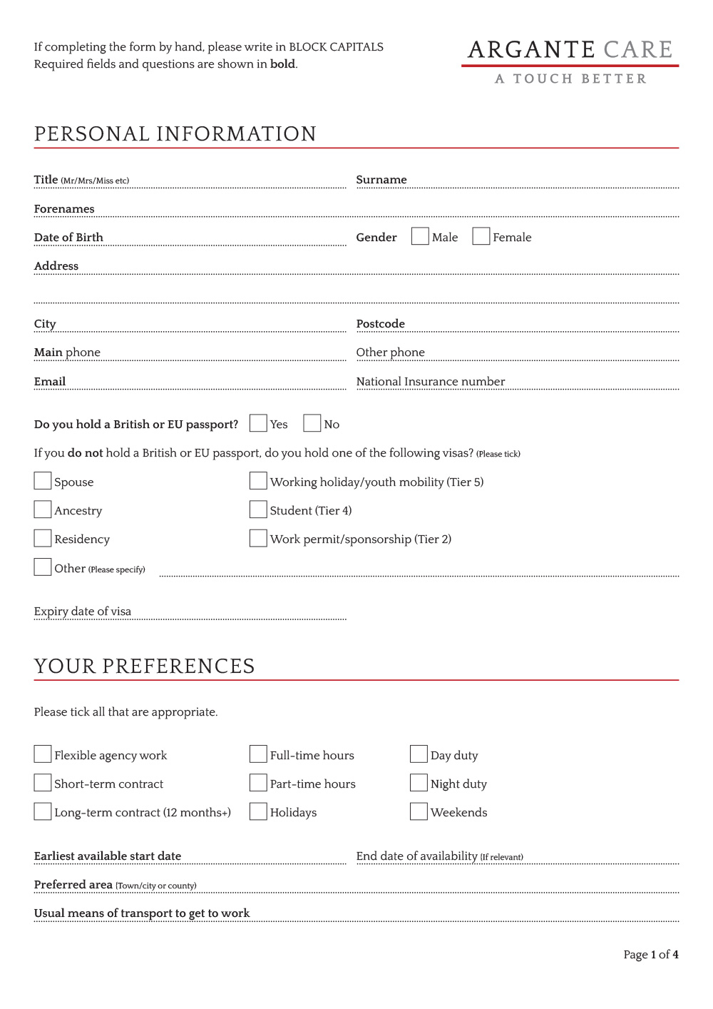
As part of the work to create the new website, Argante’s four-page job application form was overhauled. The old and the new forms may look similar at first glance, but there are numerous improvements that make the new one easier to use.
On the old version, there was too little space for people to write in comfortably. Tick boxes were also very small and were used inconsistently. A number of questions on the form lacked lines to guide people when writing their answers, and some of the instructions and headings were a little clumsy or lacking in clarity.
I gave the new form a much more open and user-friendly feel. This reduced the likelihood that people would miss questions or make mistakes. In addition, the form was made interactive so that people could chose to print it out or simply complete it on-screen.
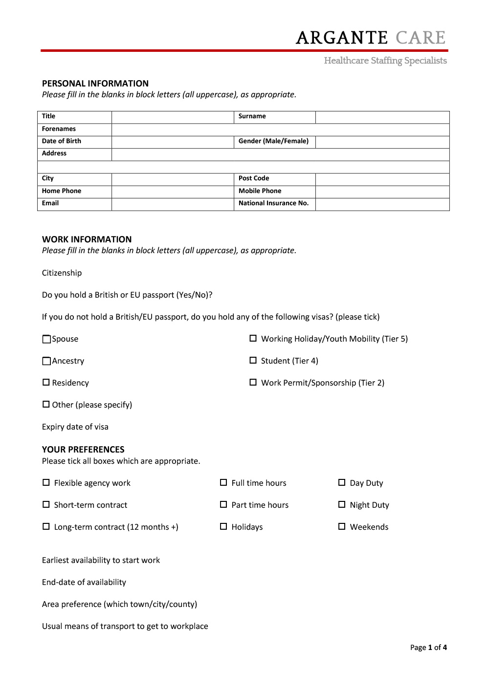
The old application form