Strengthening the brand identity and narrative of a regional utility reinstatement company.
2012


The old identity
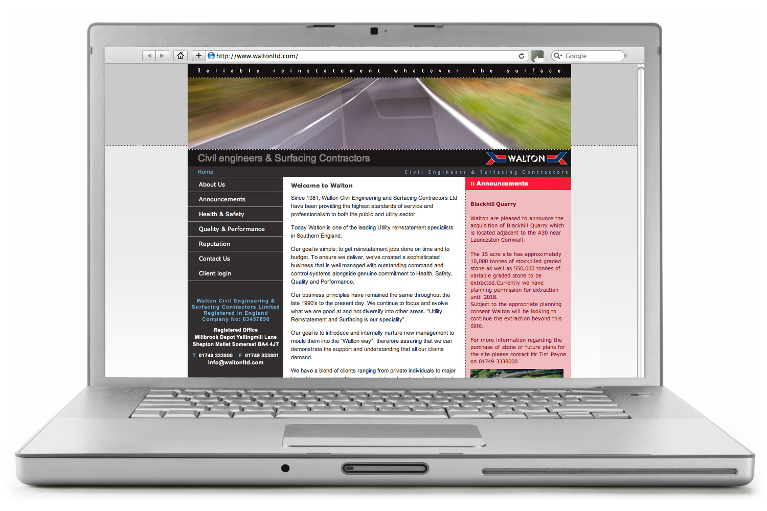
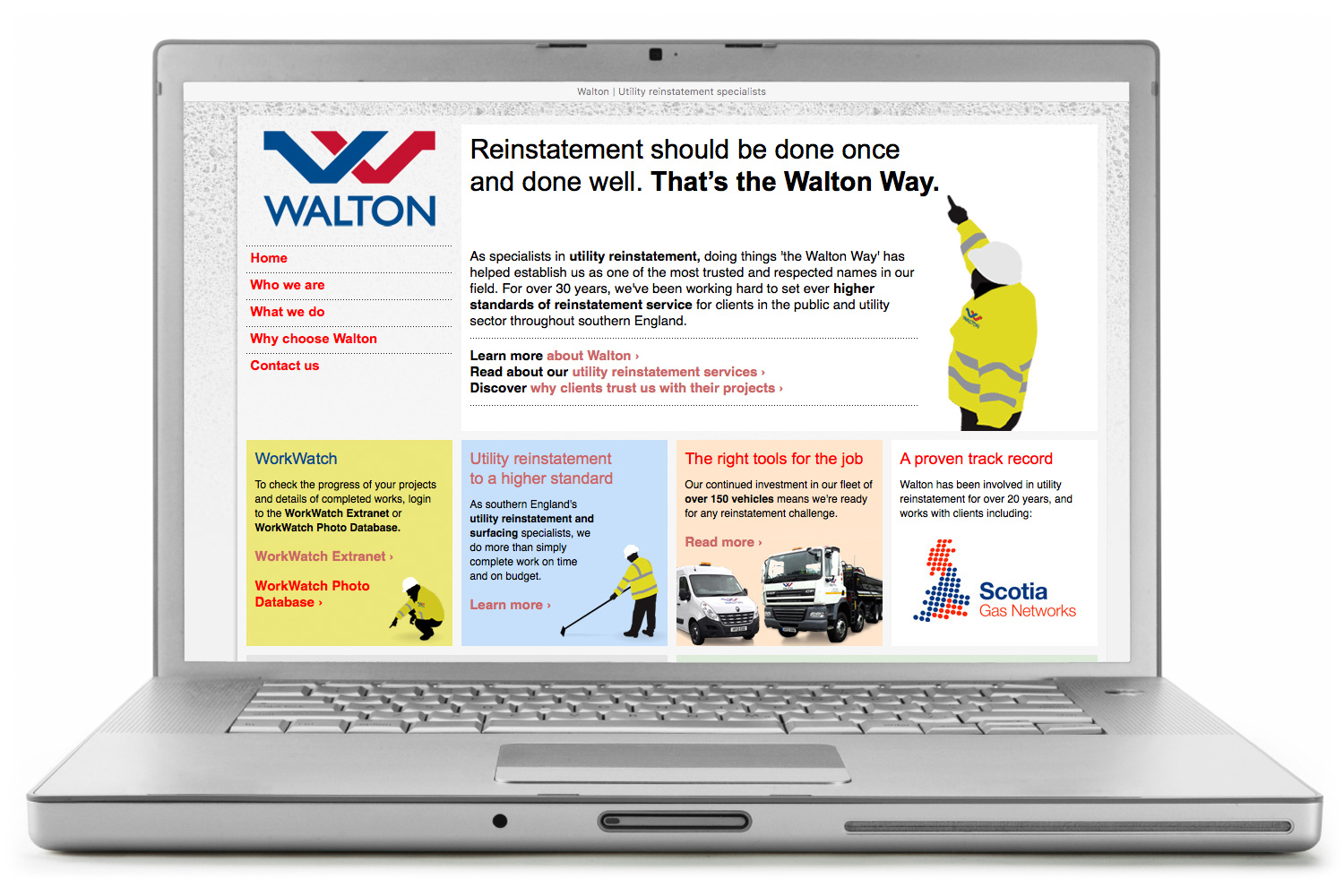
Walton’s logo was distinctive but not distinquished. The wide format, interlocking bands at each end, and use of the unusual typeface Gill Sans Shadow was arguably OK on the front of a truck, but made the logo difficult to use in many modern circumstances, such as on Walton’s website (as shown below).
The interlocking bands may have had a reason for being when they were introduced, but to fresh eyes it was hard to see their relevance (and some people said they were reminiscent of barbed wire).
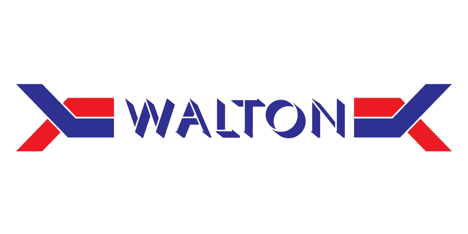
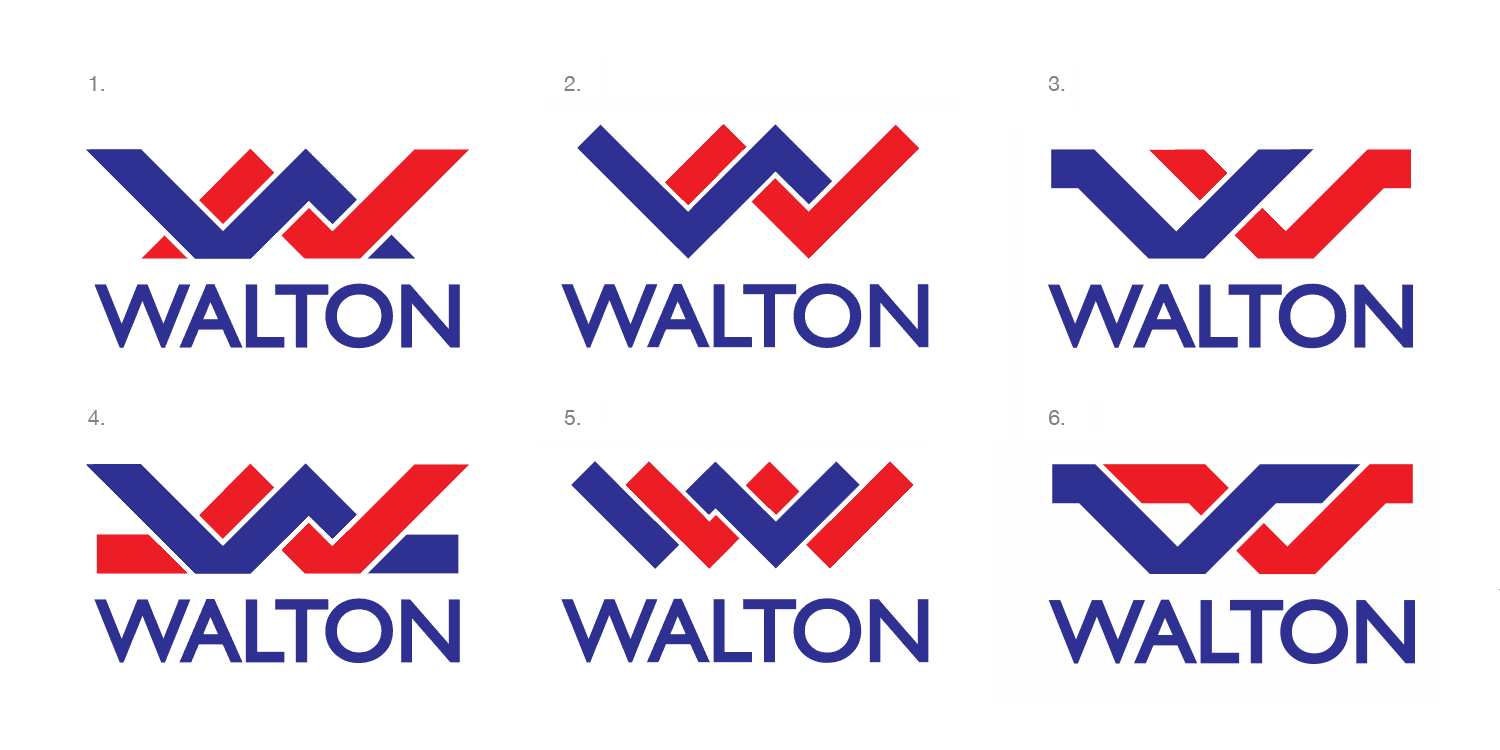
The new identity
I worked with my client, Lloyd, Walton’s joint managing directors, Tim and Andy, and other key members of the to develop a new identity that would project a more modern feel and work easily in all applications. Chief among these was Walton’s fleet of over 150 vehicles, which would need to be rebranded.
A strong degree of continuity is often valuable in such projects as it aids buy-in among both internal and external audiences. I therefore retained the red-and-blue colour scheme (albeit with some carefully considered tweaks) and made the new ‘W’ symbol feel like it was based on the original interlocking bands. Gill Sans was also kept, but a different, clearer and more professional variant used.
A new website and new narrative, the Walton Way
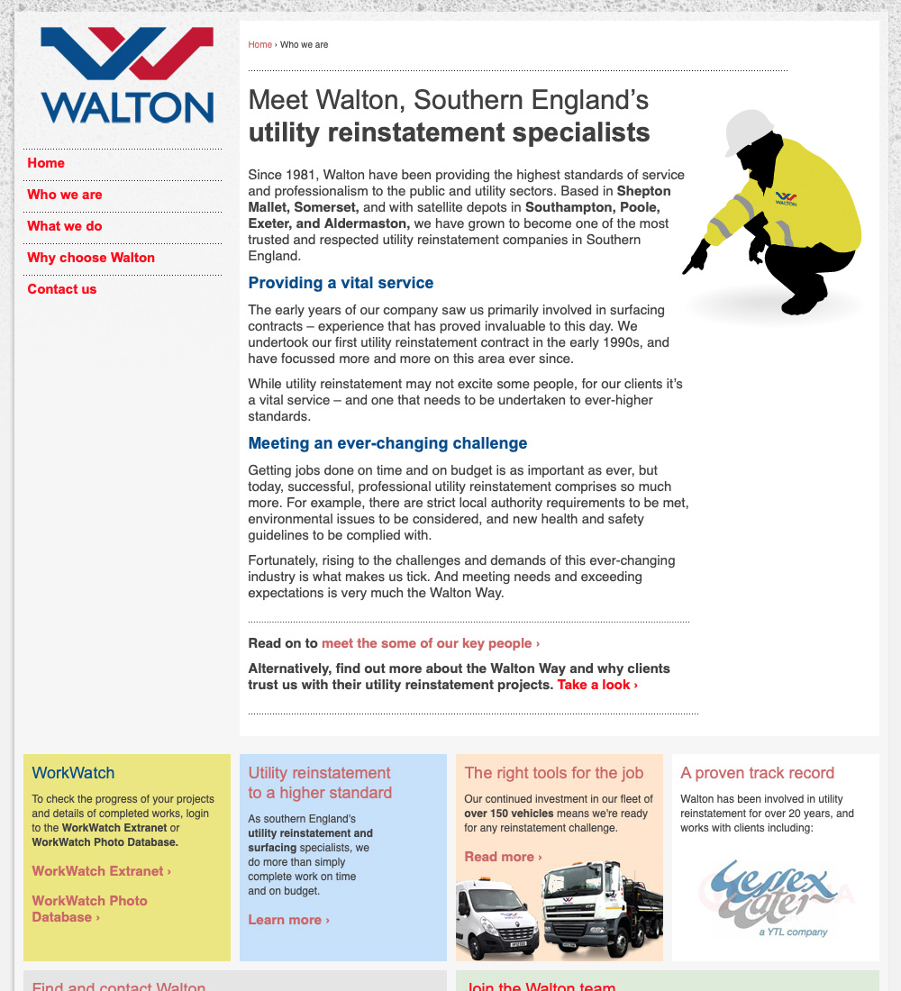
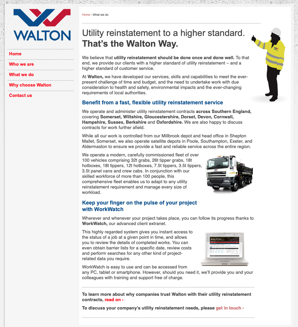
Walton’s old website was visually dull, poorly structured and off-puttingly wordy. It lacked a clear narrative, and a single, definitive positioning for the business. However, as is often the case, the text did contain a few inspiring nuggets – one of which was a brief reference to a ‘Walton Way’ of working.
I discussed this with the team at Walton and discovered that the Walton Way existed as a defined and documented set of working practices. From a branding perspective, this was gold dust! I brought the Walton Way to the fore in the new narrative and made some of the core principles into bold, engaging headline statements.
The new narrative also elevated Walton’s offering. The old site talked about doing work on time and on budget, but this sounded a bit ordinary. Instead, the new site refers to ‘Utility reinstatement to a higher standard’. Similarly, the old site referenced Walton’s extranet (where clients could track progress of their projects). This feature – and the clever technical ways in which it was delivered, including photos of completed works being added in real-time – felt like it needed highlighting, so I named it Walton’s WorkWatch extranet and photo database.
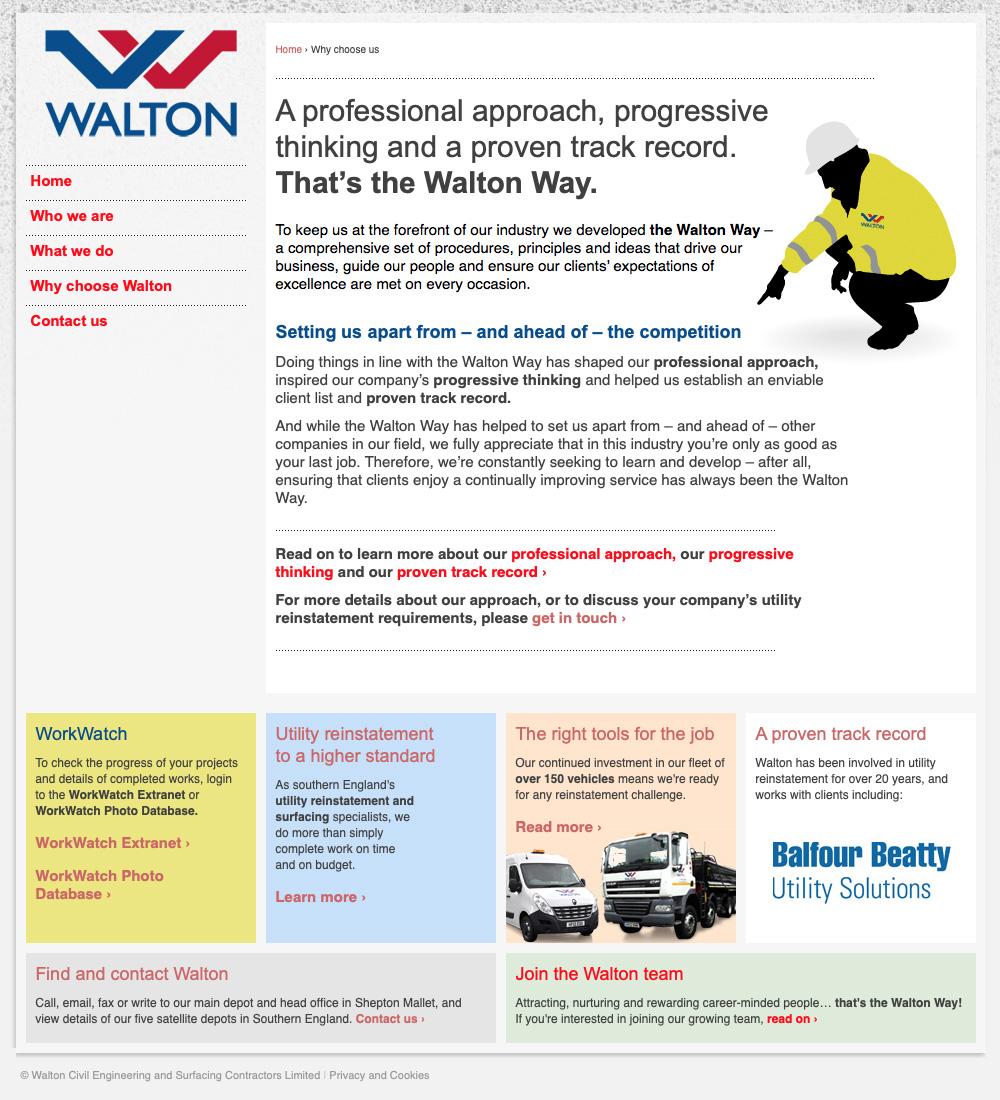
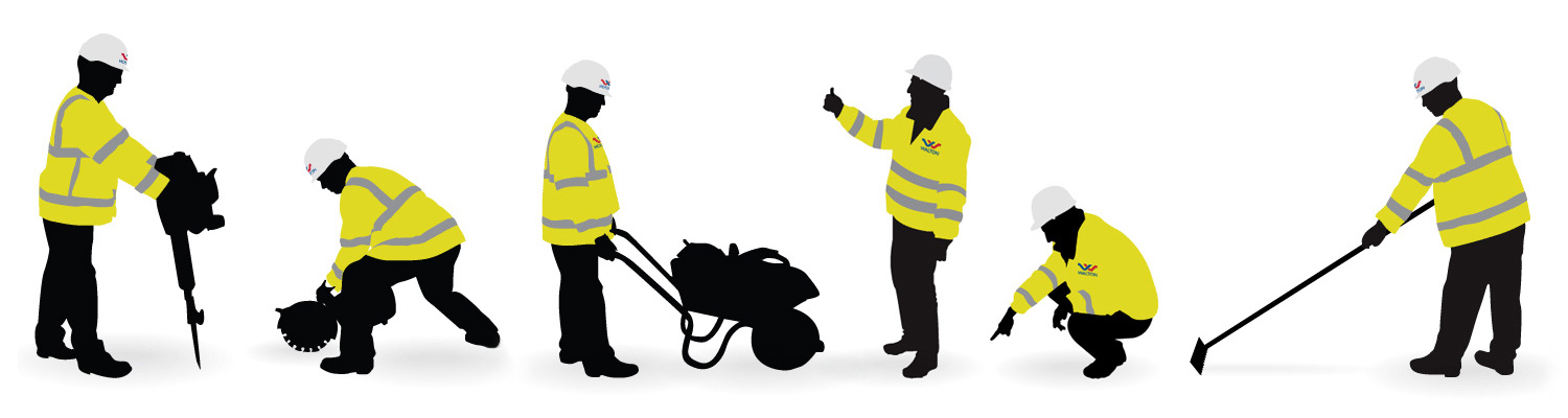
Bringing a clean look to a dirty job
Portraying Walton’s work visually was going to be a challenge. Lloyd explained to me that due to the nature, speed and location of their projects (essentially filling in and resurfacing of trenches dug by utility companies when laying or repairing pipes and cables in often-busy roads ) it would be very difficult to arrange or manage a photography shoot. And ensuring that workwear, vehicles, tools and equipment present on site were all kept spic and span for a shoot would be almost impossible.
So, I circumvented the problem by commissioning illustrator Lesley Tristram Spencer to produce a team of smart, clean ‘Walton workers’. This enabled us to determine poses, equipement and other aspects with ease – and actually create something with far more impact than would have been possible with location-based photos.