A refreshed brand identity and new brand positioning for the world’s largest rugby play programme for young children.
From 2015
“We’ve been working with Objective Ingenuity for a number of years. Jeff is innovative but flexible in his approach, which makes him a pleasure to work with. He has great ideas and performs seamlessly as an extension of our marketing department.”
Max Webb, Founder and Managing Director, Rugbytots


The old identity and positioning


Rugbytots started in a park in Surrey. By 2015 it had grown to become an international franchise operation with over 40,000 children taking part each week. But ambitions to grow further were being hampered by branding and marketing materials that had become tired. It was time to substitute them for ones with fresher legs!
The Rugbytots logo and ‘Artie’ character were well liked but lacked finesse. In particular, the logo struggled for clarity on dark background – and, in black in white, Artie looked naked!
Rugbytots positioned themselves as ‘The UK’s first rugby-specific play programme for young children’. While accurate, this was a bit of a scrum of a sentence. In other countries, the line would change to say “France’s first..”, “Australia’s first…” and so forth, but this meant that Rugbytots always appeared to be a national entity, not an international one.
The new identity and positioning


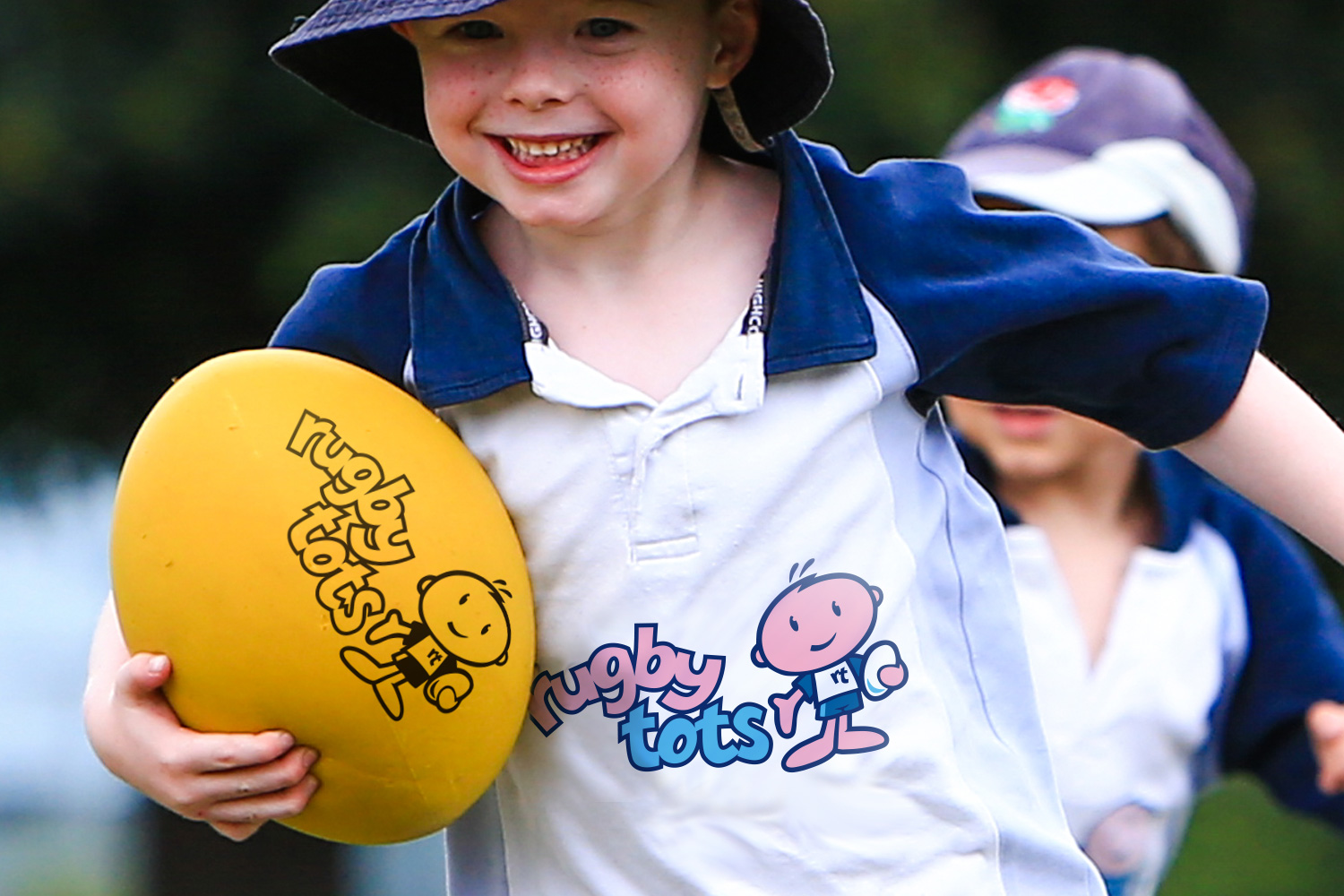
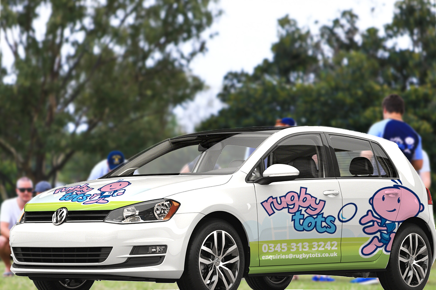
The new identity sees an evolved and completely redrawn Artie and rugby pitch background. I worked with illustrator Daniel Howarth to craft this new version and bring more professionalism as well as more personality to Artie’s appearance. This included adding Rugbytots’ rugby kit and replacing the old spatula-like hands.
Where Artie had previously appeared in only one pose, Dan and I developed a whole suite of rugby-relatated and other poses. This has helped to bring more life and fun to the brand.
For continuity, the typographic part of the identity was retainined, but increased in size, and given a bolder line work and simplified colouring. The whole logo was then given a white outline to ensure clarity on dark backgrounds.
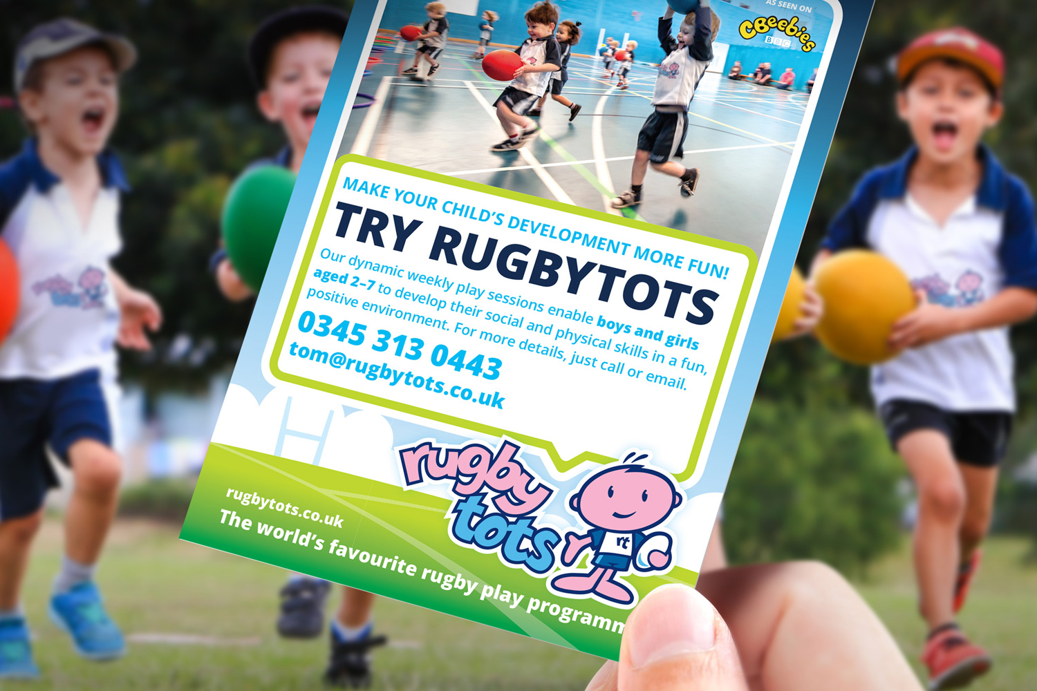
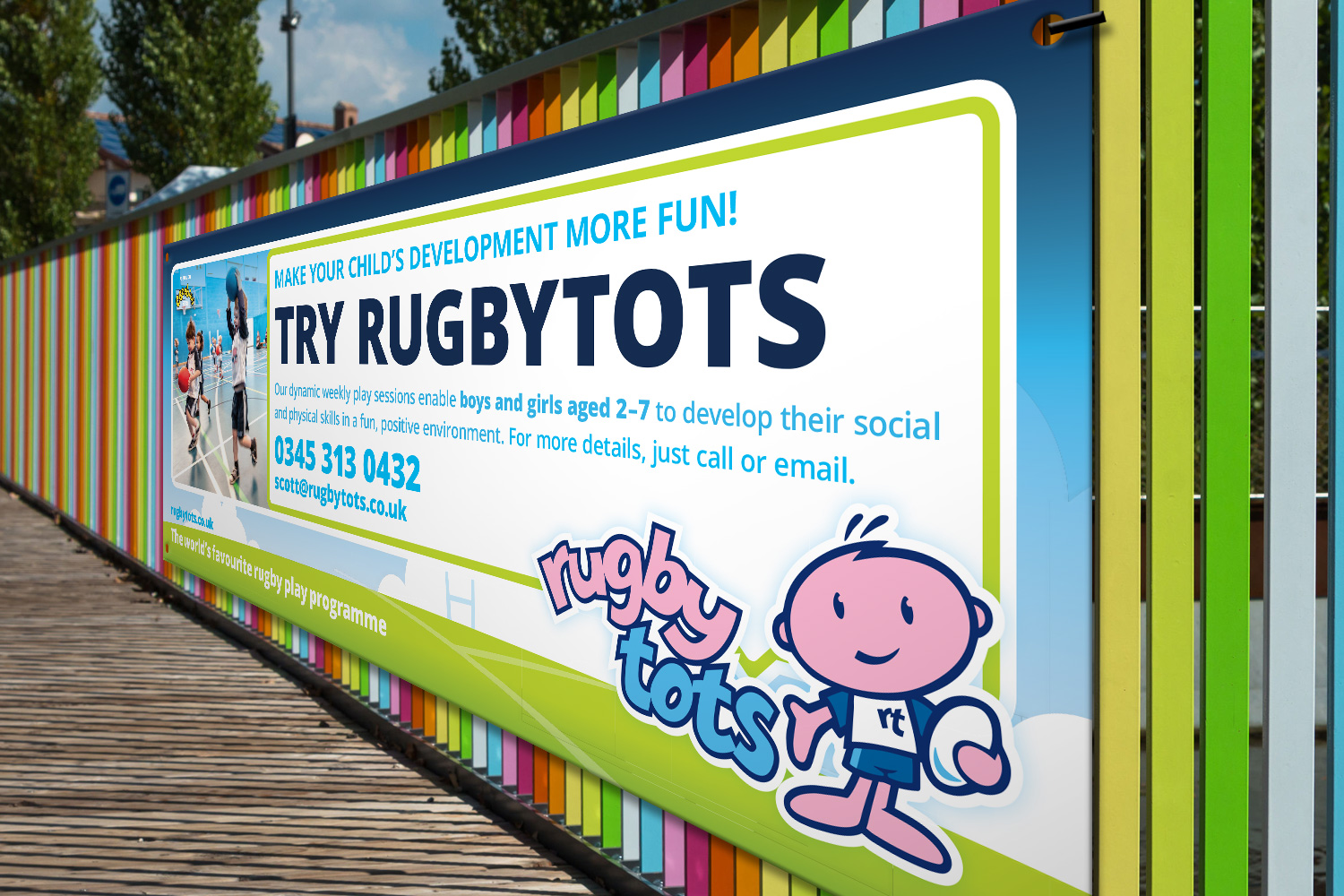
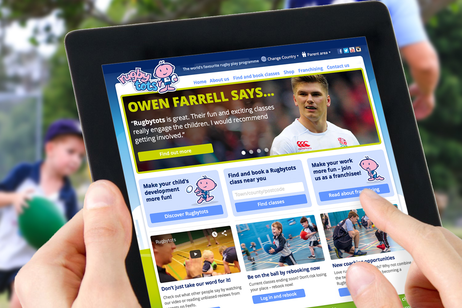
I also developed a new positioning line, ‘The world’s favourite rugby play programme’. This definitive, confident and memorable line reflected the brand’s global nature and status as the leader in its field.


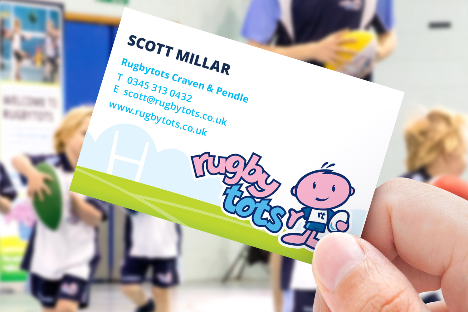
Personalised marketing materials for franchisees across the globe
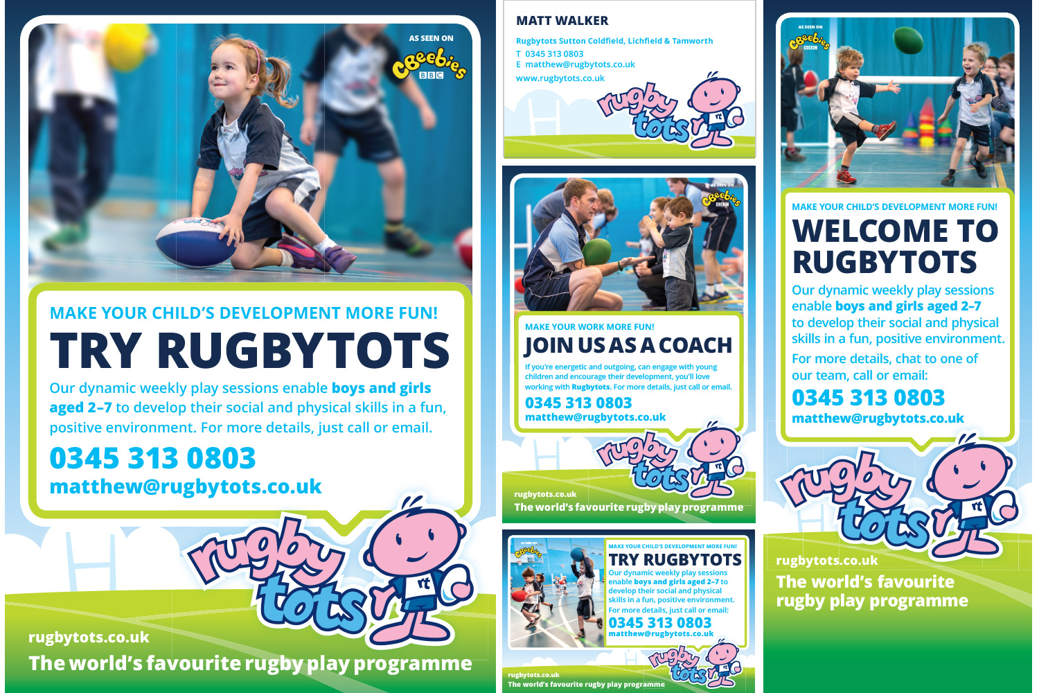
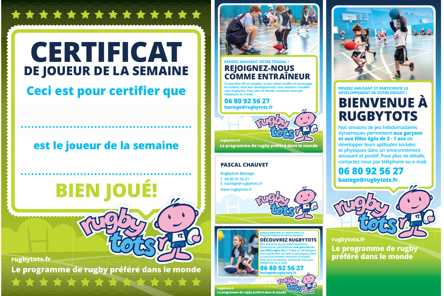
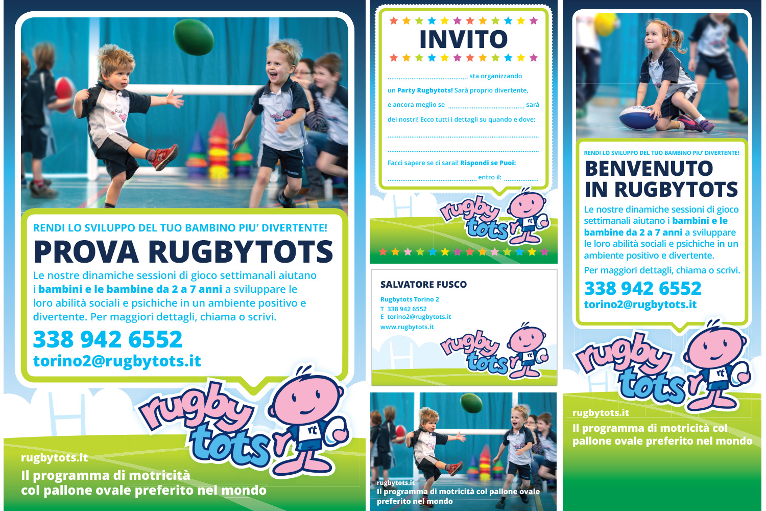
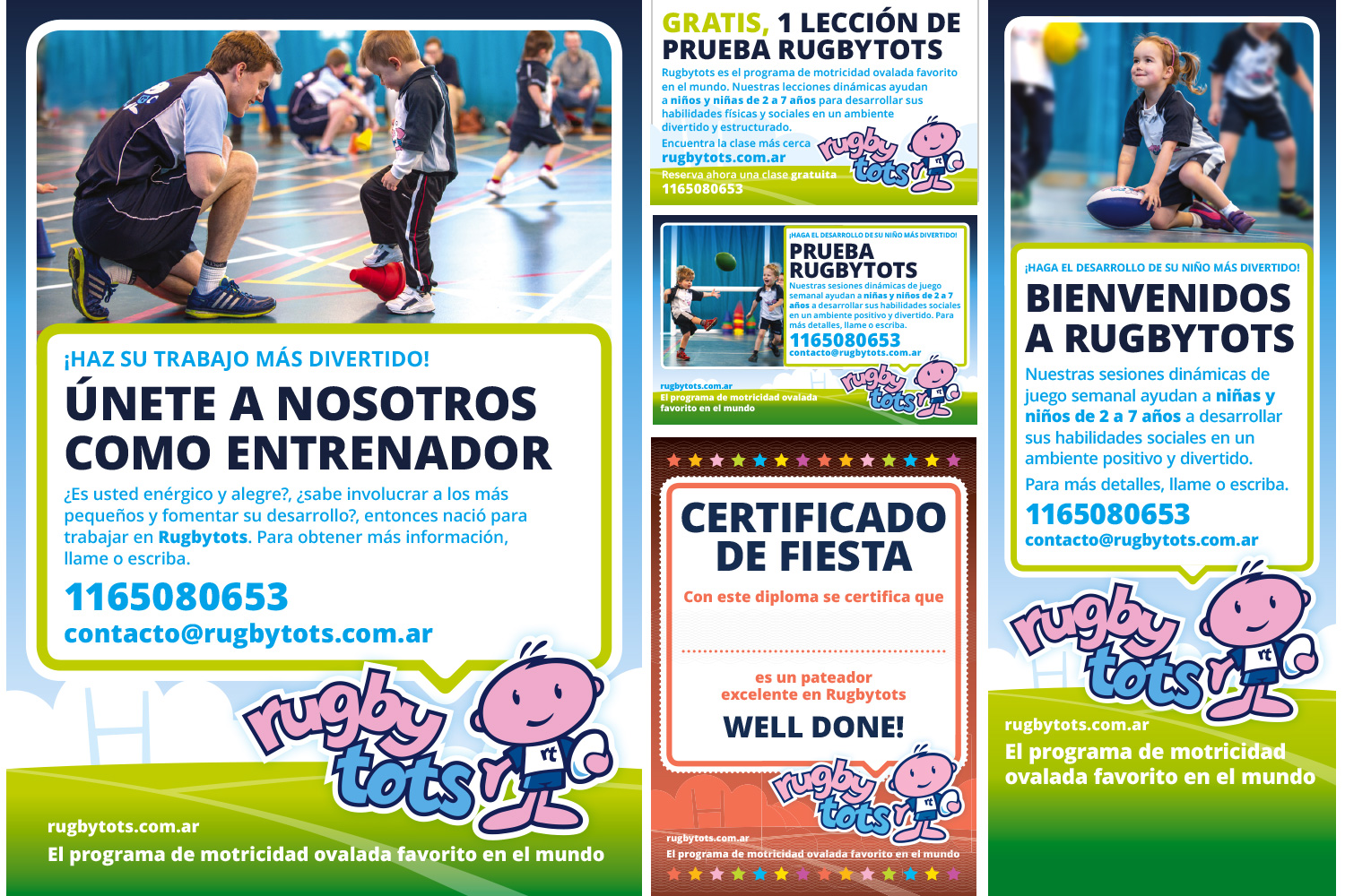
To ensure a consistent roll-out of the new branding throughout the world, I set up a streamlined process that enabled the production of the 60+ pieces of personalised marketing material required by each franchisee around the world. These range from adverts and flyers to banners and party invites. By 2020, we have produced these materials in 6 different languages (plus the US and Australian variants of English) for over 250 franchisees running classes for 80,000 children on six continents.
+ 2 variations of English