Evolution of the brand identity and positioning for a national charity, plus the redesign and production of their annual magazine.
2004–2008
“Your work made a massive difference and gave us the professional company image we needed to take BabyGROE to the next level. You were also very patient and a pleasure to work with.”
Susan Oak, Co-Founder, BabyGROE


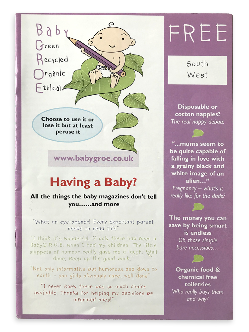
Old branding
The old logo was lacking in style and charm, and the thin feel to the lines and lettering made it difficult to see at small sizes.
The tone of voice and personality the brand wanted was friendly and ‘peer to peer’, but the child-like handwriting suggested it was a child talking, or that the brand was for children rather than their parents.
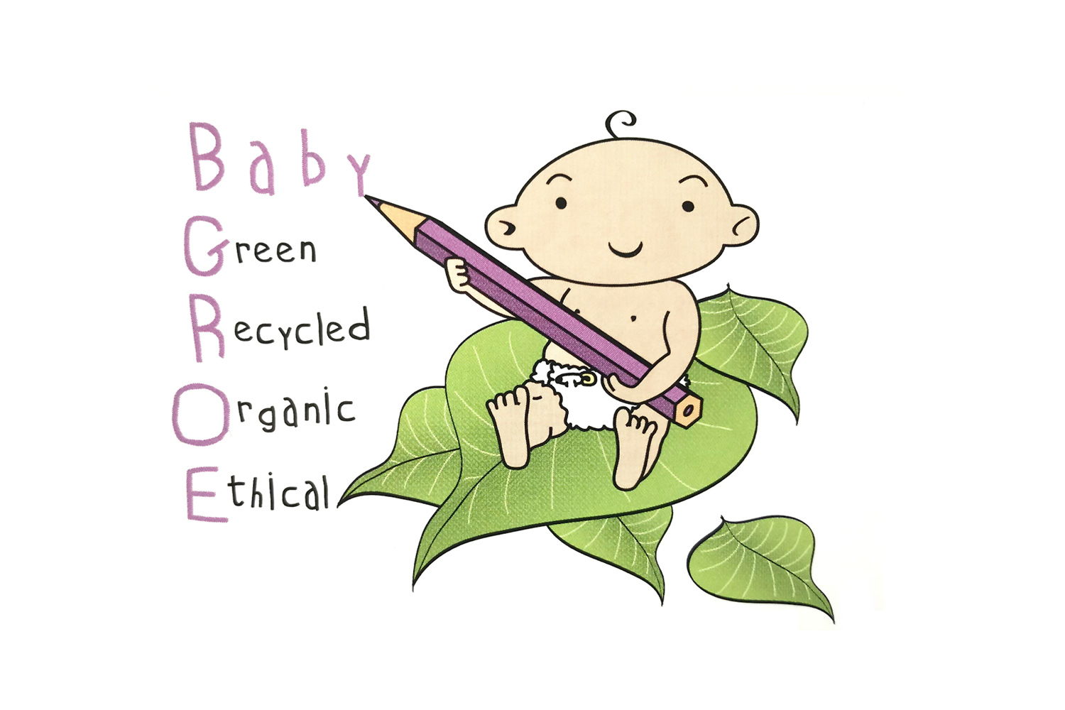
Given the slightly obscure brand name, it was important to explain what G.R.O.E. stands for, but doing this as part of the logo was not the best approach.
New branding

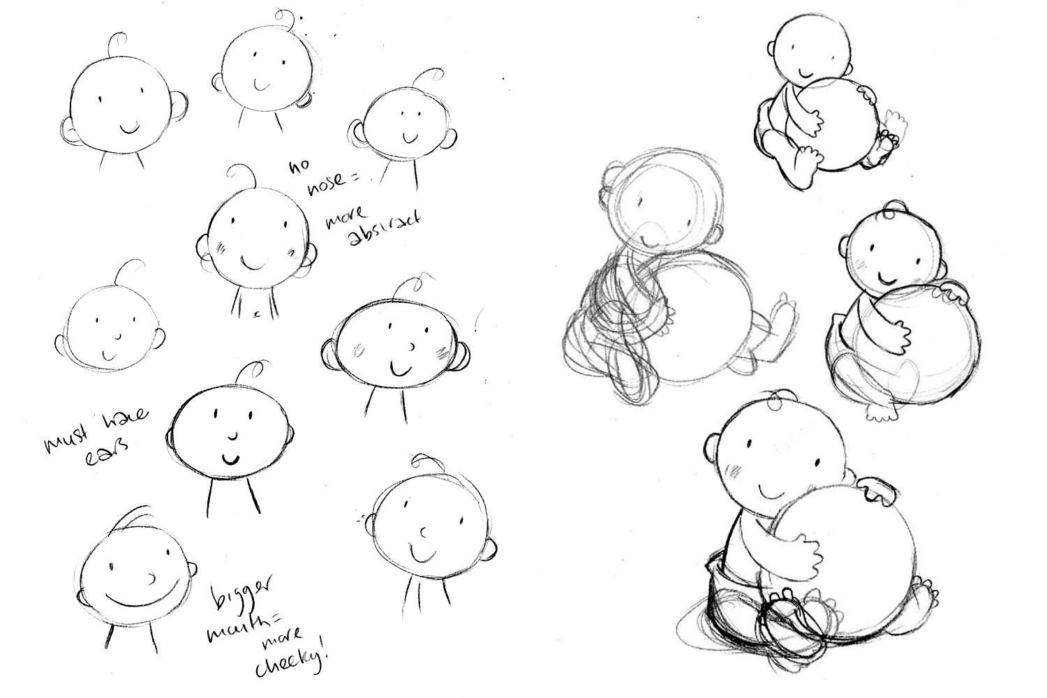
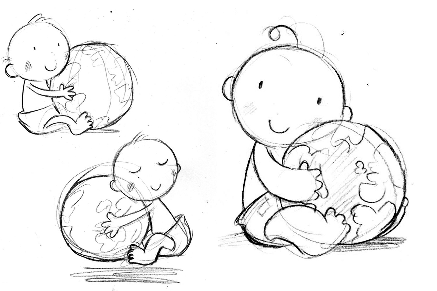
I worked with illustrator Daniel Howarth to develop a new drawing of the baby. In the new logo, he has a more relevant context thanks to the presence of the globe, and is drawn in a more attractive and charming manner.
A smart-but-friendly typeface is used for the brand name, with a hand-drawn font used for the new positioning line ‘Helping parents make natural choices’.
This new brand positioning was developed as key part of the project, and articulates the charity’s aims and activities in a clear and engaging way.
Old magazine
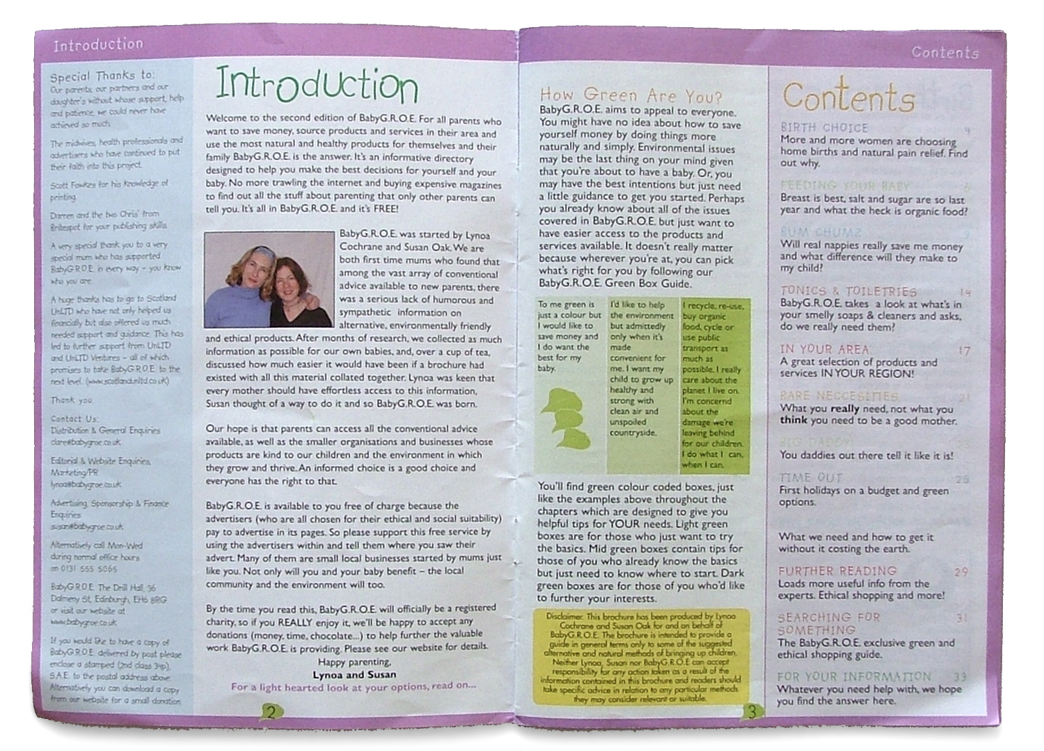
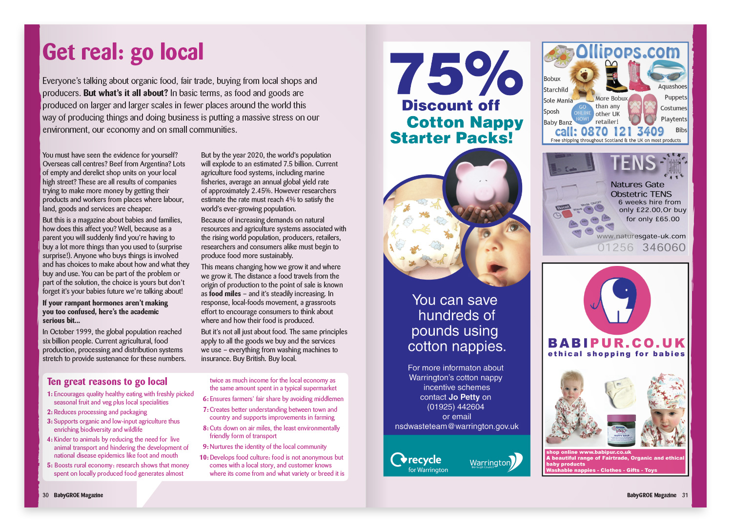
The old magazine design had a lot of failings. On the cover, there was too much emphasis on the Baby GROE logo, a lack of a masthead and main feature image, and the key-content messages were being underplayed.
The spreads were text heavy – partly out of necessity due to the amount of information that needed to be communicated – but a lack of imagery made for an off-putting read. This was made worse by the use pale colours and a thin handwriting-style font, which were sometimes difficult to see.
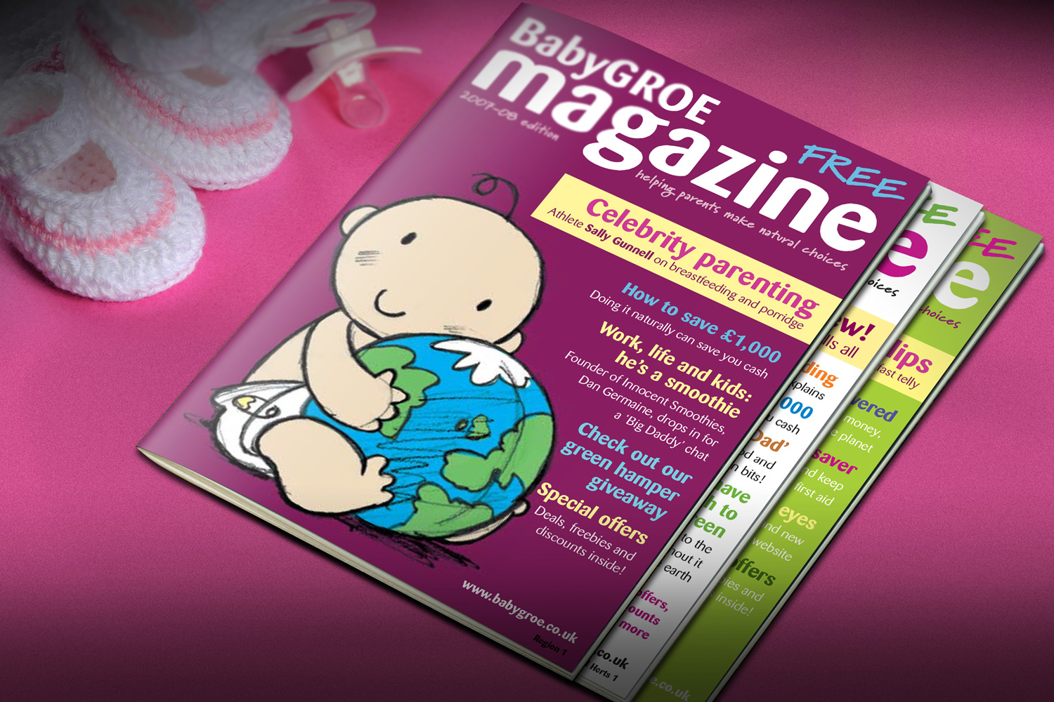
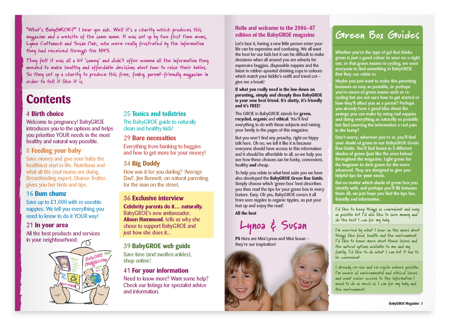
New magazine
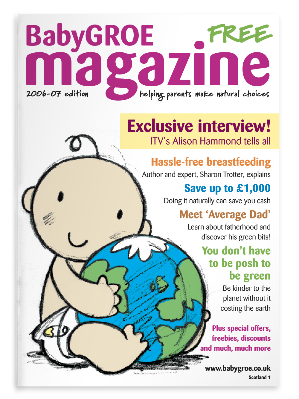
The new cover uses the title BabyGROE Magazine rather than just BabyGROE, to separate the name of the publication from that of the charity. With brighter, bolder typography, and the BabyGROE baby taking centre stage it becomes much more striking, exciting and inviting to the reader.
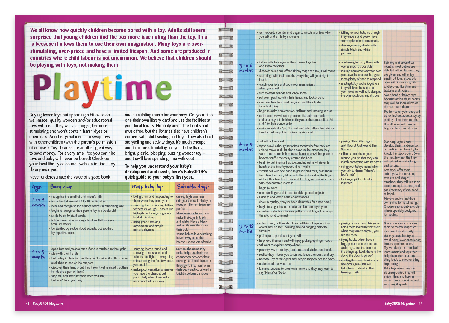
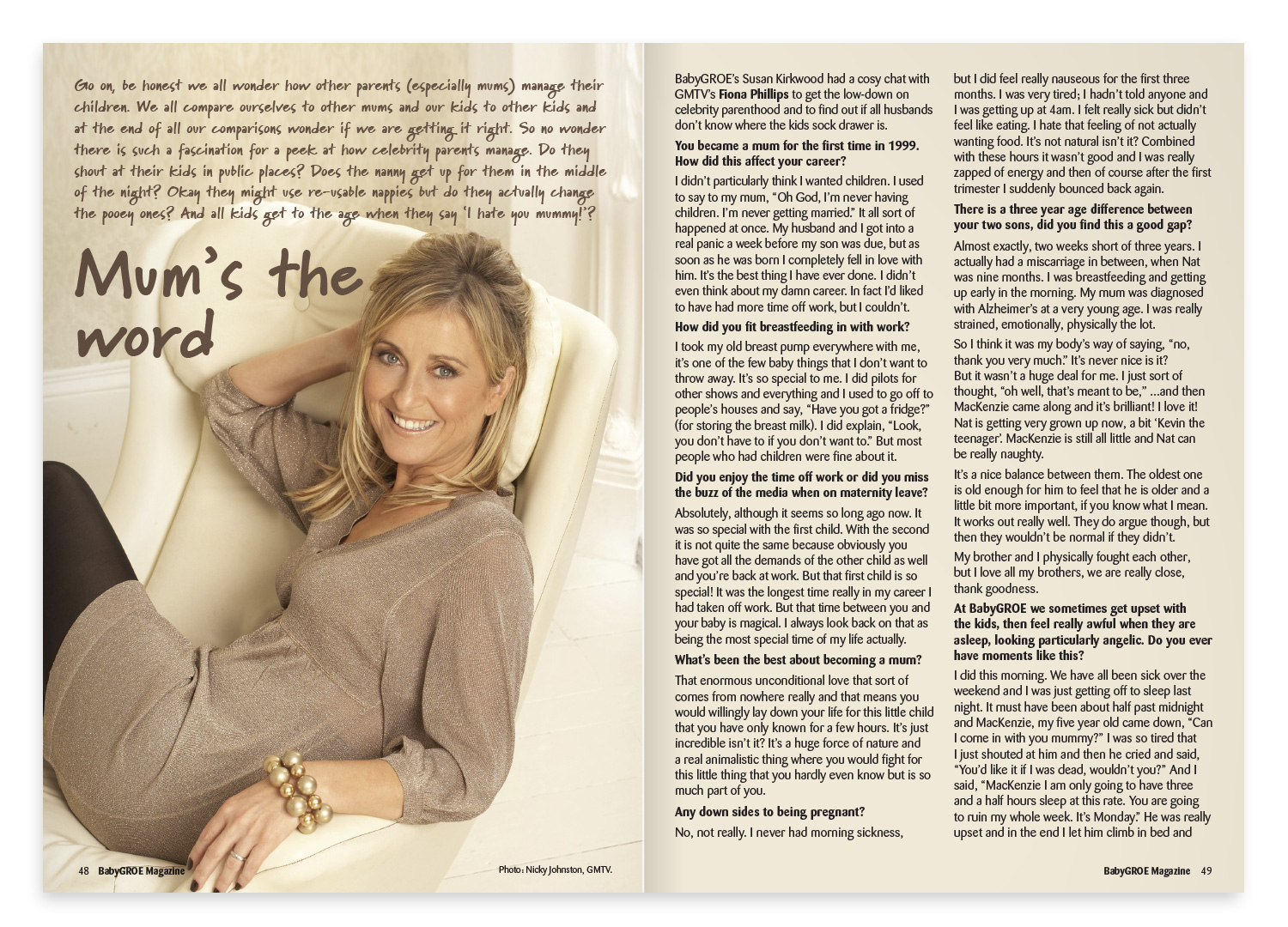
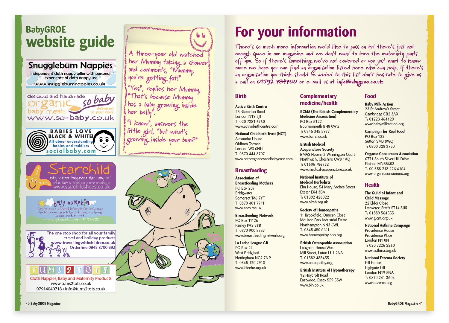
The feature articles still contain a lot of information, but make it clear and attractive. Headlines are bold and intriguing, and colours vary from one spread to the next. The BabyGROE baby (and friends), together with large photos, blocks of colour, shapes and icons, all add variety and bring each spread to life.
Pages from the magazine
Not exactly child’s play…
BabyGROE Magazine grew in size each year. The final edition comprised 56 pages and had a print run of 250,000. The four pages in the centre were bespoke to each of 20 regions, and contained small ads ranging in size from an eighth of a page up to a full page. All in all, it was a rather grown-up production and organisational challenge!