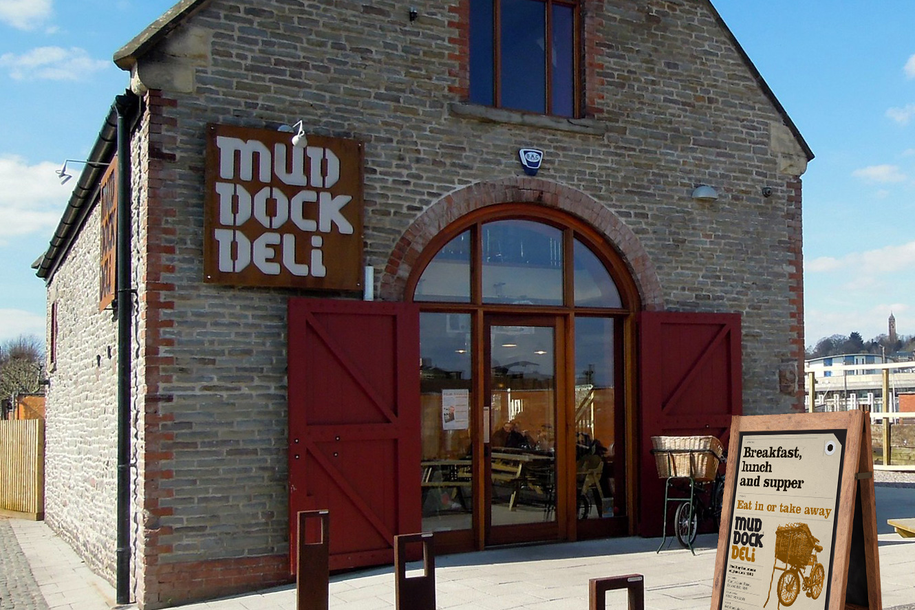
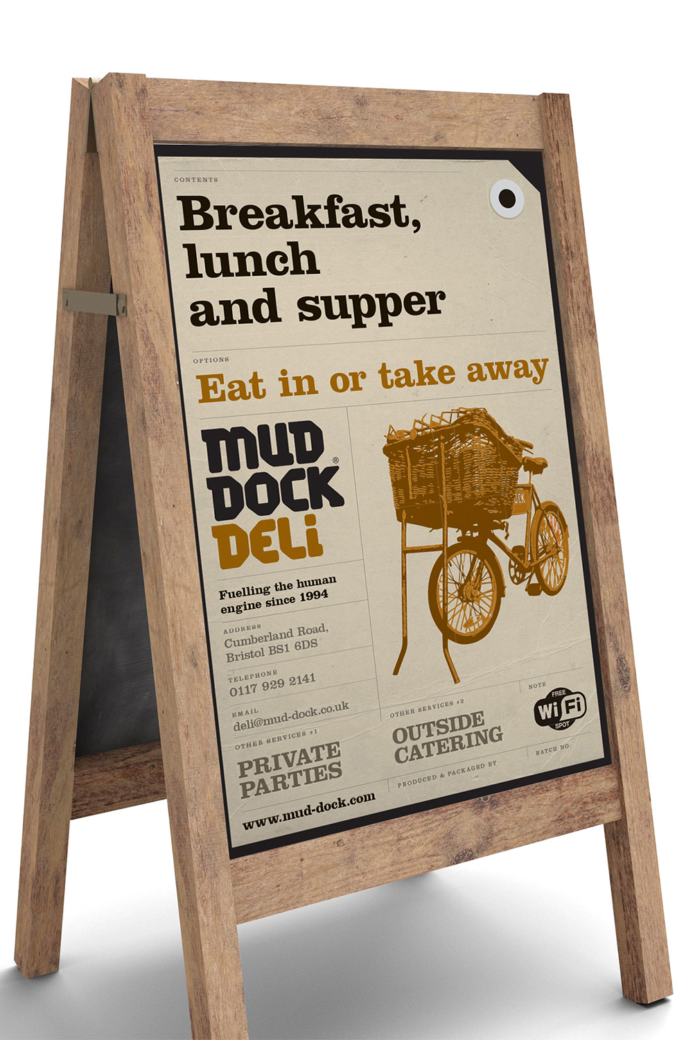
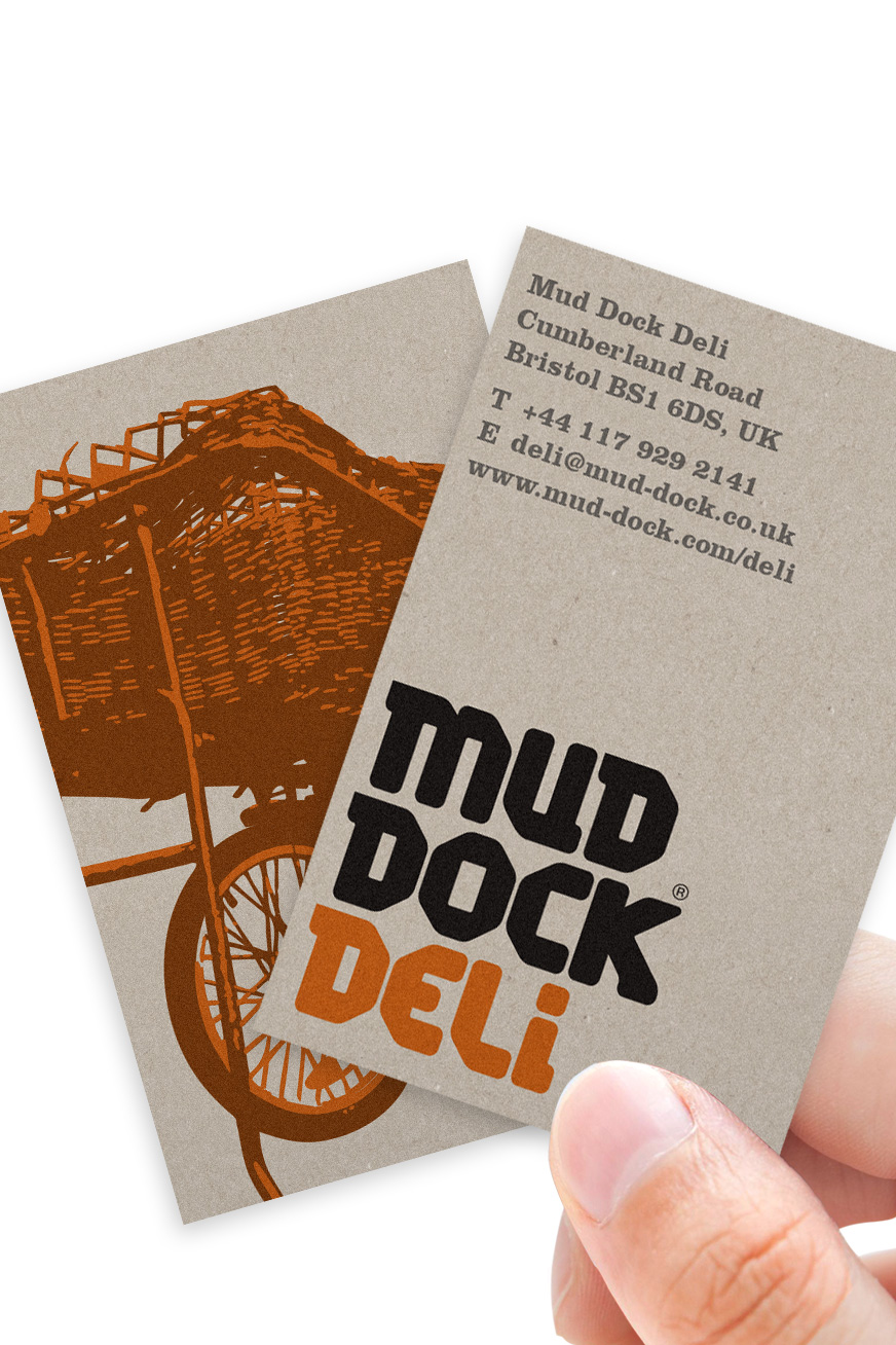
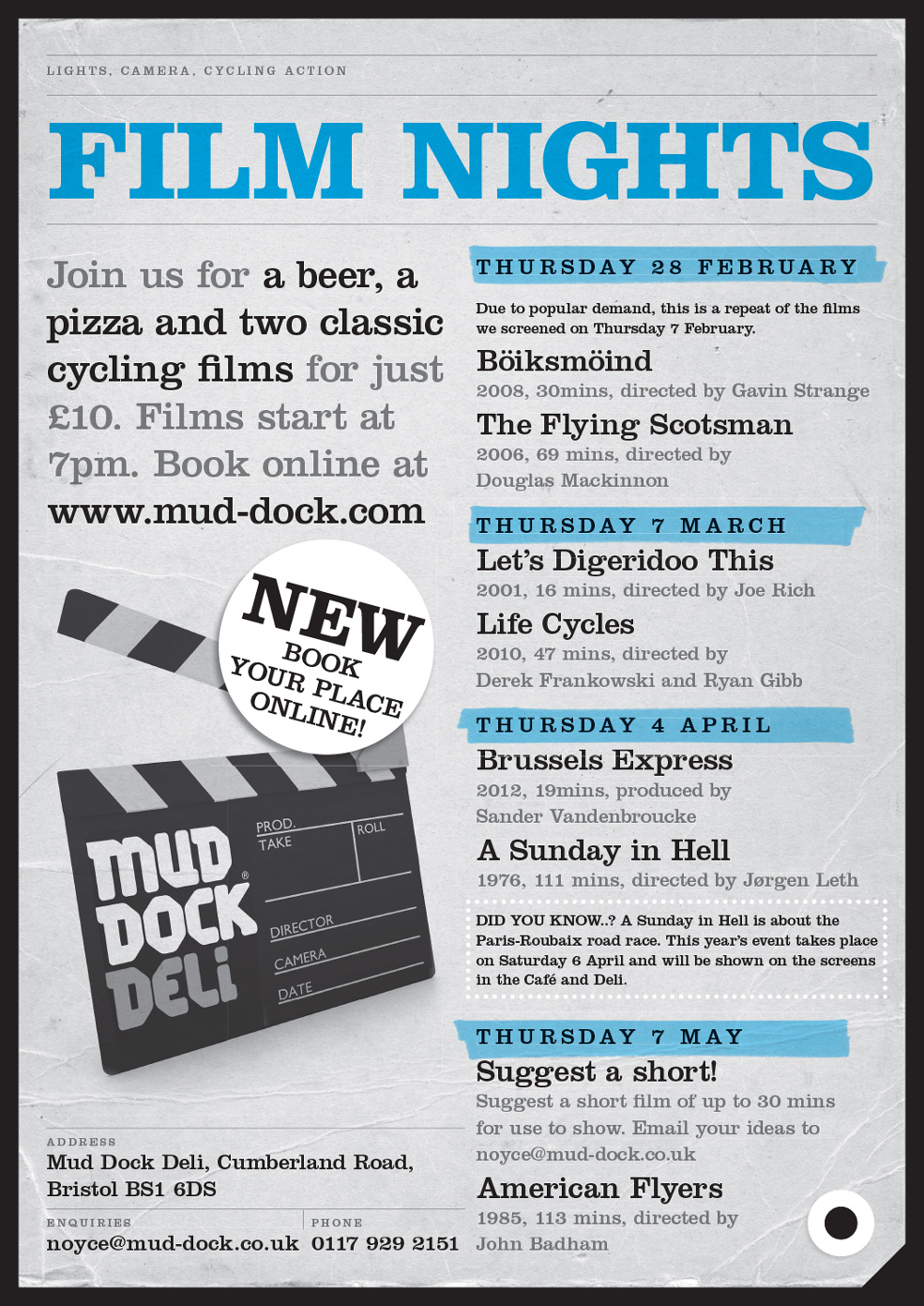
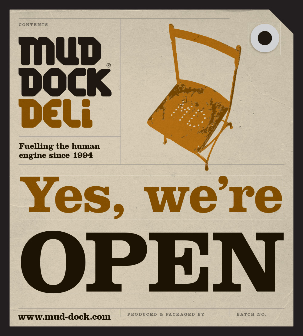
Brand name, identity and marketing materials for Mud Dock’s new venture on Bristol’s fast-developing Whapping Wharf.
2012
“It’s difficult to believe that we have been working with Jeff since 2003. That’s a lot of water under ANY bridge. And no regrets. As an ‘exacting’ client, I don’t really think I need say much more. But I will. As someone who’s worked professionally in the design, marketing and advertising business, I well recognise that Jeff’s significant contribution to the Mud Dock story would have been curtailed long ago if at any point his submissions failed to deliver. They simply don’t.”
Jerry Arron, Owner and co-founder, Mud Dock

New site, new offer, new name
Building on the success of their long-established main premises on Bristol’s harbourside, Mud Dock were opening a new site on the opposite side of the water. The new sister venture would be located in what was originally the workshop for Bristol’s old prison – a superbly characterful building that Mud Dock were renovating.
The concept was not to duplicate the offer at Mud Dock’s main café, bar and restaurant, but focus on takeaway food and drink (coffees, teas and lunches, plus a range of artisan essentials that people might buy on their way home from work) and centre the eat-in menu around freshly made pizza.
From a branding perspective, while there was merit in the new site simply being seen as ‘Mud Dock’, an alternative name would help differentiate the my clients’ two premises. After presenting and exploring options with owners Jerry and Beverly, we settled on Mud Dock Deli. I then developed the identity for this using existing and specially designed letterforms in the style of the main Mud Dock logo.
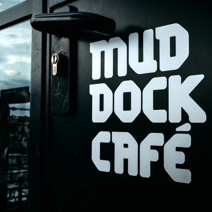
In the same way, I created a new identity for Mud Dock Café. (The café, bar and restaurant had been referred to as Mud Dock Café for many years, but hadn’t previously had its own logo.)
Low-cost, flexible and fun product labelling
Mud Dock Deli would be selling a mix of selected brands, plus a number of own-brand and homemade products such as coffee, tea and preserves. A cost-effective way of labelling these items needed to be found as small volumes meant that standard approaches (which rely on large production runs to generate low unit costs) would be too expensive.
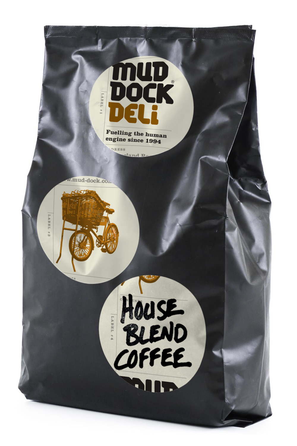 I designed a set of round labels which could be added by hand give each item a fun, individual feel. One of the labels had space for the product name to be written on by hand, while the others could be added in a mix-and-match way, and applied whenever there was space. (So some products might feature all four lables, while others may have two or three).
