Evolution of the brand and marketing communications for a brewery at the forefront of making real ale appeal to the masses.
2006–2017
“I worked with Jeff for almost 10 years at Bath Ales and he was a valuable source of ideas and insight and really understood what made the Bath Ales brand tick. We commissioned him for projects ranging from brand naming and development, through packaging and POS, to trade and consumer marketing literature and advertising. His work helped define the appearance of virtually all of Bath Ales marketing materials and shaped the brand’s distinctive written personality and tone of voice.”
Karin Ashwell, Head of Marketing, Bath Ales (2006-2017)

The old bottle label
When people learn that I’ve worked with Bath Ales, they often say “Oh, did you design the Hare?” I reply that I wasn’t his father, but that I did look care of him for 10 years or so!
The hare’s original appearance on Bath Ales’ bottle labels – alongside some small-but-neat typography – had bucked the traditional centre-aligned, shield-shaped designs that prevailed in the marketplace.
But by the time I was invited into Bath Ales in 2006, various visual bells and whistles had been added to the labels, and the typography lacked the care and craft of the original. All of this made the front of the labels look cluttered and lacking in the confidence of their predecessors.
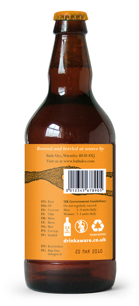
The backs of beer bottles are often dull and functional, and Bath Ales’ labels were no exception. The text was dry, descriptive and devoid of personality.
However much anyone liked the beer, it was becoming harder for them to love the brand.
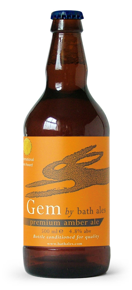

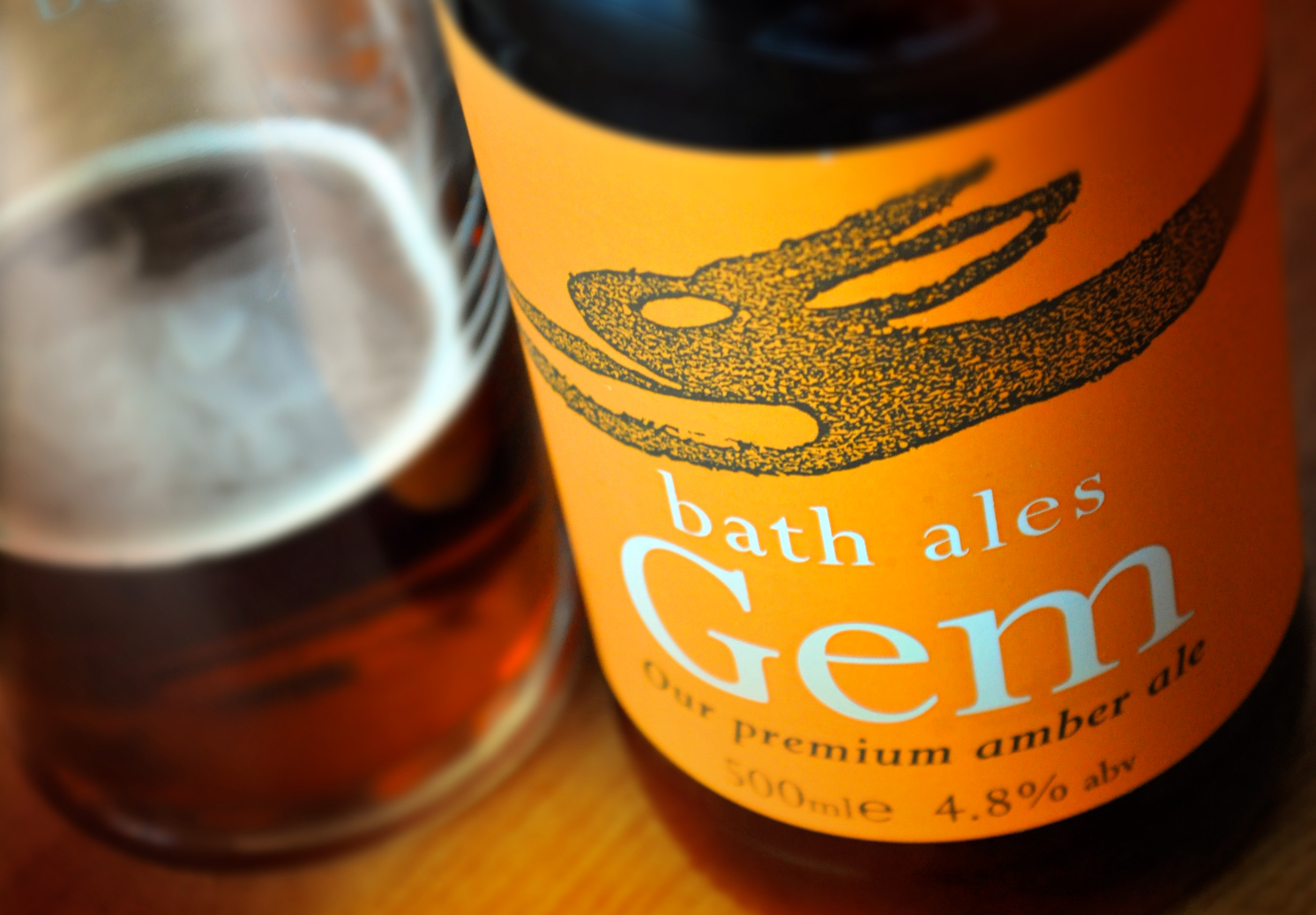
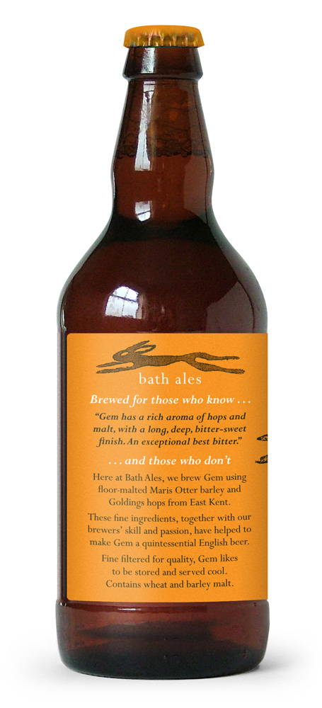
The new bottle label
My aim was to build on the positive aspects of the original labels, while giving far greater impact to the typography. (Small and neat has its place, but it can be bloody hard to read from the other side of a bar or supermarket aisle!)
Bath Ales had been using a tagline of ‘Brewed for those who know’ on the side of its lorries. I noticed that on one truck this was followed by ‘and those who don’t’ (which turned out to have been added on a bit of a whim).
I felt these two statements could provide a strong framework for Bath Ales’ marketing as they captured the company’s ethos of brewing beer that would please beer buffs and real-ale newbies in equal measure.
I employed this on the bottle labels, adding review-style tasting notes under the ‘Brewed for those who know…’ heading, and detailed info about the beer under ‘… and those who don’t’. This – plus all of my subsequent copywriting for Bath Ales – was written in a conversational tone to give the brand a more friendly and engaging personality.
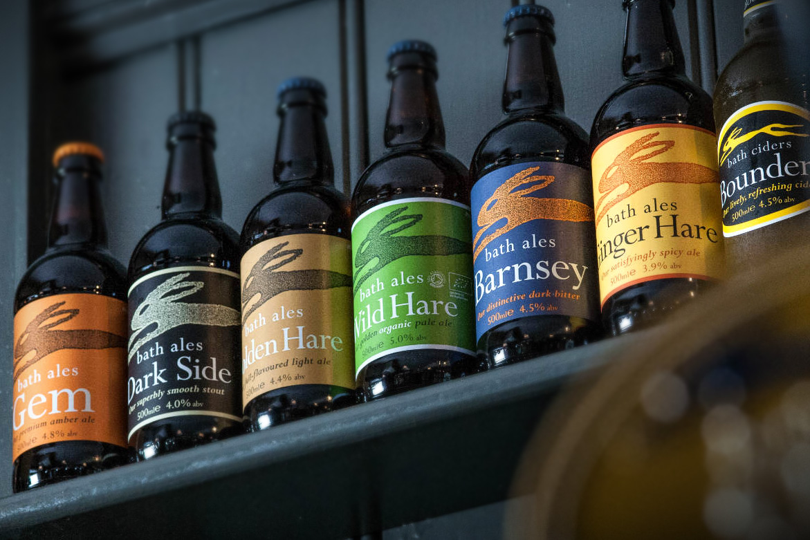
The labels went through several iterations between 2006 and the 2009 version shown here. This design remained (with just minor changes to the mandatory info on the back) till 2018.

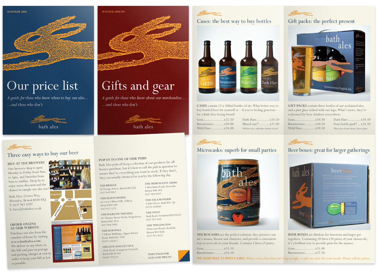
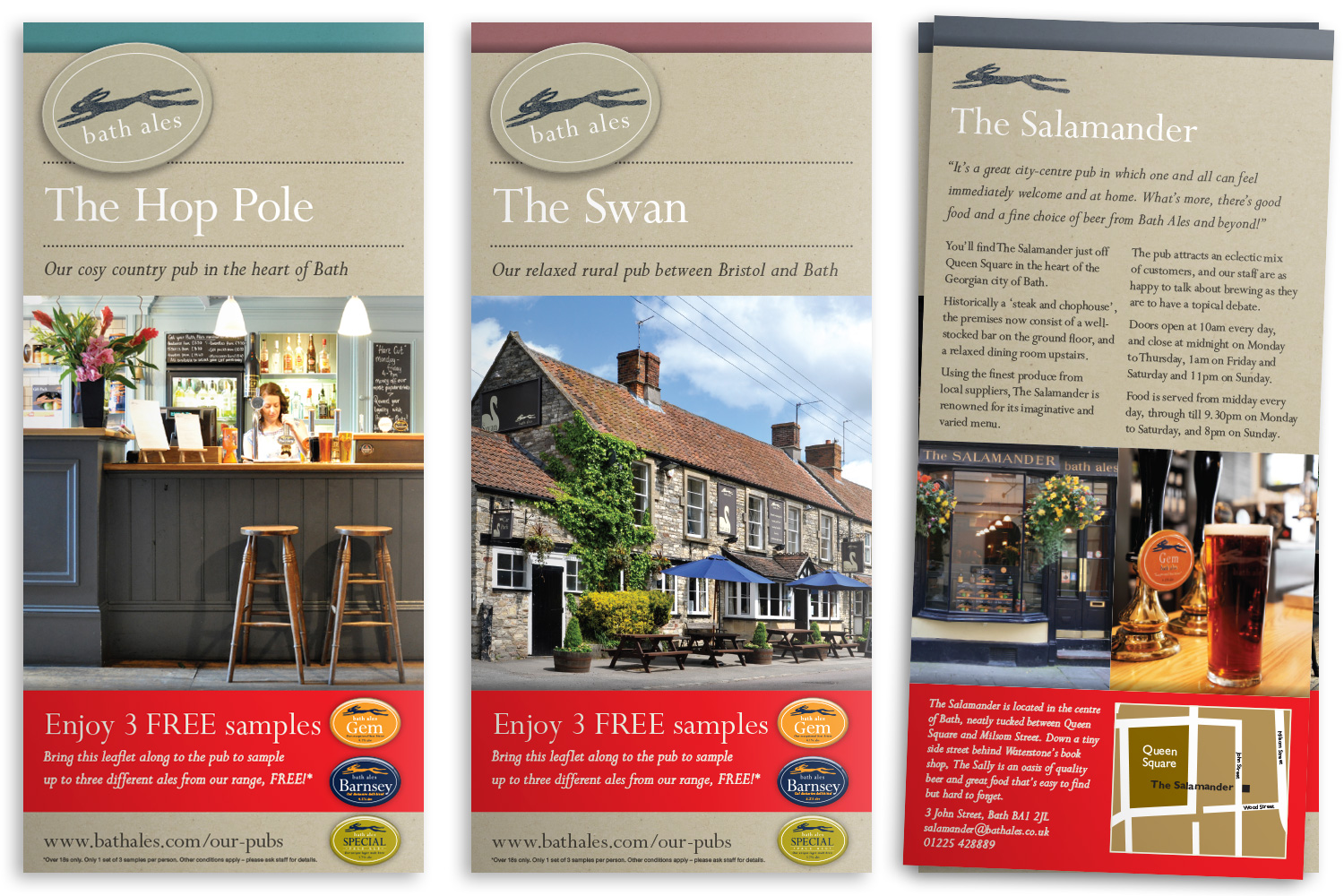
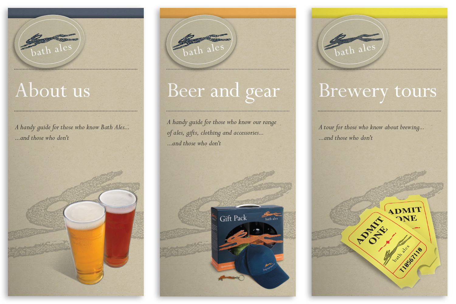
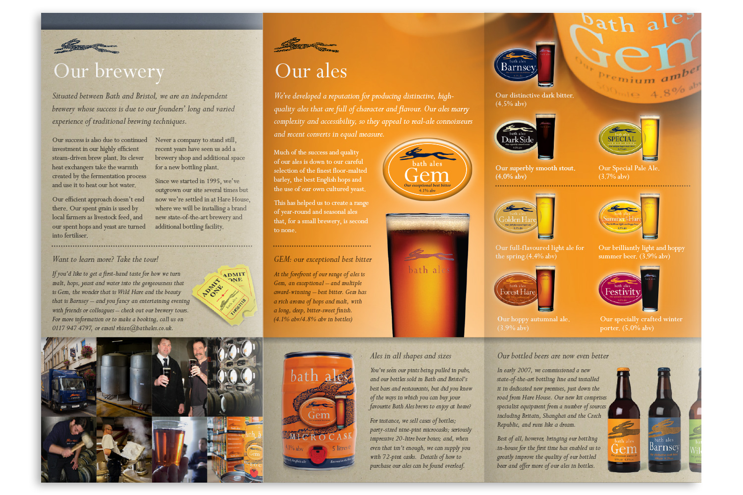
Printed marketing materials
As with the bottle labels, Bath Ales printed materials were originally a little disjointed – a result of each being designed on an ad-hoc basis and without a core set of foundation design elements (such as colour palette, typefaces and photographic styles) to guide their production. Working together with Karin, my client, we began to turn this around, developing a wide range of materials for B2C and B2B purposes. From price lists and pop-up banners, beer mats and menus, to tasting notes and tent cards we covered it all. Over the years, the style evolved in order to keep things fresh, but everything was always unmistakably ‘Bath Ales’.

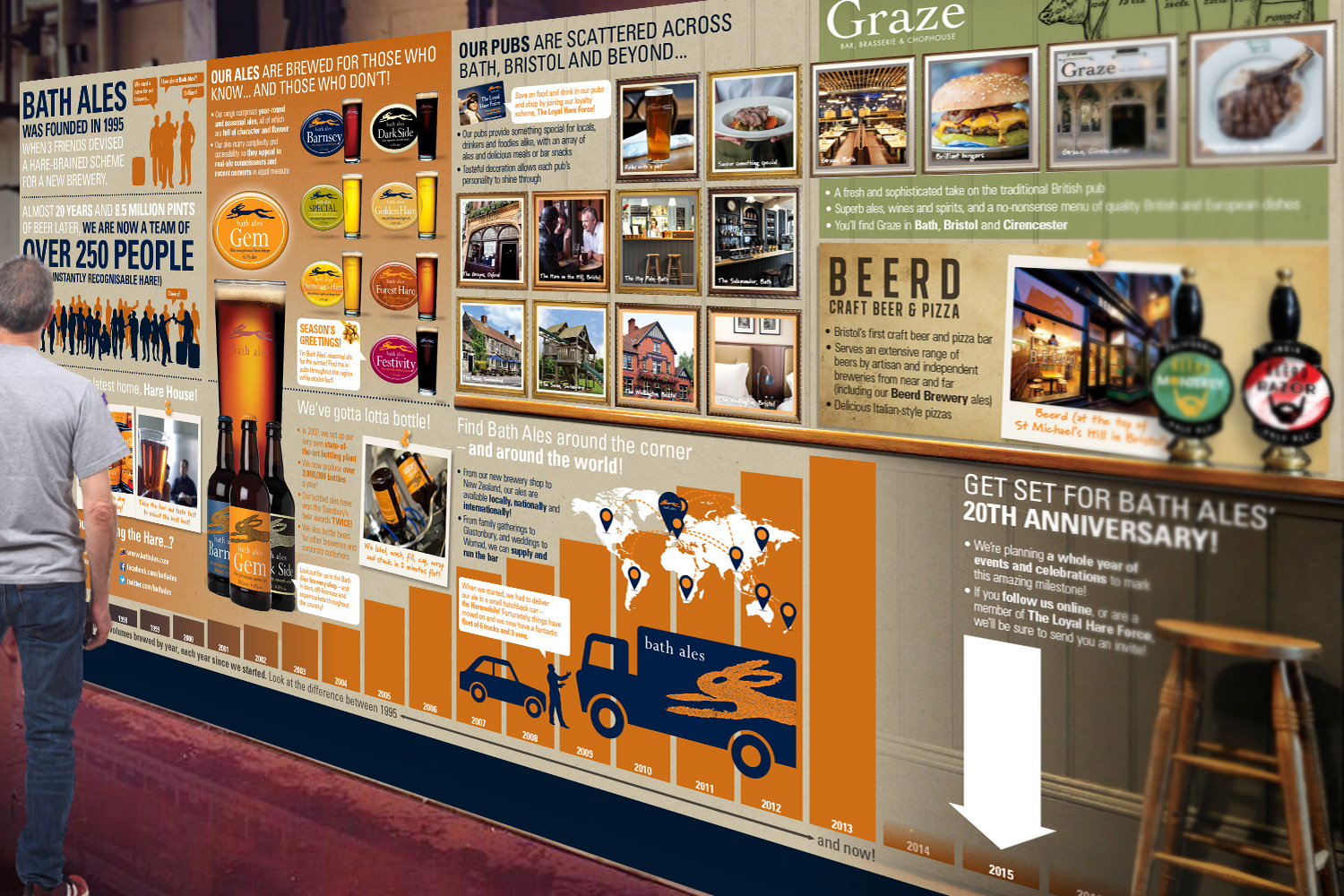
Infographic
In 2012, Bath Ales moved into new premises – Hare House. The large industrial-warehouse-like space, which has since been completely renovated, needed brightening up to make it more interesting for people on a brewery tour. The solution was the creation of a large infographic to give visitors a rich and colourful overview of the business and its beers, together with brewing facts and figures.