New brand identity and brand positioning, plus a website, exhibition stand, leaflet and animation for a group of engineering companies.
2006
“You addressed the branding and communication issues faced by the three parts of the business and provided a smart, modern solution. Your ideas and insights were explained in presentations to me and then the wider team in a clear and engaging way that helped achieve buy-in and take the project forward. You were very easy to work with, talented and professional, and I would certainly work with you again.”
David Whitfield, Chairman, Altex Limited (2005–2007)

The problem: a lack of common ground
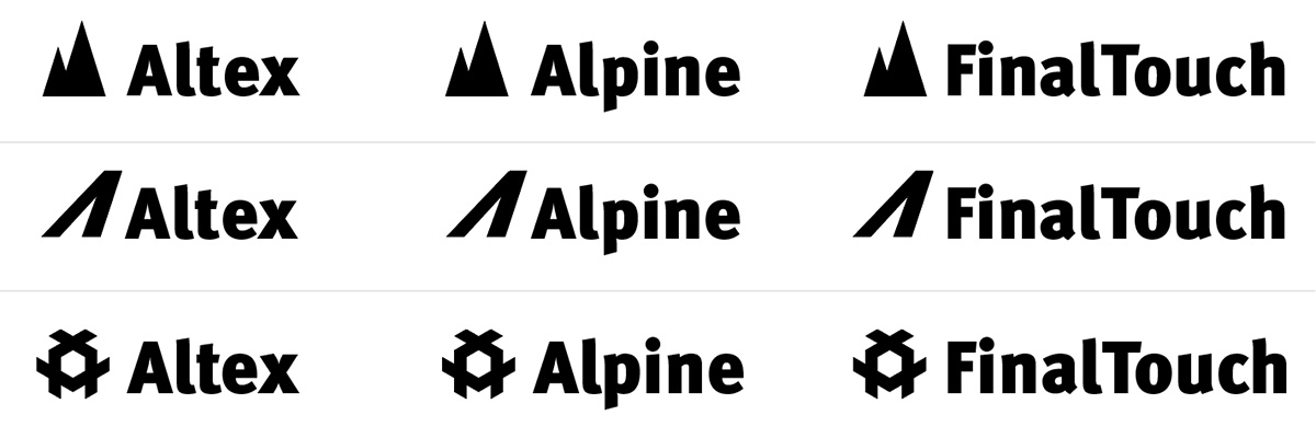
Initially, each company in the group had a different identity, with nothing that tied them together in a way that anyone could recognise.
Each identity had been developed in isolation – which was understandable when the companies were independent of one another – but now this made them look like three players from different teams.
While Altex was the largest of the three companies, I felt it was Alpine’s identity that had the most merit.
As well as lacking anything visual to tie the three entities together, the companies also lacked a unifying idea. The development of this would be a core part of the project.
The solution: a postive partnership
To gain insight into what made these three businesses tick – and what made them valuable to their customers and competitive in the marketplace – I examined a raft of their existing marketing materials, sales presentations and feedback from customers. I also toured the three companies’ sites and interviewed members of staff.
From the inside looking out, much of what I read was about products and capability. But in conversations with key members of staff, I found there was a wish to be seen as a valuable partner rather than just another supplier. I was told things such as “When customers say jump, we ask them how high?” and “We’re the ‘can-do’ engineering company.”
This was neatly underlined by a letter from a key customer, HMV, whose praise was primarily directed not at the products, but the level of service and support they had received.
From this insight, I developed the idea of joining the three companies under an umbrella of ‘The Postive Partnership Group’ and created a narrative around the ‘Positive Partnership Process’ (the three companies’ distinct way of working both together and alongside their customers).
Visually, I explored ways to bring the three company identities together, with each option featuring at least a small nod to one or more existing elements such as a colour or font. The chosen route featured a 3D shape made out of three ‘+’ symbols. As well as referencing the three companies and the new ‘Positive Partnership’ concept, the 3D shape also linked to the nature of the companies’ products.
I expanded on this notion in the company capability animation shown above, which I created for use on Altex’s stand at an engineering expo.
Helping the new branding to take off
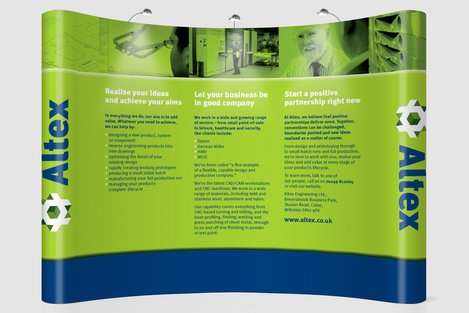
Soon after the new branding was launched, Altex were exhibiting at an engineering event. They wanted a new pop-up exhibition stand, some form of leaflet to hand out, and something to show on a video and laptop screen.
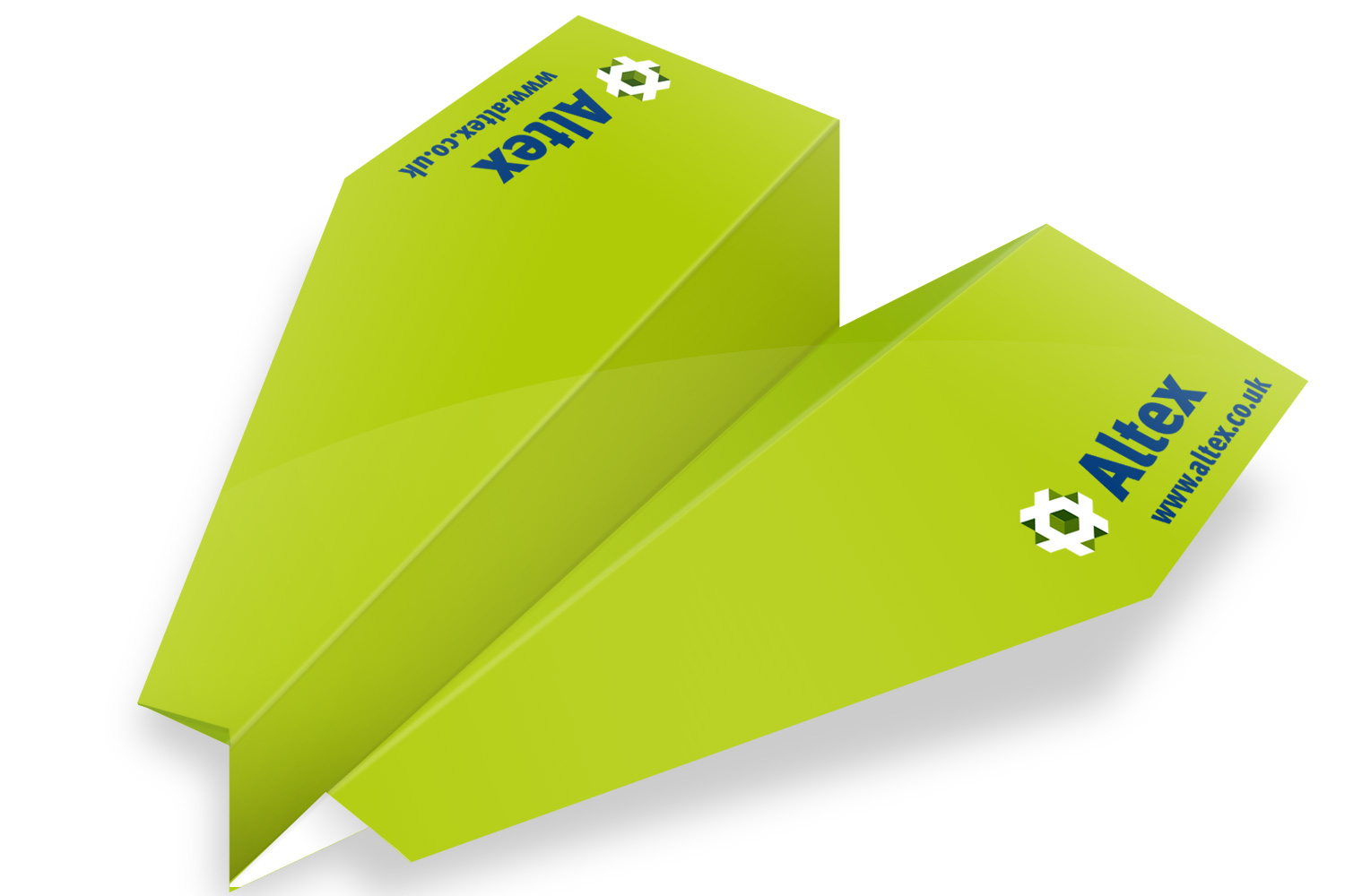
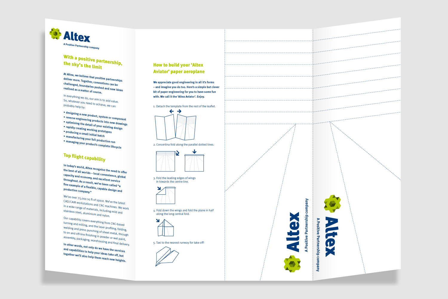
The exhibition stand used the new brand narrative, and introduced people to the idea of ‘Positive Partnerships’. For the hand-out, I created two versions of an A3 gatefold leaflet that again introduced the ‘Positive Partnership’ concept, but included a fun element as it could be folded into a rather smart paper aeroplane. (Each of the two leaflets featured a different plane. This encouraged people to pick up several leaflets and share them with colleagues and friends.)
The on-screen task was met with the creation of a vibrant animation (shown at the top of this page). It employed Altex’s new logo in a variety of ways to give an overview of the company’s capabilities in a quirky and memorable way.
