Brand positioning, brand identity, stationery, signage, marketing materials and website for a specialist consultancy in the financial services sector.
2012

The old identity
Anchura had only been in business since 2010 but their logo already looked dated. Stylistically, it was reminiscent of many designed in the 1990s.
And although the company’s full name was Anchura Partners, everyone referred to them as Anchura, so the word ‘Partners’ felt surplus to requirements.
However, the biggest issue was that it felt uncomfortable alongside the logos of Anchura’s clients and peers in the financial services industry.
The new identity
I worked with my clients Paul, Fiona and Jo to develop the new identity. We considered a range of initial options covering a rich variety of approaches before settling on a final route.
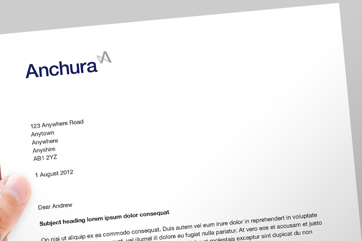
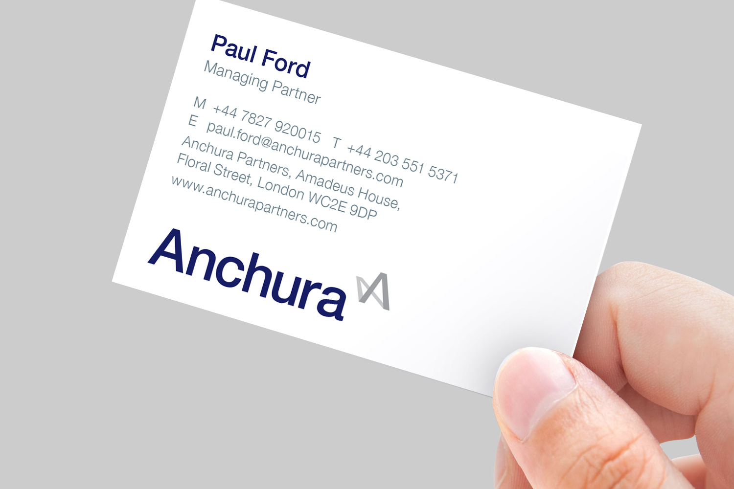
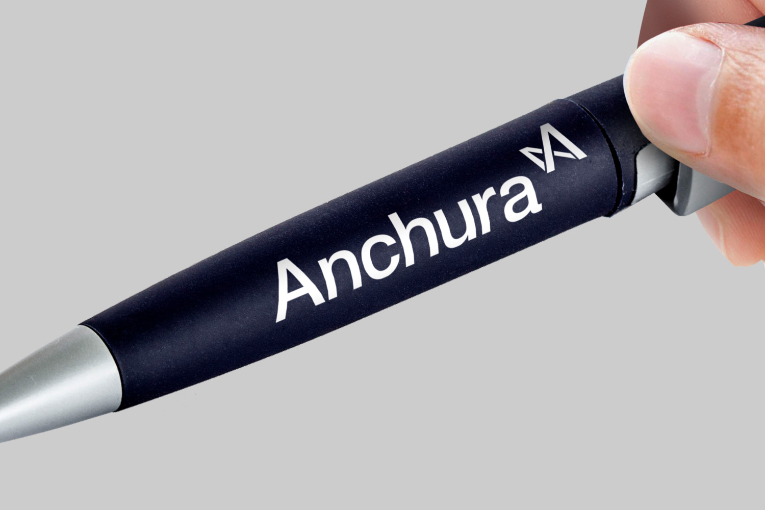
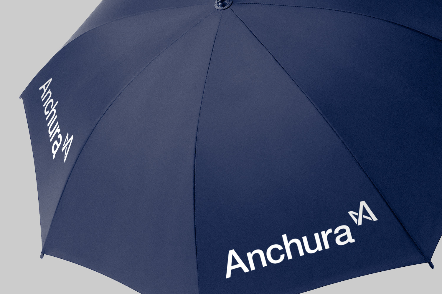
The new identity uses a sans-serif font plus a smarter blue-and-silver colour palette. The symbol can be seen as representing either an A for Anchura, with a shadow behind it, or infinity.
These changes – and dropping the word ‘Partners’ – created something more modern and confident that could happily sit in the company of Anchura’s clients and competitors.
A brand new narrative
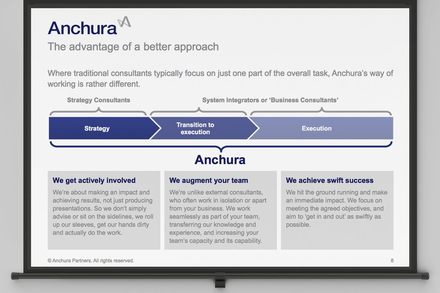
Anchura’s existing communication contained many strong and salient points about their service, but these felt somewhat hidden. The communication also lacked a degree of structure and a compelling central idea. As a result, it read in a dry and descriptive fashion, and did not feel particularly special or memorable.
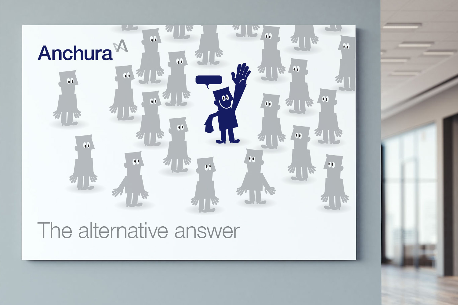
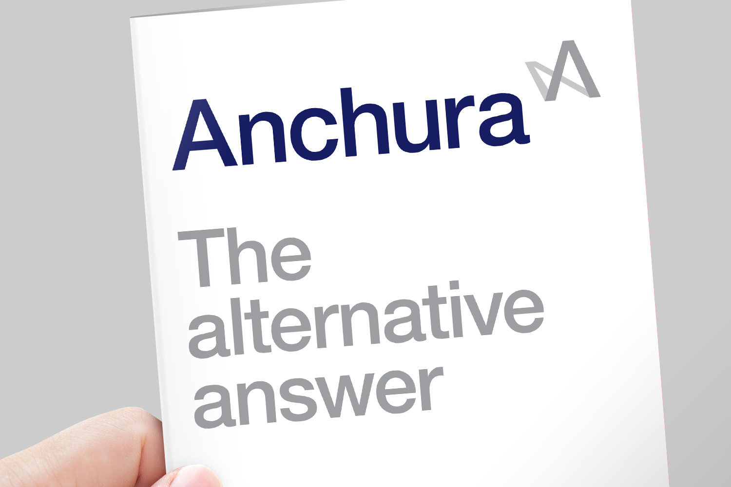
Anchura was a small, niche player, but their competitors included ‘the big four’ consultancies such as Deloitte and PwC. Part of the challenge was therefore to give prospective clients a compelling reason to consider Anchura. I did this by positioning Anchura as ‘The alternative answer’.
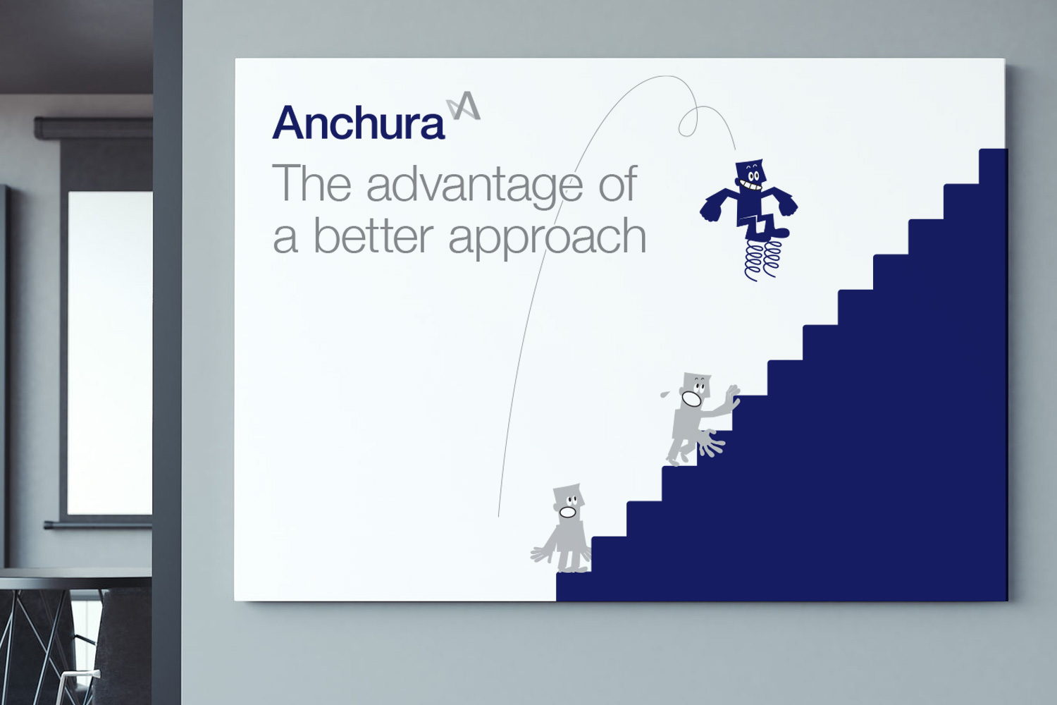
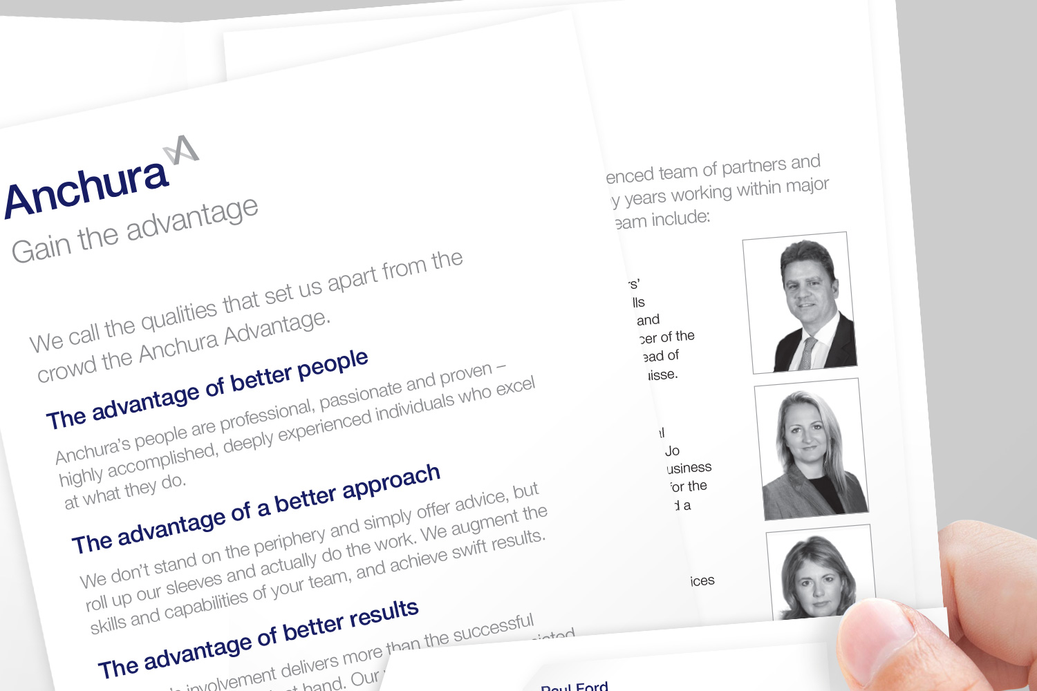
This was supported by the pragmatic and no-nonsense proposition ‘Get things done’, which reflected Anchura’s focus on results and delivery, rather than waffle and report writing. And to clearly establish the company as a capable choice, I created the idea of the ‘Anchura Advantage’ which worked as a framework for the three core factors that made Anchura better than other options: their people, their approach and their results.
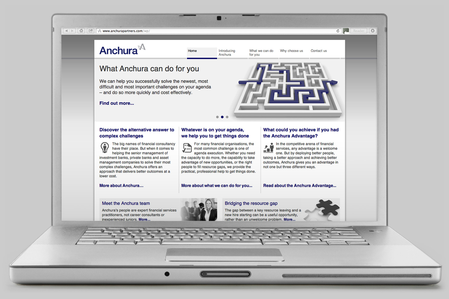
All these new key messages were brought together and fleshed out within new marketing materials including a folder and inserts, a website and a PowerPoint presentation.
Office graphics
Anchura had moved into new offices, but these needed livening up. Paul asked me to create something based around the new narrative that would add some interest to the walls and be a talking point for visitors. I created several A1 framed prints featuring fun, impactful stock-image illustrations that I adapted and styled to work with some of the brand’s key messages.