A revolutionary redesign of Bath Ales’ iconic pump clips.
2017
“I worked with Jeff for almost 10 years at Bath Ales. He was a valuable source of ideas and insight, and really understood what made the Bath Ales brand tick. We commissioned him for projects ranging from brand naming and development, through packaging and POS, to trade and consumer marketing literature and advertising. His work helped define the appearance of virtually all of Bath Ales marketing materials, and shaped the brand’s distinctive written personality and tone of voice.”
Karin Ashwell, Head of Marketing, Bath Ales (2006-2017)

A little bit of history
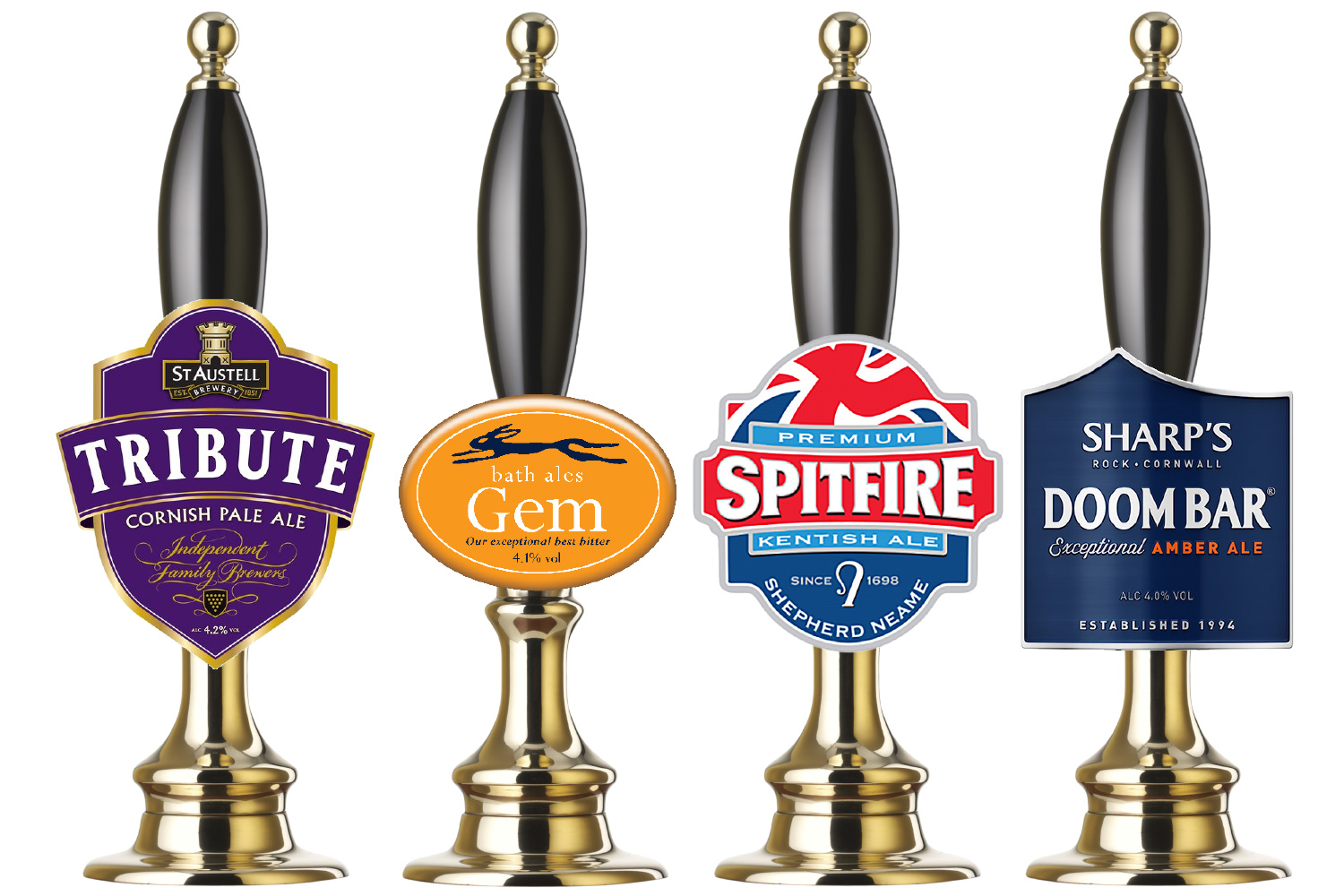
When I started working with Bath Ales I inherited their iconic elliptical pump clips.
In a row on a bar they looked great, but I could see room for improvement. The shape and size were set in stone, so I focussed on tuning-up the layout, colours and typography.
Bringing personality into the verbal aspects of the brand was a core part of my work at this time. On the pump clips this was achieved using new, friendly sounding descriptors.
Fast forward to 2017, and competitors had started producing ever-larger pump clips. Bath Ales’ clips were starting to look a little lost in comparison.
A new style of pump clip was needed that could square-up to the competition but at the same time feel familiar to the brand’s many fans and followers.
Original version

Updated version (2011)

Finding the sweet spot between evolution and revolution
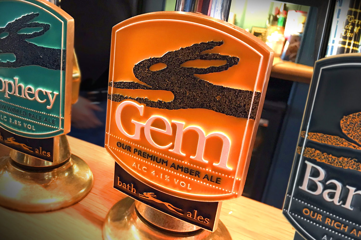
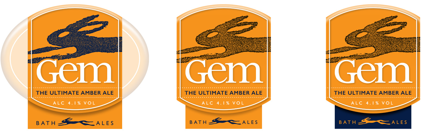
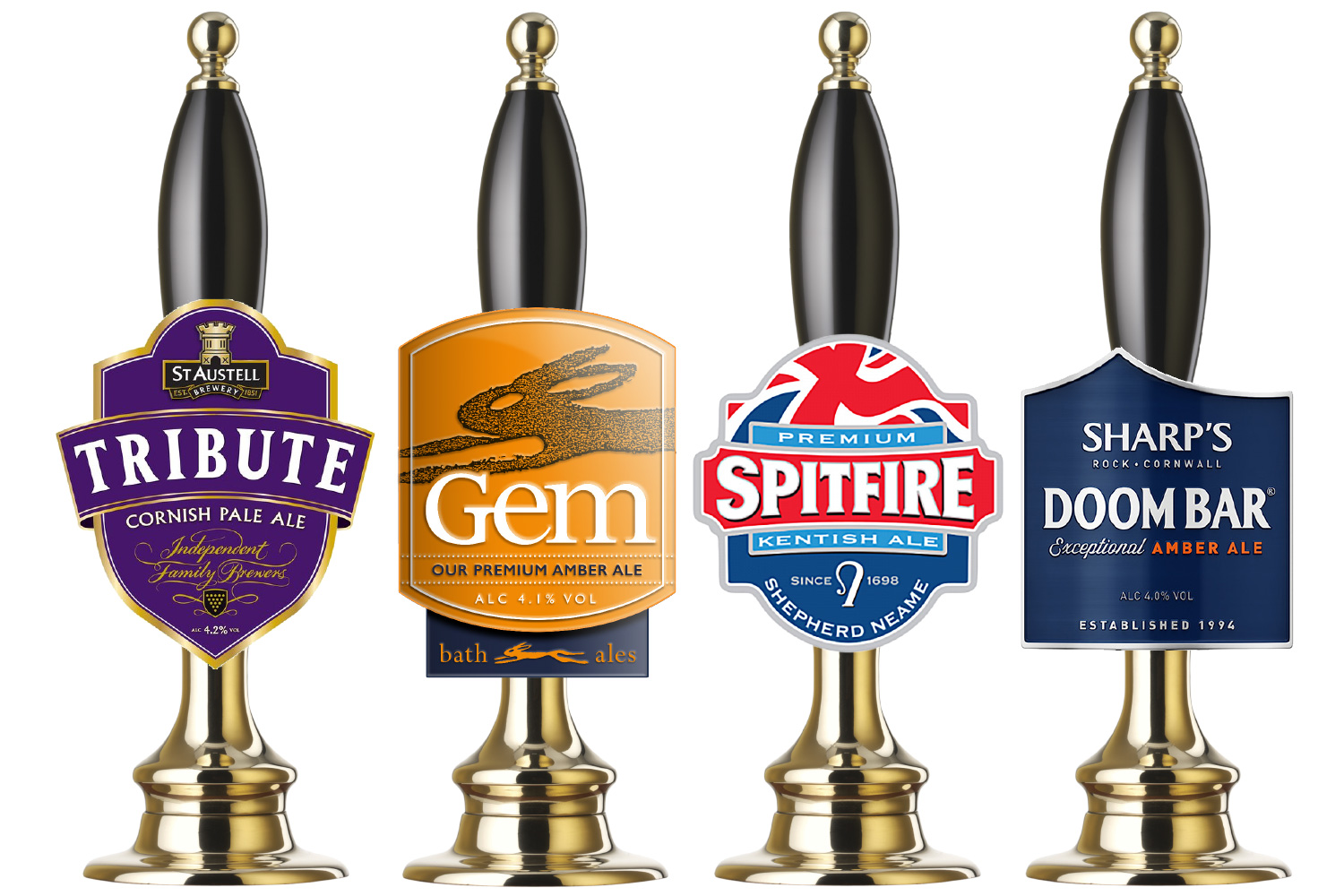
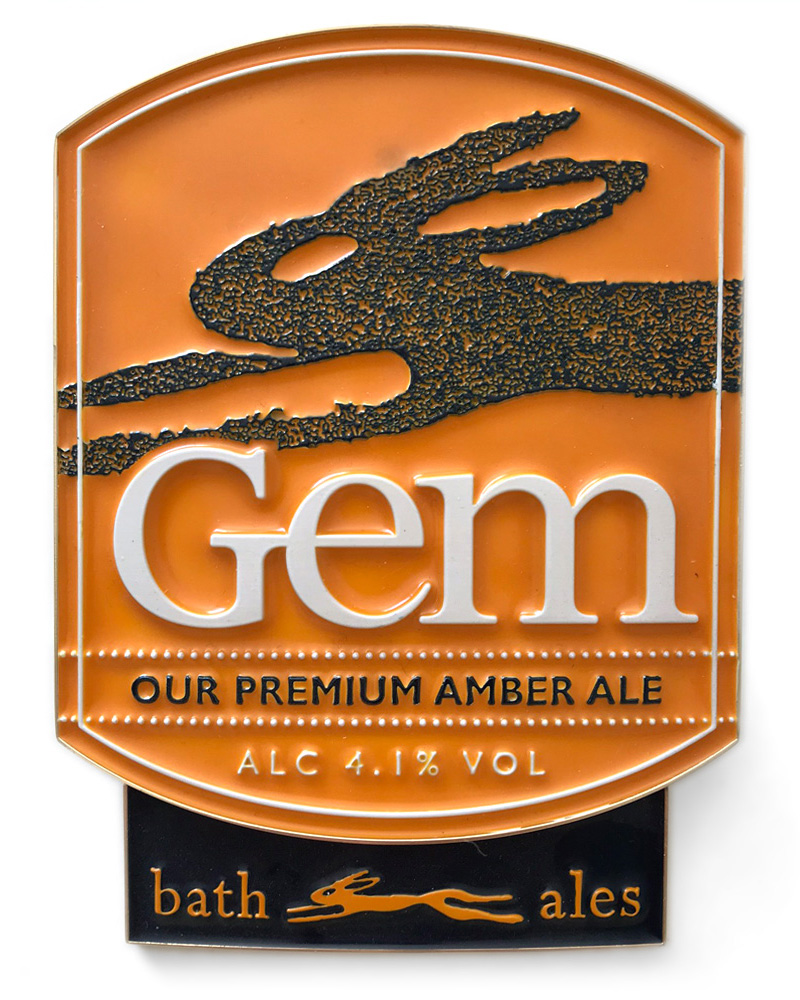
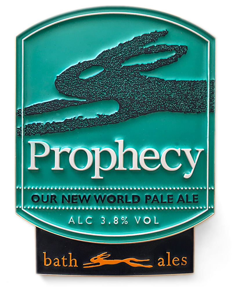
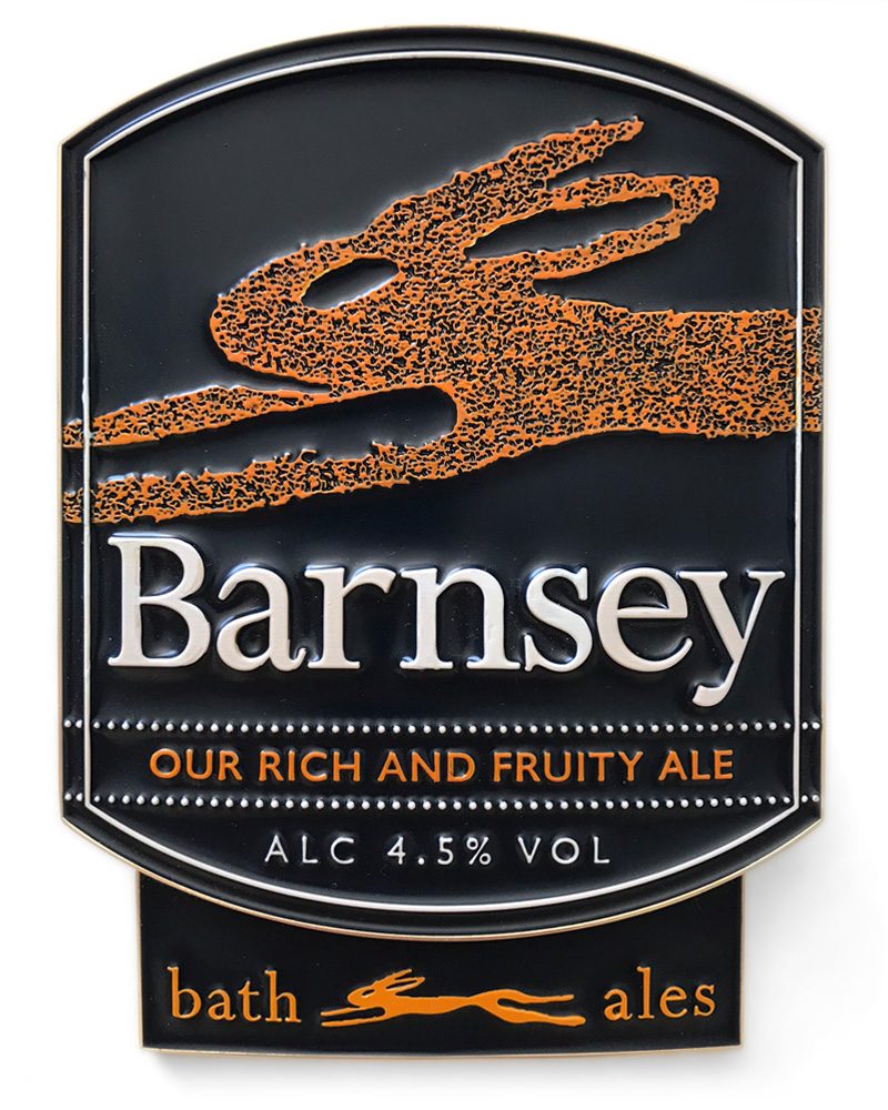
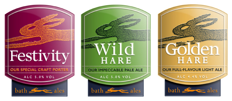
The new design was based on a scaled-up-and-cropped version of the original ellipse. The elements within the clip were completely revised – as was the Bath Ales logo, which I reworked and moved into a subtle, endorsing tab at the base of the clip.
The typography of the brand names also underwent several careful stages of development to make them feel more distinctive and give them greater impact.


The new approach was then applied to Bath Ales’ core beers (for which high-quality metal pump clips were made) and their range of seasonal and limited-edition ales.

A new approach for font badges
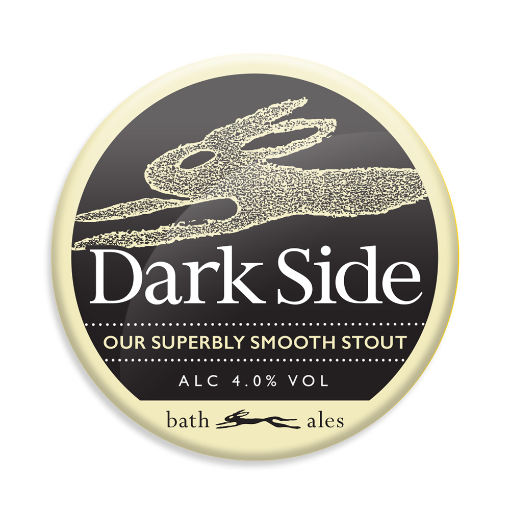
In addition to the new pump-clips, I created an updated design for the font badges of Bath Ales’s kegged brands. This complemented the changes made to the clips, with the Bath Ales logo appearing in an endorsing tab at the base of the badge, a larger hare added to the background, and revised typography.
Dark Side font badge (2010)
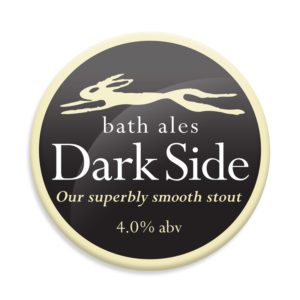
Dark Side font badge (2017)
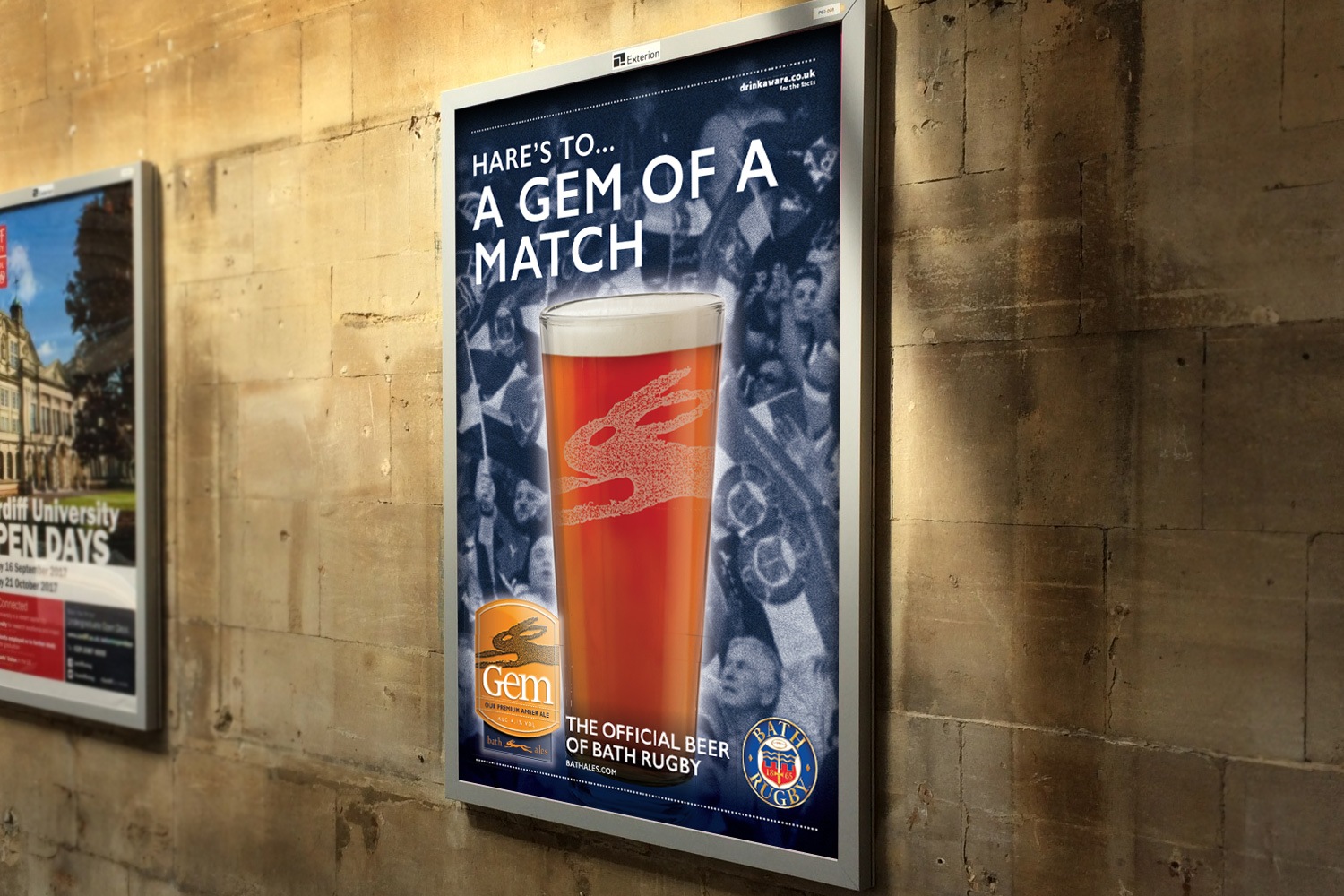
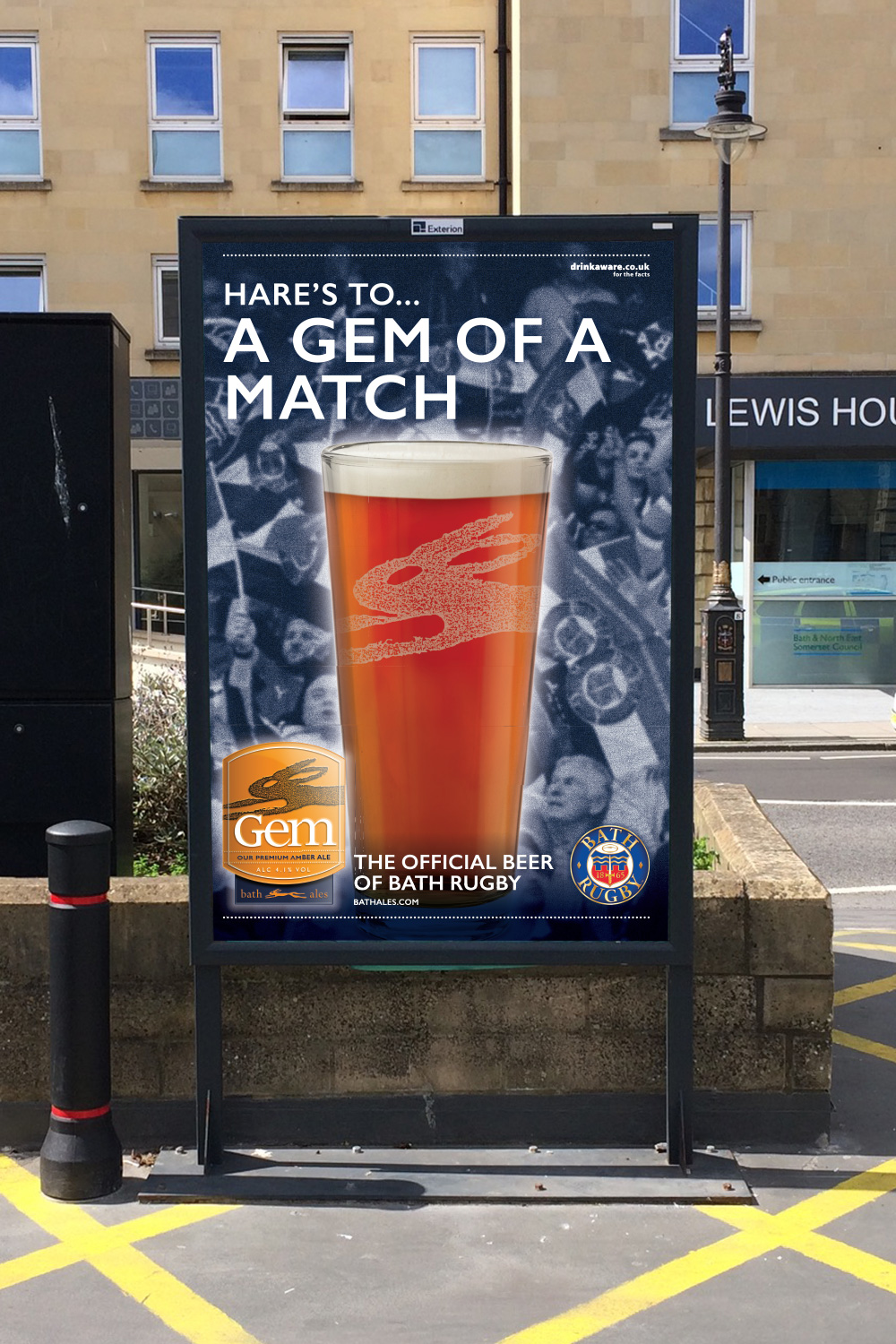
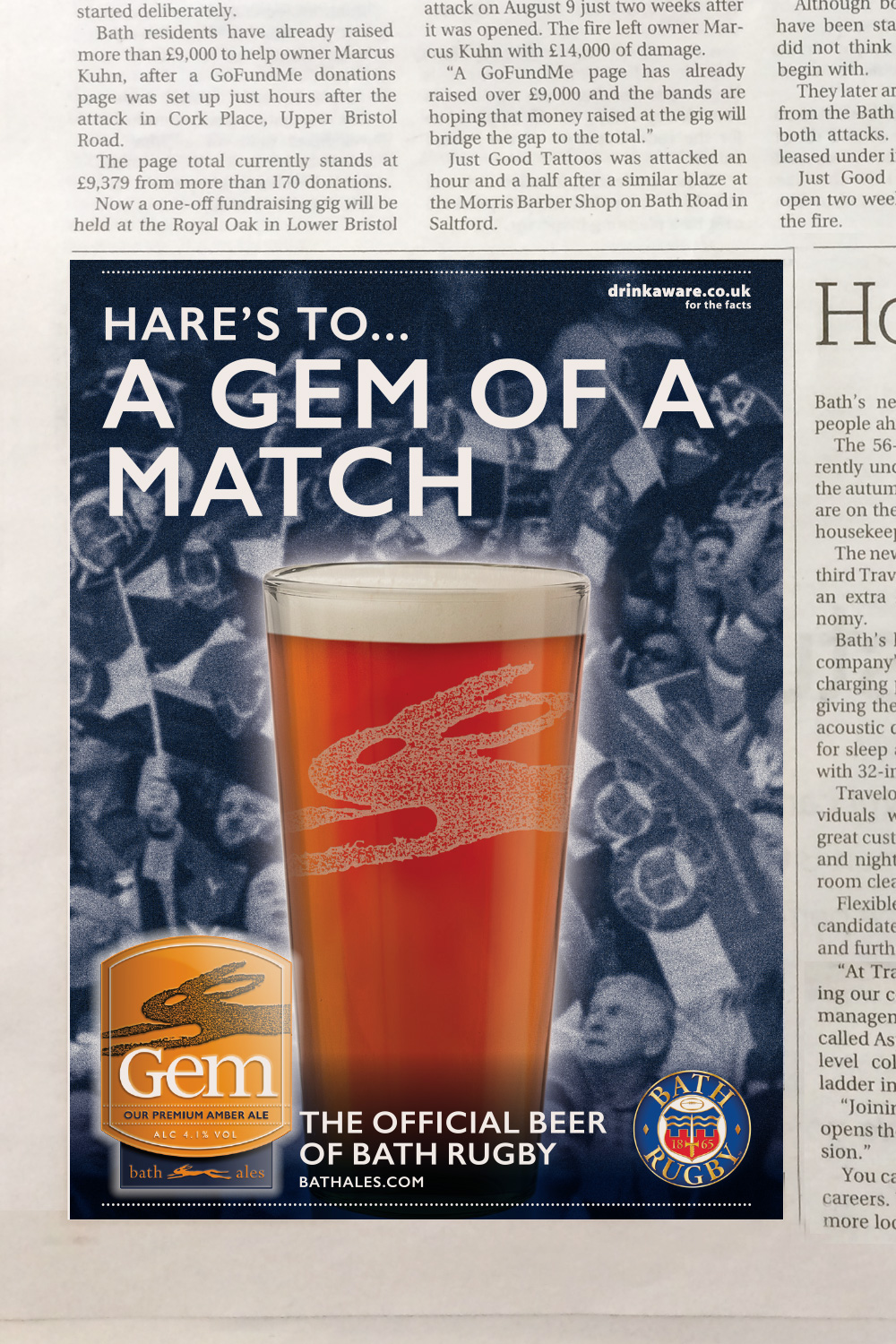
Kick-off for the new design
Bath Ales’ new owners, St Austell Brewery, wanted to promote Gem’s new association with Bath Rugby. They briefed me to create a poster for a range of outdoor advertising sites in the city, and an advert in the local press. This was the first appearance of the new Gem pump clip in Bath Ales’ marketing.