Cycling-themed product branding for an own-brand range of coffees, tea and muesli.
2006
“It’s difficult to believe that we have been working with Jeff since 2003. That’s a lot of water under ANY bridge. And no regrets. As an ‘exacting’ client, I don’t really think I need say much more. But I will. As someone who’s worked professionally in the design, marketing and advertising business, I well recognise that Jeff’s significant contribution to the Mud Dock story would have been curtailed long ago if at any point his submissions failed to deliver. They simply don’t.”
Jerry Arron, Owner and co-founder, Mud Dock


Blending verbal and visual elements to create the right flavour
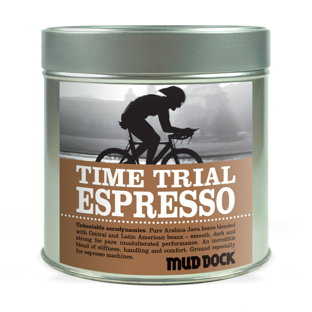
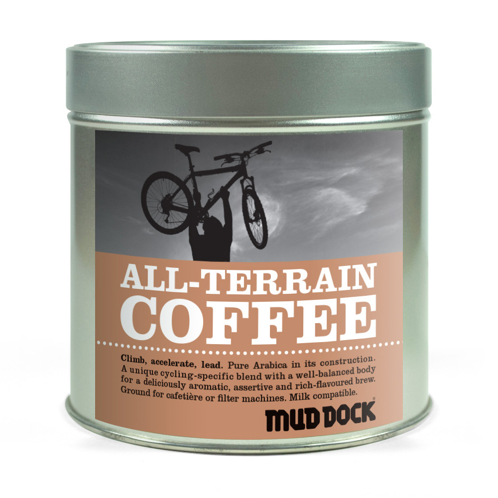
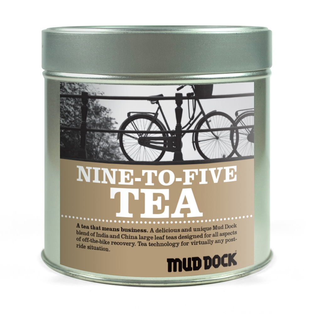
Mud Dock comprises both a bike shop and café. So when they wanted to launch an own-brand range of coffees, tea and muesli, the challenge was to give the items a cycling theme in an engaging and relevant fashion.
This was achived in a number of ways, starting with the product names. It extended through front-of-pack descriptions and, of course, the imagery. In each instance, the products were linked to a relevant aspect of cycling – such as aligning the espresso with performance cycling, the tea with commuting, and the muesli with tough rides in the mountains.

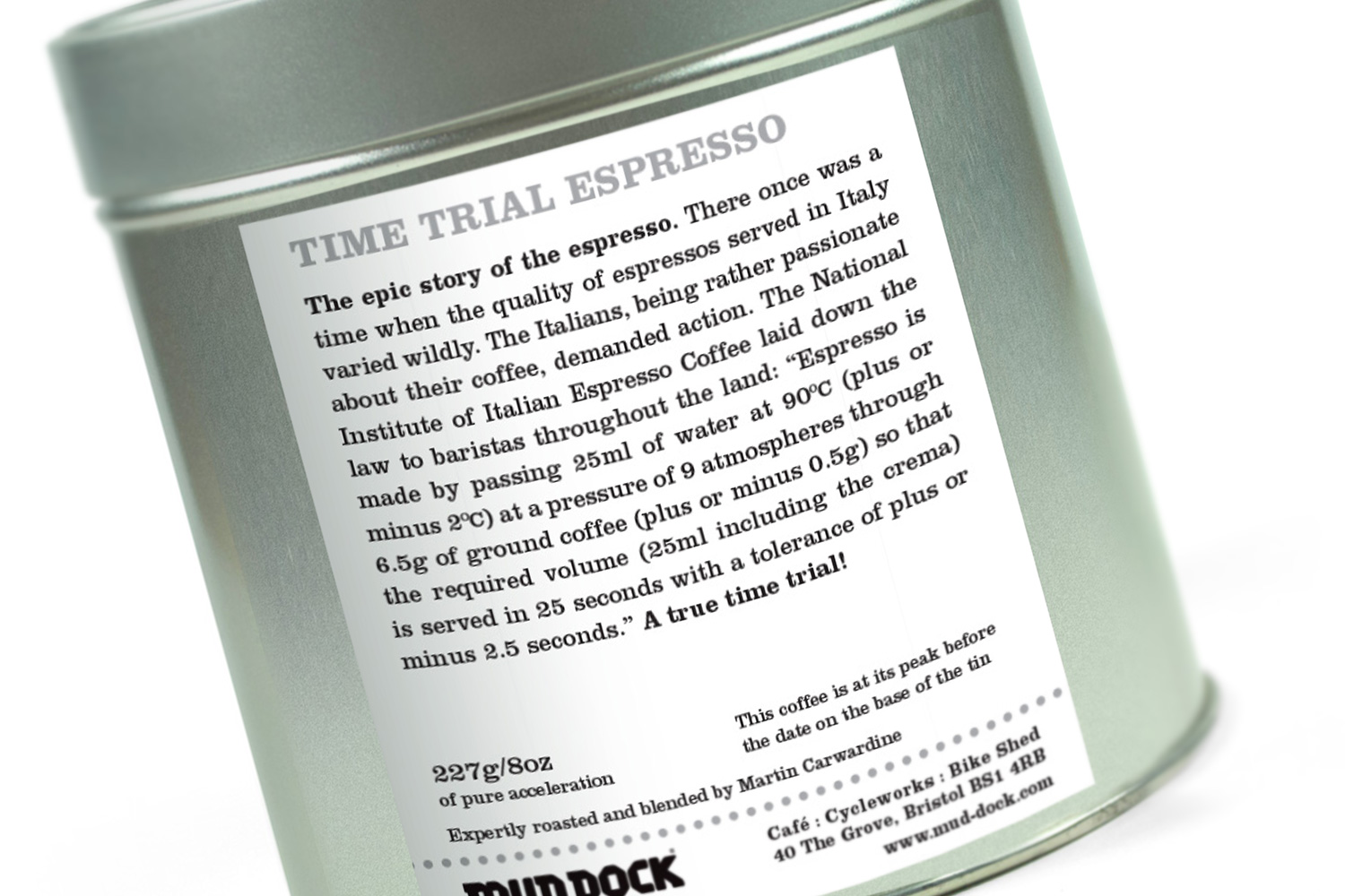
Bringing the backs to life
Often, back labels on jars, tins, boxes and packs are dull and purely functional affairs (typically due to the array of mandatory information that has to be included).
But here, with plenty of space available, it was possible to give customers an additional reward in the form of a short story relating to the origin of the product – and gently tie this in with the cycling theme.