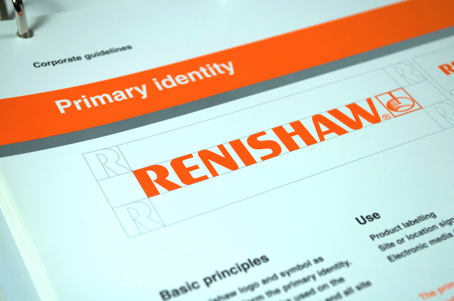
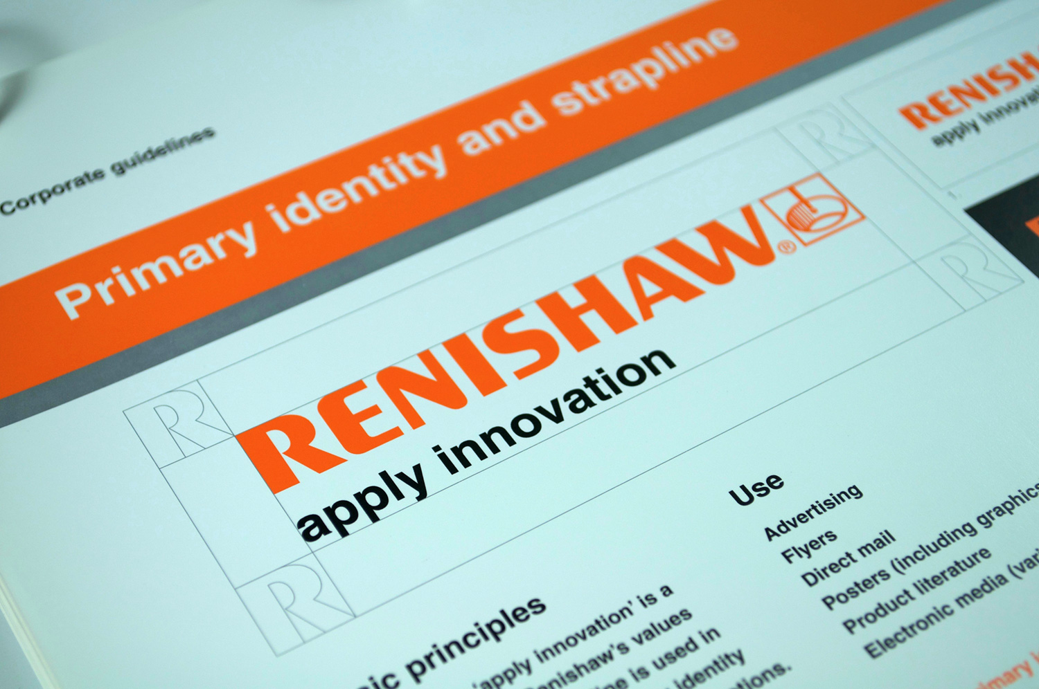
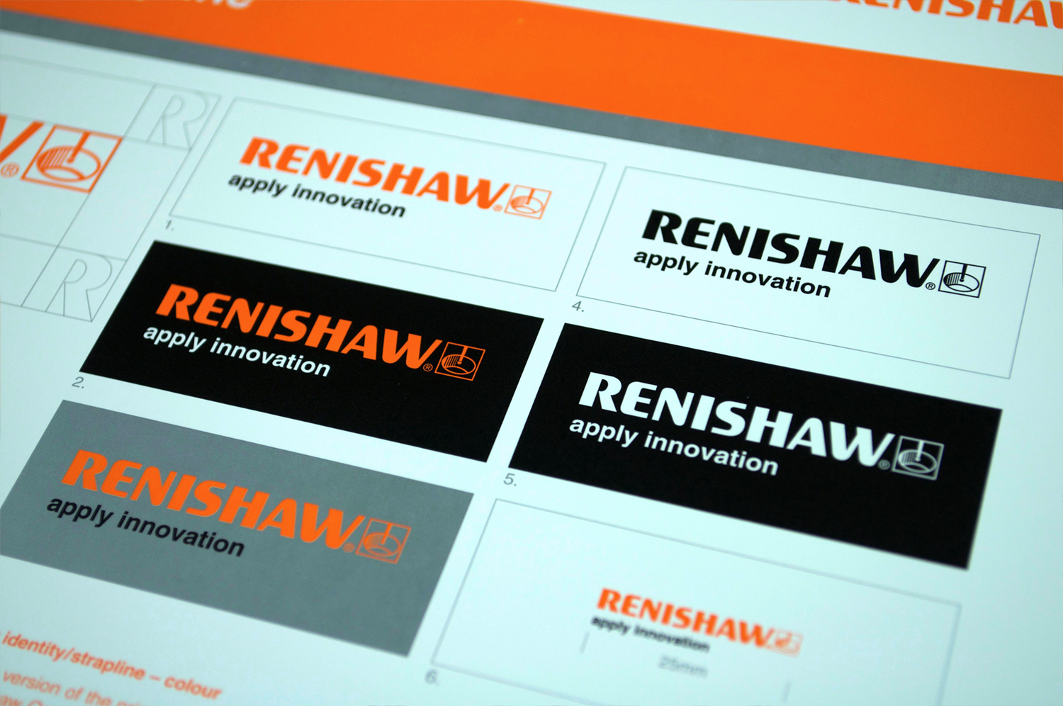
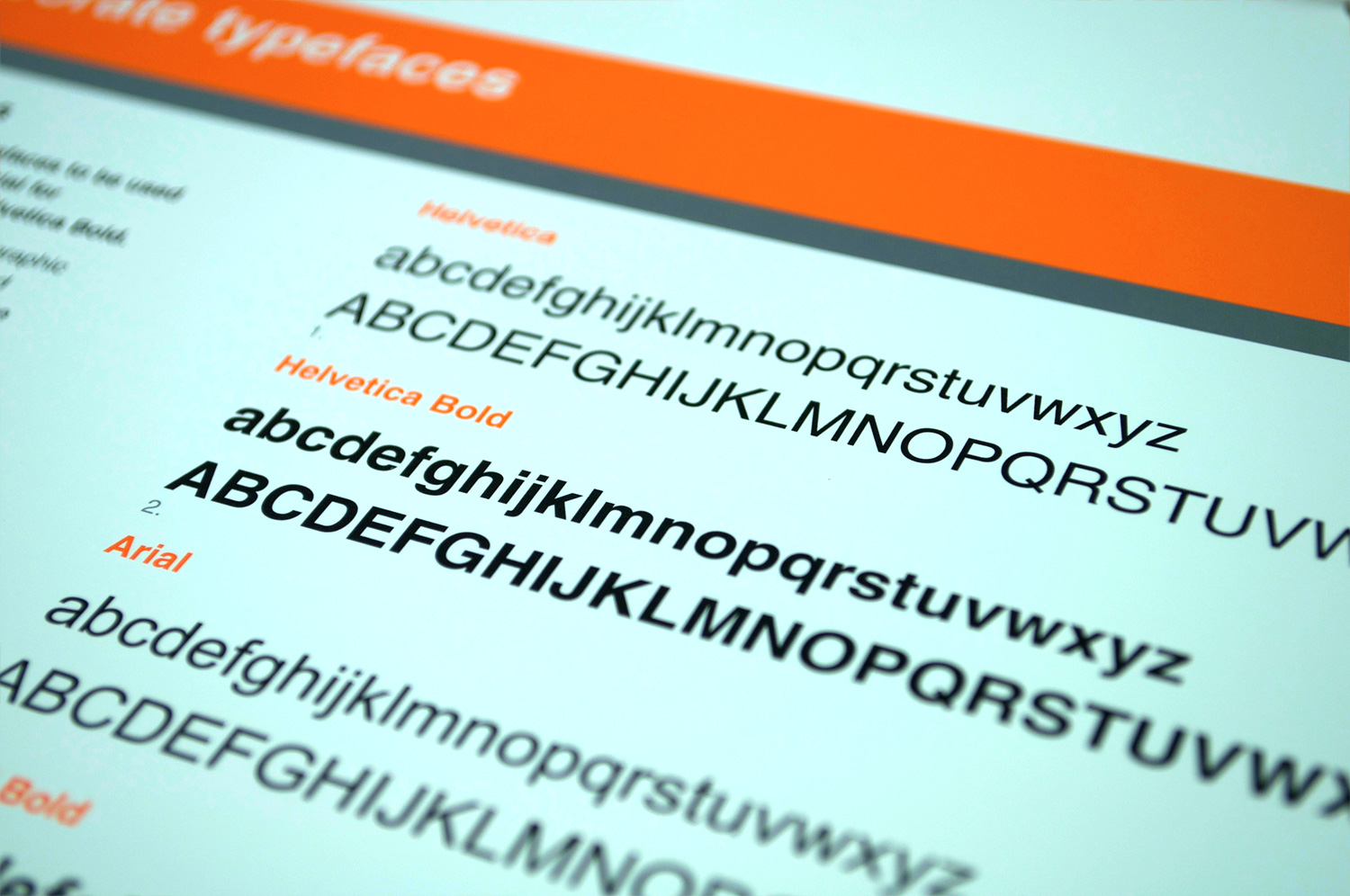
New verbal and visual brand positioning, and brand identity guidelines for one of the world’s leading engineering and scientific technology companies.
2001 (undertaken in my previous Creative Director role)
“The updated brand identity, brand proposition and modern design style helped us present Renishaw as a modern, innovative company that provides elegant technical solutions to complex challenges. It enabled us to give Renishaw a common identity across all media – and do so across the globe. The ‘Apply Innovation’ brand proposition helped connect all of Renishaw’s existing activities, and has allowed for extension into new markets. Almost 20 years later, this branding is still working hard for Renishaw.”
Marc Saunders, Group Marketing Services Manager (2001-2005), now Director of Group Strategic Development, Renishaw plc

Comprehensive corporate guidelines
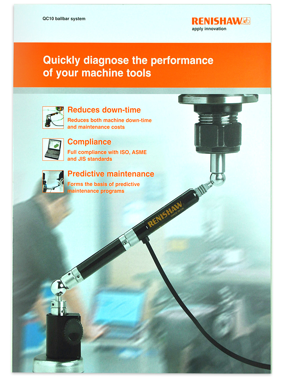
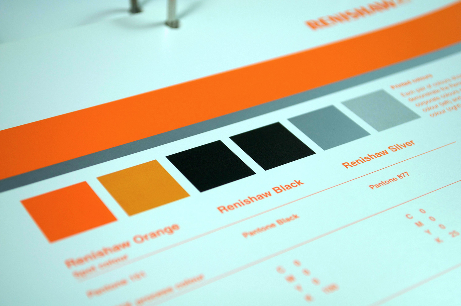
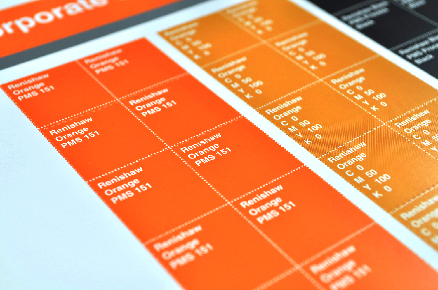
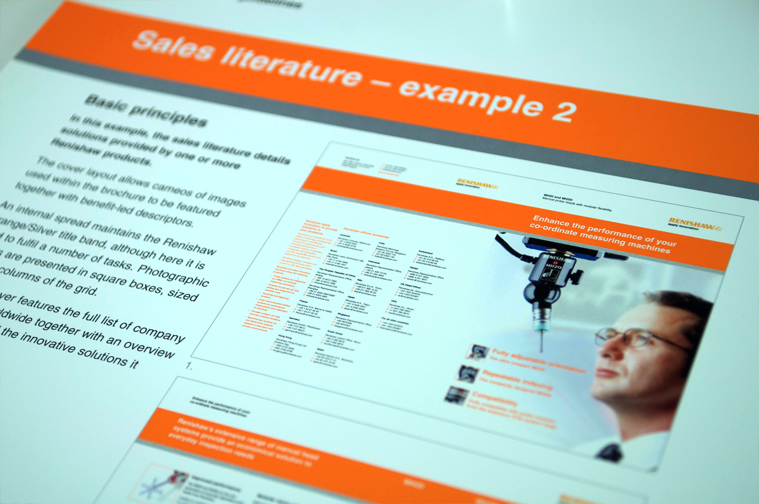
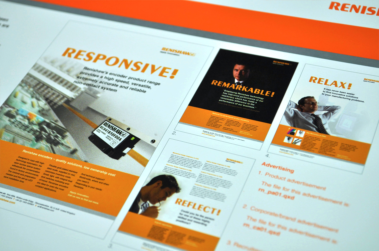
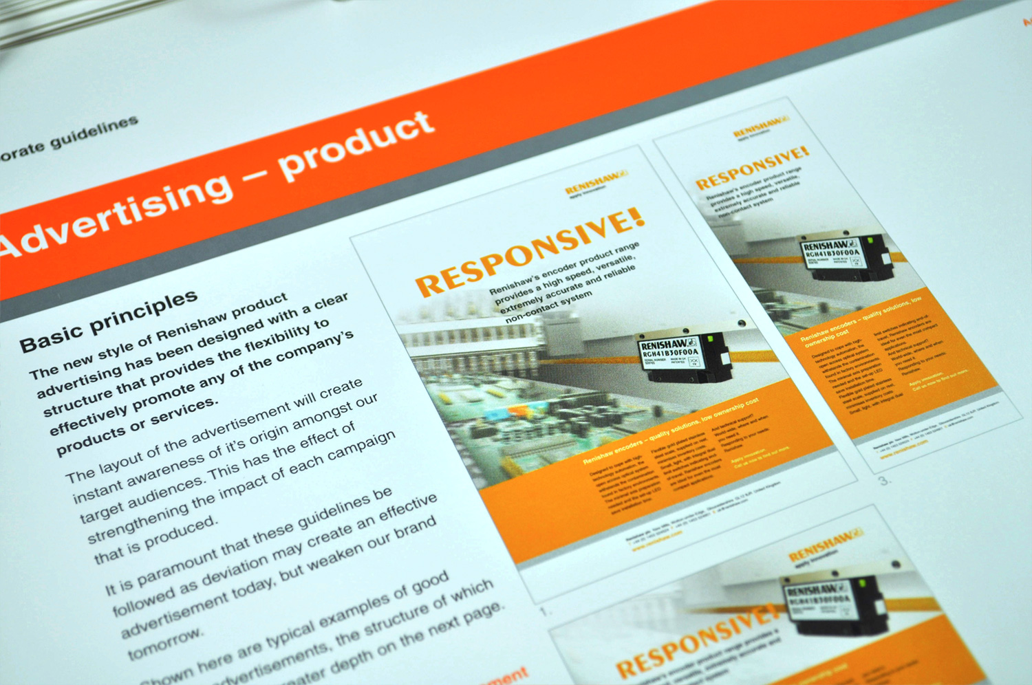
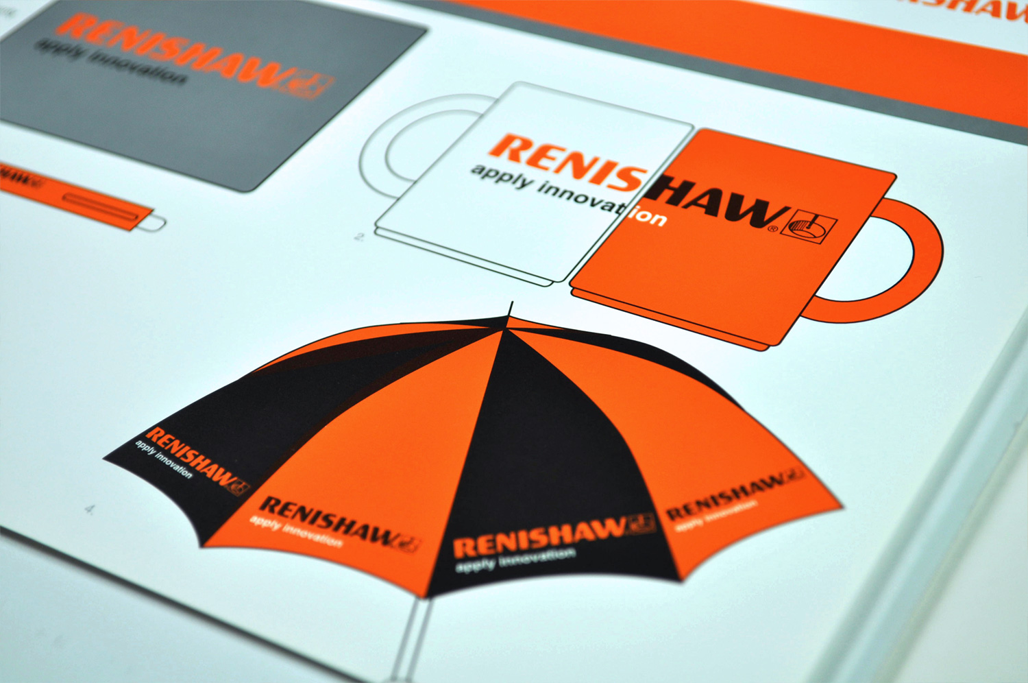
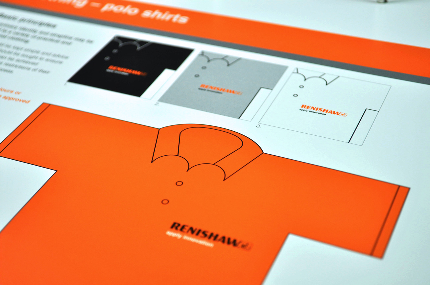
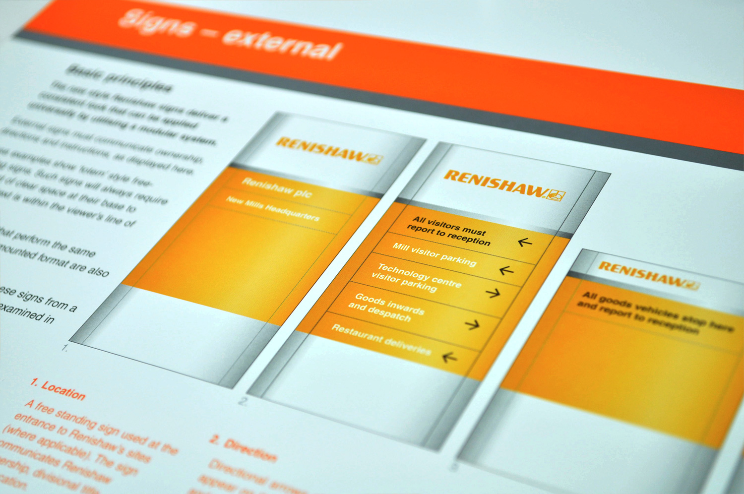
Development of the new brand styling encompassed everything from Renishaw’s identity, stationery and advertising, through brochures, catalogues and data sheets, to signage, vehicle liveries and clothing. To ensure consistent application internally and by external agencies across the globe, a comprehensive set of corporate guidelines were created, which were supplied with digital files and templates for key items.
The old
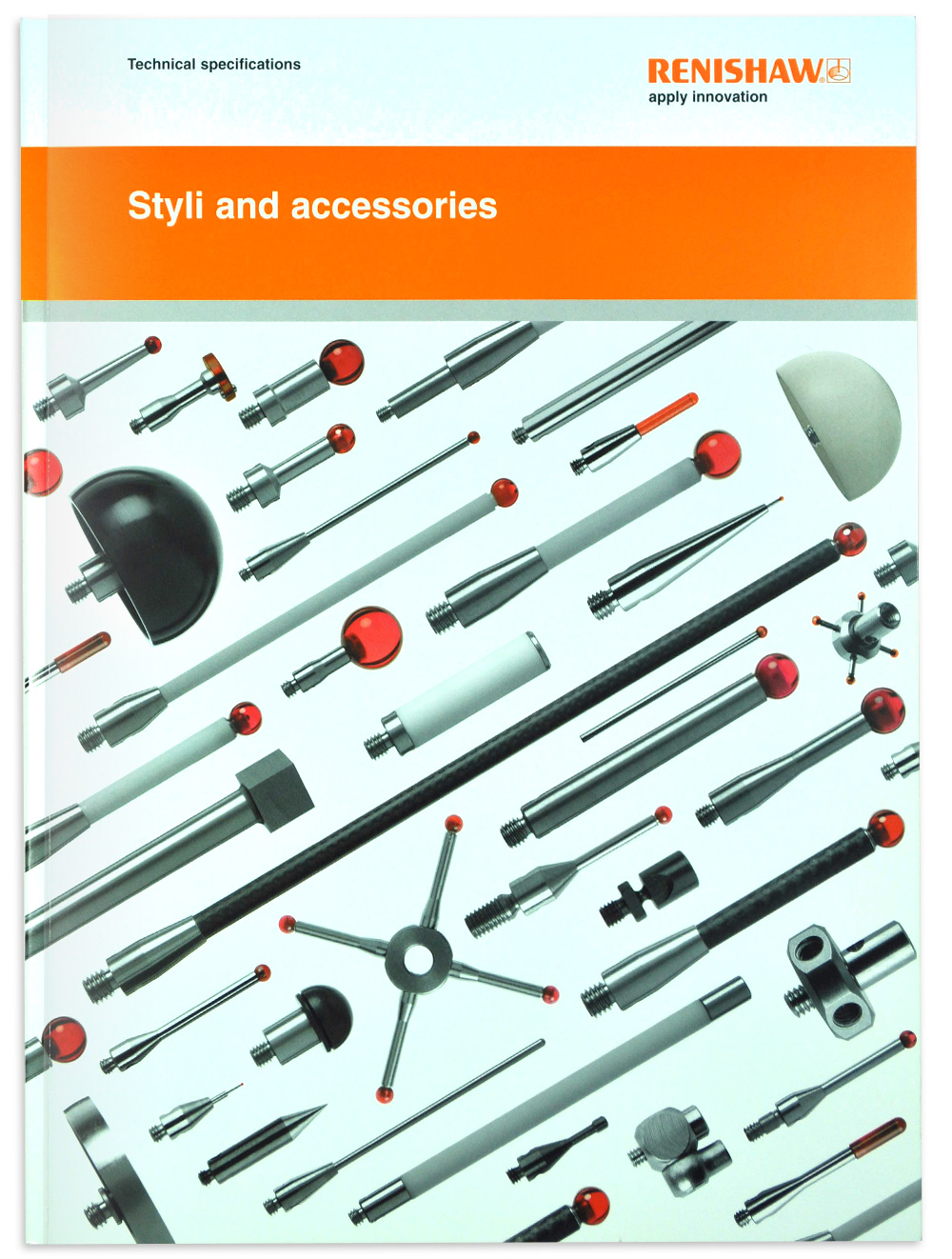
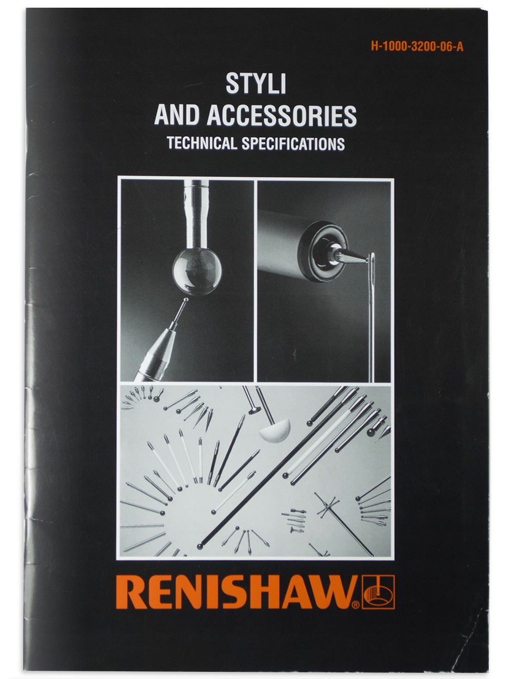
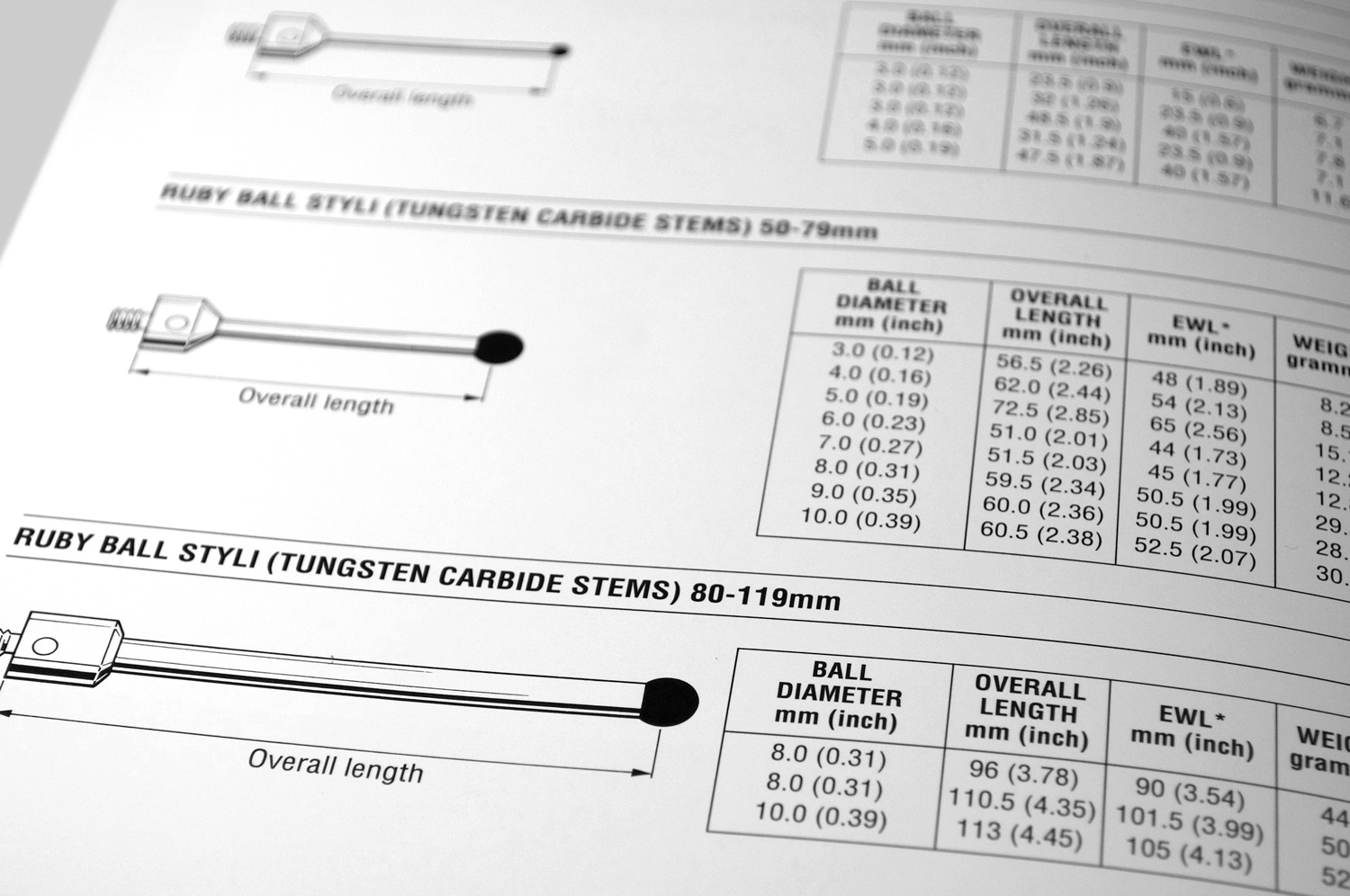
Renishaw’s previous materials had become tired and disjointed. Use of colour was a key issue as the old palette of brown and black lacked vibrancy. The design challenge extended well beyond the surface elements, however. Important marketing materials such as this styli catalogue were also addressed.
The new
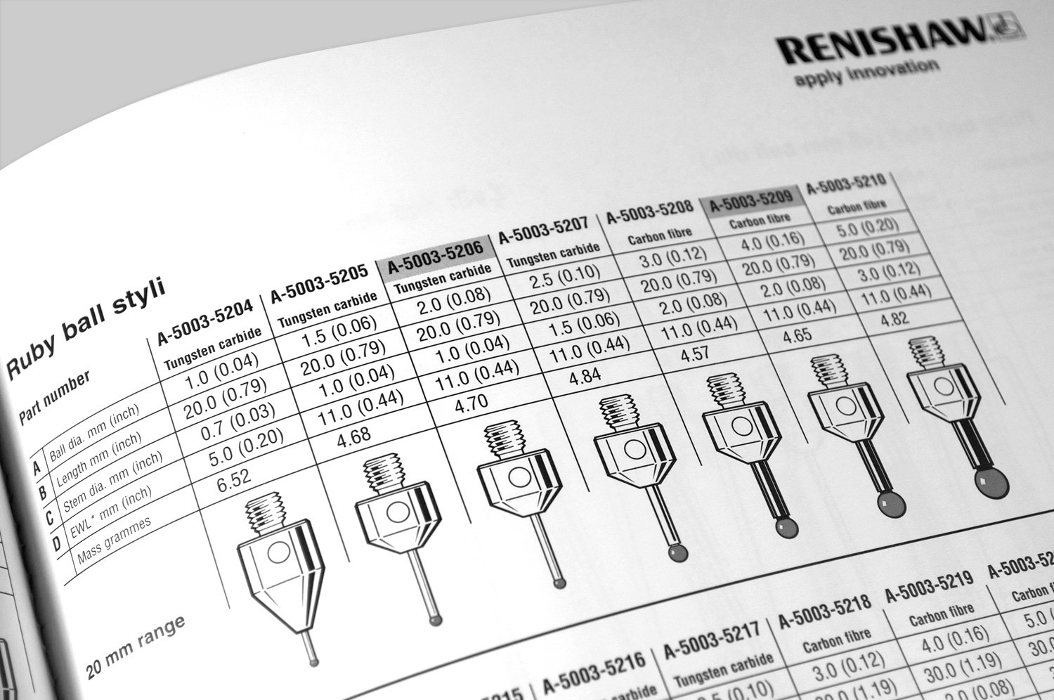
Where the old catalogue utilised images of one type of stylus alongside a table showing the available variants, I saw the opportunity for the new catalogue to show an image of each variant at actual size. The new layout made it much easier for customers to find and match the styli they required.

