New website, brand positioning and narrative for a specialist in the provision of accountancy services to nannies and their employers.
2015 (On behalf of Brand New Way)
“Jeff’s work on our brand positioning helped to present and structure our offering in a clearer way. With our new website, he took some of the strongest and most distinctive elements of our existing branding, but added to them to create a brighter and more engaging experience. He also helped us write and edit the text on the main pages of the site to make it easier to read and more effective. We’re very pleased with the result.”
Sara Graff, Founder, Taxing Nannies
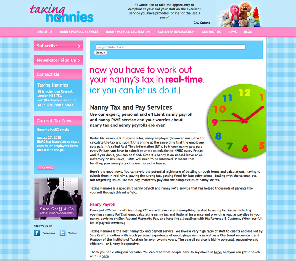
The old website
The old website’s colours and the checked background made it distinctive, but other factors such as the amount of text on the homepage, lack of clear calls to action and colourful-yet-slightly-disjointed set of images were letting it down.
The structure of the site was a little confusing. To the first-time visitor, sections such as ‘nanny payroll information’ and ’employer information’, or ‘news’ and ‘blog’, appeared to do much the same thing.
Reading through the site, the tone of voice felt somewhat corporate and therefore out of step with the audience (either nannies, or parents who employ nannies).
What’s more, some aspects of the text made it feel like it was written for robots rather than humans. For example, multiple references to – and variants of – the terms ‘nanny tax’ and ‘nanny payroll’ were used in the opening sentences. (This is a process referred to as ‘keyword stuffing’, which some people misguidedly used in the past to try to improve their search rankings.)
The new website
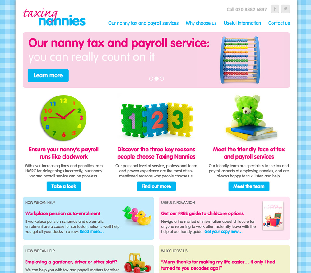
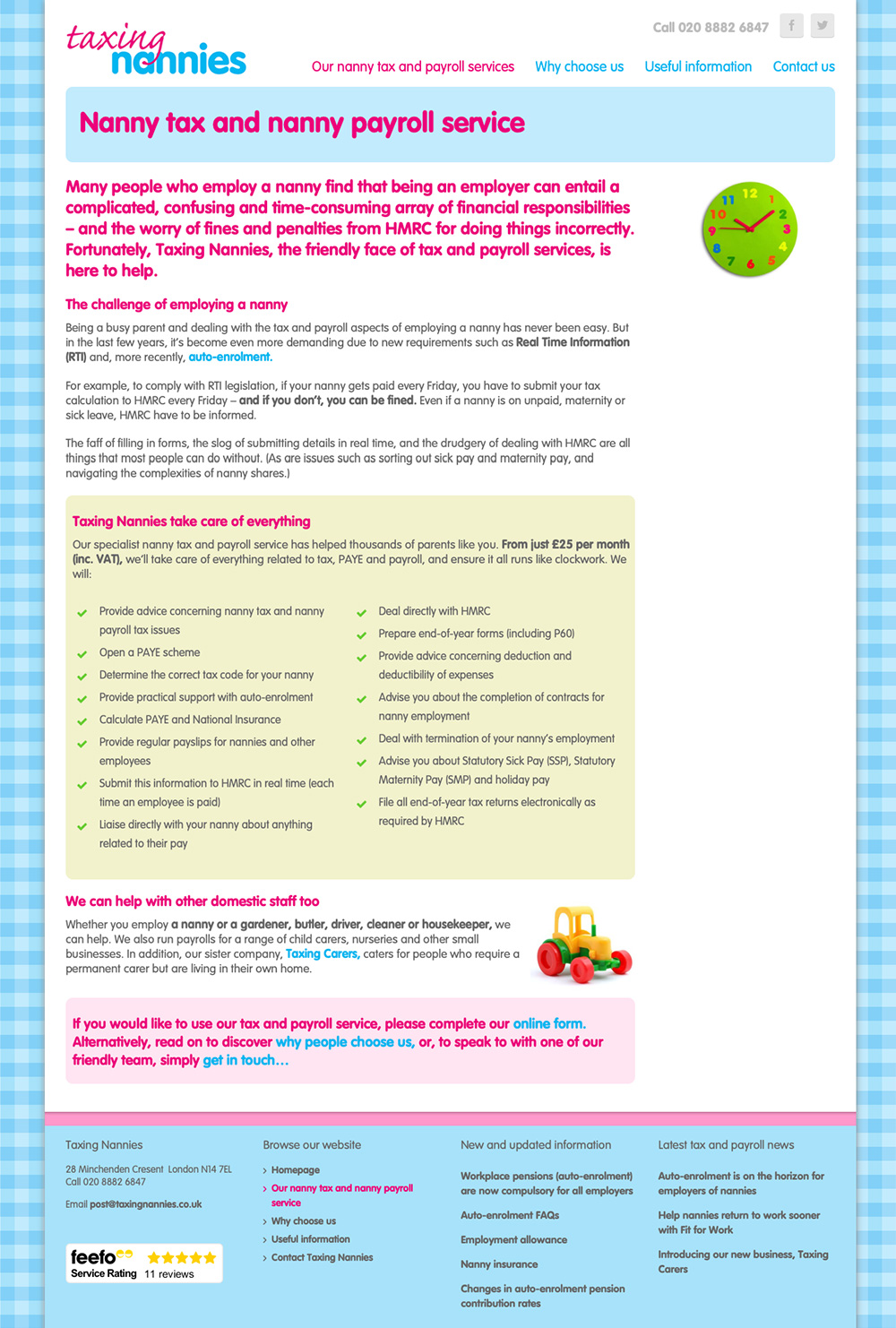
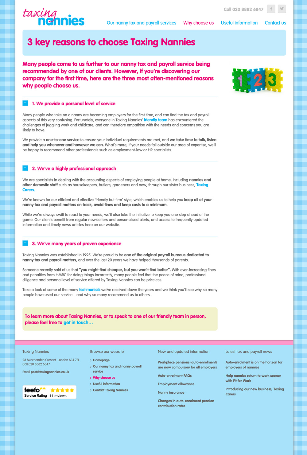
While, at a glance, the new website seems like an evolution of the old one, much has changed.
The new approach centres around Taxing Nannies’ new brand positioning as ‘The friendly face of tax and payroll services’. The site employs a new brand narrative and a clearer, friendlier, more compelling style of writing. The content on the main pages was either heavily edited or completely rewritten.
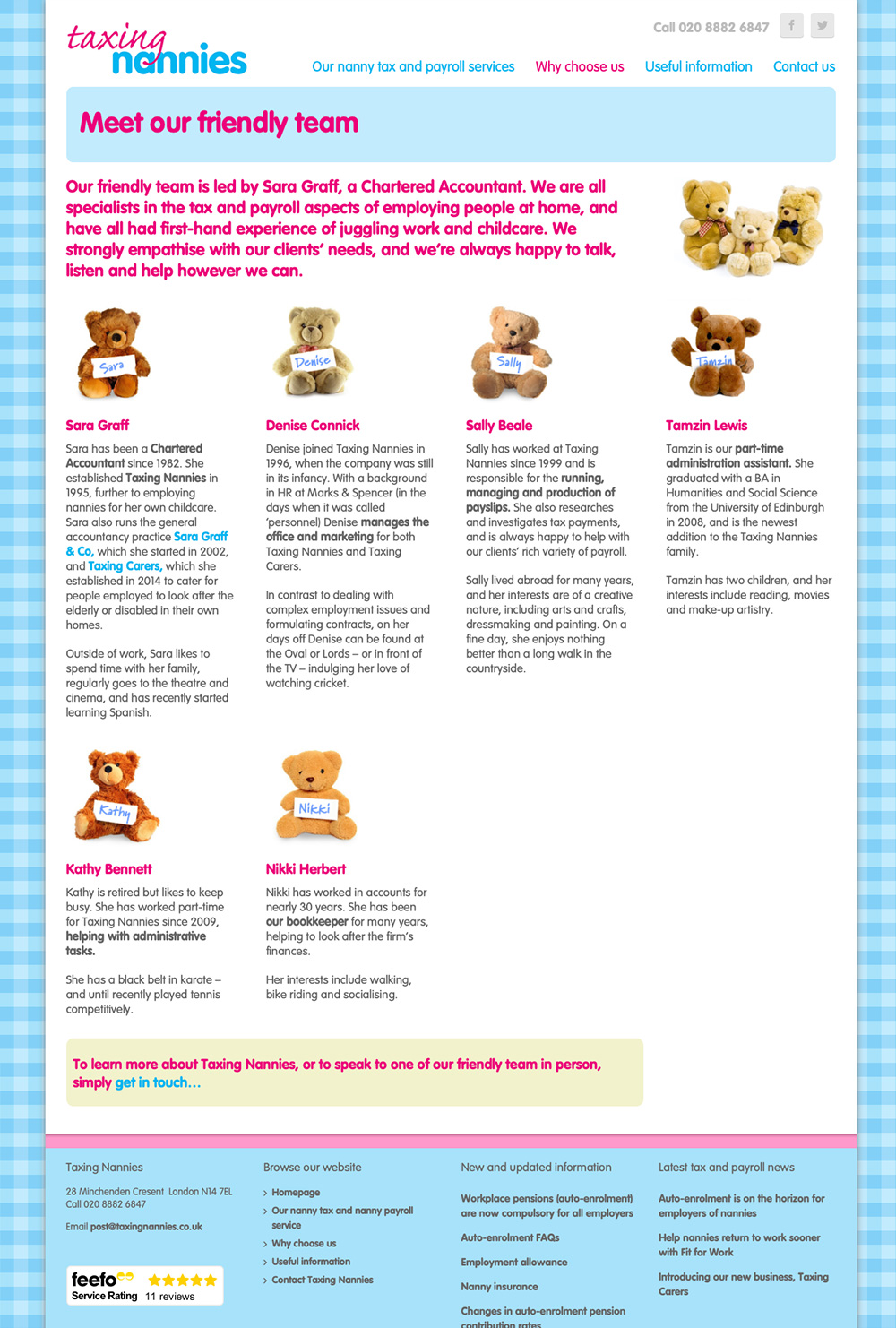
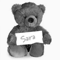
A greater number of fun, friendly images are used to support the new messaging in a relevant and engaging way. Sara and the Taxing Nannies team were reluctant for staff photos to be included. So instead I added a personal touch by asking each member of the team to pick their favourite teddy bear from a range of cuddly options.
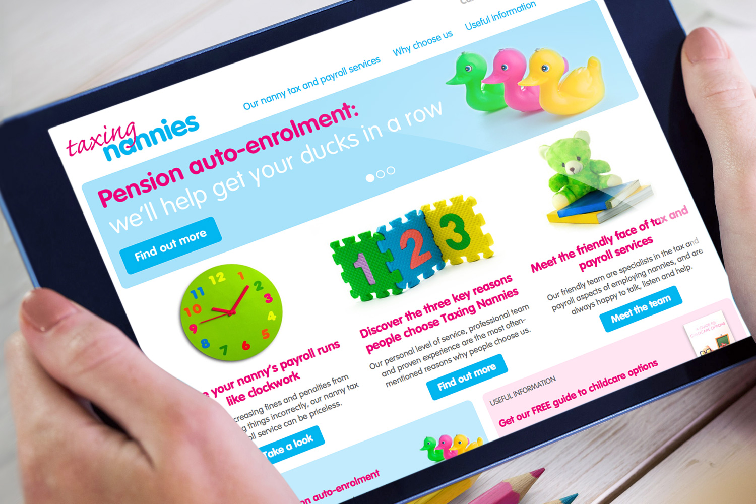
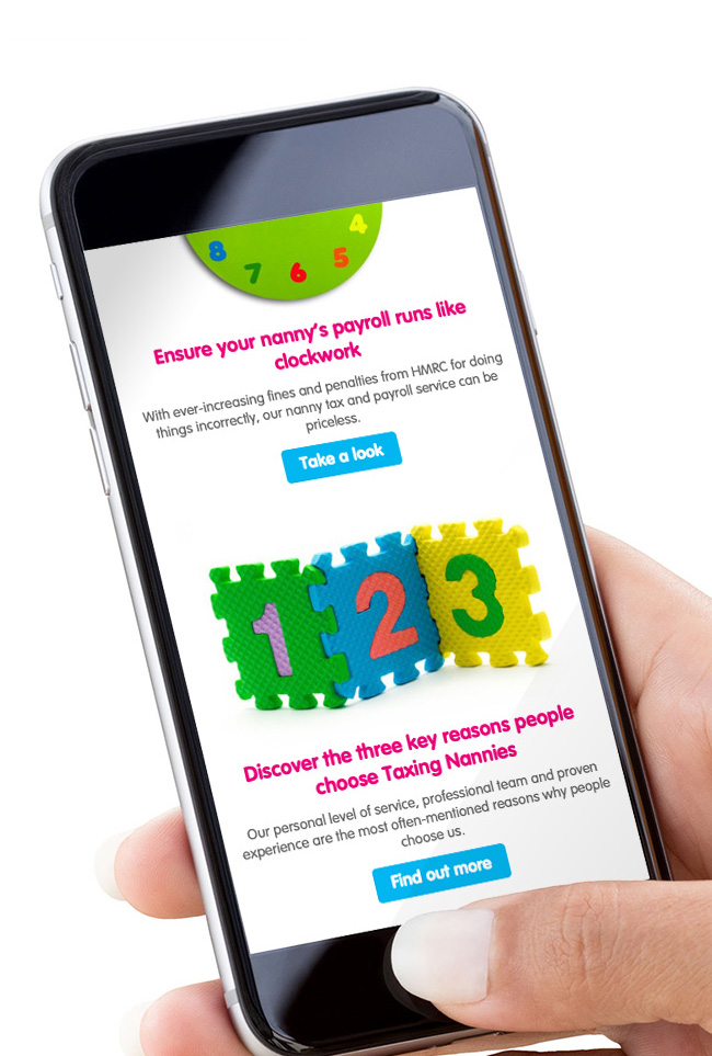
And, unlike the old site, the new version was built around a responsive framework, making it easy to use on phones and tablets as well as laptop and desktop PCs.
