Taking an increasingly popular craft-cider brand – and its packaging, website and marketing materials – to the next level.
From 2015
“I’ve been working with Jeff on the look, the presence, the branding, the website, the labelling and just about everything to do with my multi-award winning craft-cider business for several years. Although Jeff is at the end of the phone or communicating with me via email, I often feel he is part of the company as he is totally indispensable. He is very knowledgeable and so much more than a graphic designer – he has helped me make lots of crucial marketing and branding decisions. He is always professional, prompt and very efficient. Good value for money too!”
Alex Culpin, Managing Director, Ty Gwyn Cider


The old bottle label
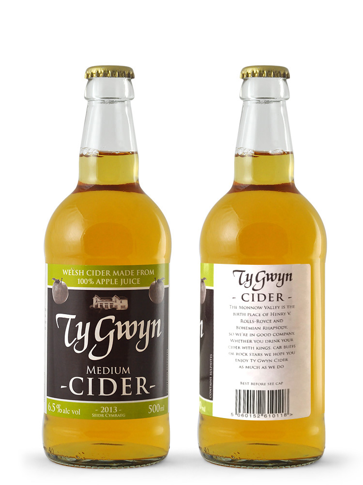
Ty Gwyn’s bottle labels were distinct but in need of refinement. The front featured an array of elements and lacked structure. A key element was the image of Whitehouse Farm, the place where Ty Gwyn was based. The image – a photo – lacked punch and looked a bit of an afterthought.
To either side of the front, text explained the meaning of Ty Gwyn (it’s Welsh for ‘white house’), the provenance of the cider, and a bit about Ty Gwyn’s location. Splitting the story (and details such as the barcode, company address and drinking guidelines) across the two side panels made everything a bit disjointed.
For example, the two parts of the brand’s story were succinct and interesting, but being split apart made it less likely that people would read them both – a shame as they help bring the brand to life.
My remit was to retain the elements familiar to Ty Gwyn’s fans and important to Alex (such as the key colours and the styling of the words Ty Gwyn) but rethink everything else.
Also, as the business was about to move a few miles up the road – and just across the border from Wales into England – all references to Ty Gwyn’s location needed to be revised.
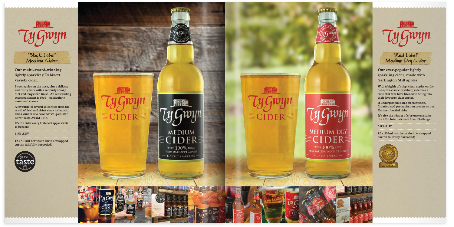
The new bottle label
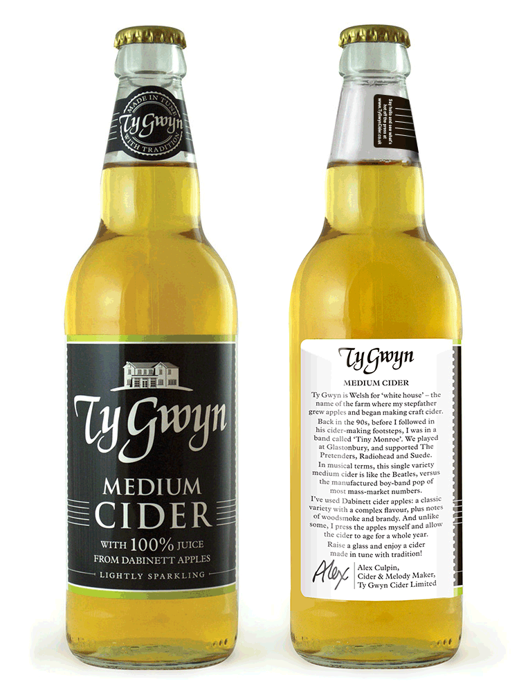
First, I redrew the house and made it an integral part of the logo. I refined the typography and omitted the apples.
The content on each side of the label was reworked so that all of the manadatory details were together on one side, and the story of the brand and the cider was on the other.
In rewriting the text, I brought Alex and his personal story to the fore. In the 1990s he was in a band that played at Glastonbury and supported the likes of Radiohead and Suede. Linking music to cidermaking created a highly distinctive narrative.
For example, we now talk of Ty Gwyn’s cider being made in tune with tradition and hitting all the right notes, and Alex being the company’s Cider and Melody Maker.
As well as the musical references in the brand’s verbal content, they appear visually too. The eagle-eyed will spot the five horizonal lines of a musical stave on the new labels.
As part of the move to a new design, Alex also wanted to switch to a taller, slimmer bottle. So, in addition to the main wraparound label, I created a neck label (without which, the top 40% of the bottle would lack any branding).
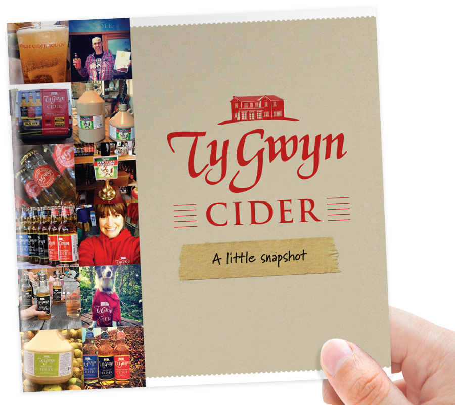
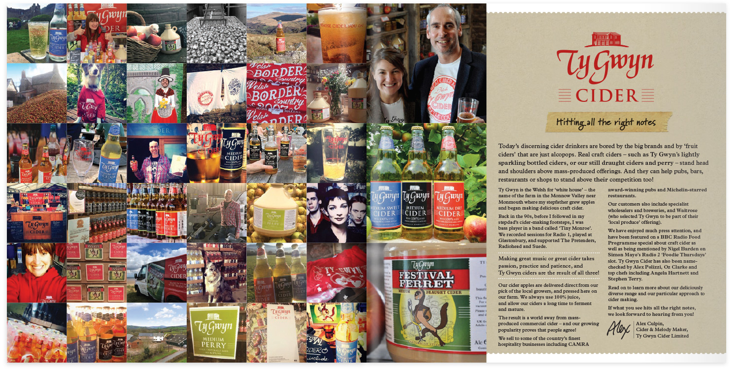
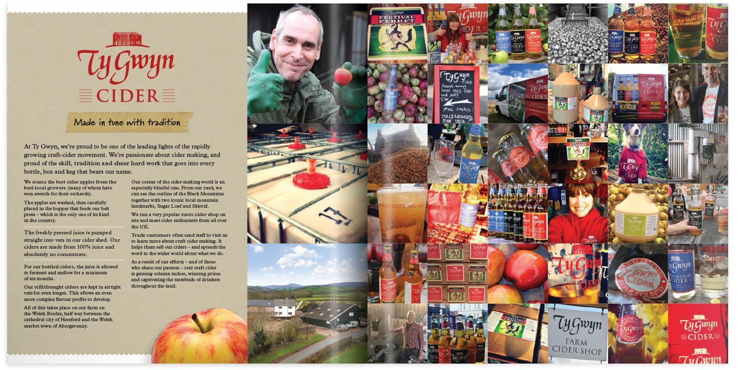
Creating a snapshot of Ty Gwyn for prospective trade customers
Alex wanted a piece of sales literature that he could use to introduce prospective trade customers to Ty Gwyn.
Imagery is always important in such items, but a relatively small budget meant that we could not commission professional photography. The solution was to draw upon the hundreds of amateur photos Ty Gwyn had posted on social media.
Together with product photos I took or created on their behalf, the result was a vibrant patchwork of imagery that creates an approachable and down-to-earth feel. This was further supported by the use of a cardboard-style background, and strips of masking tape featuring handwritten headlines.
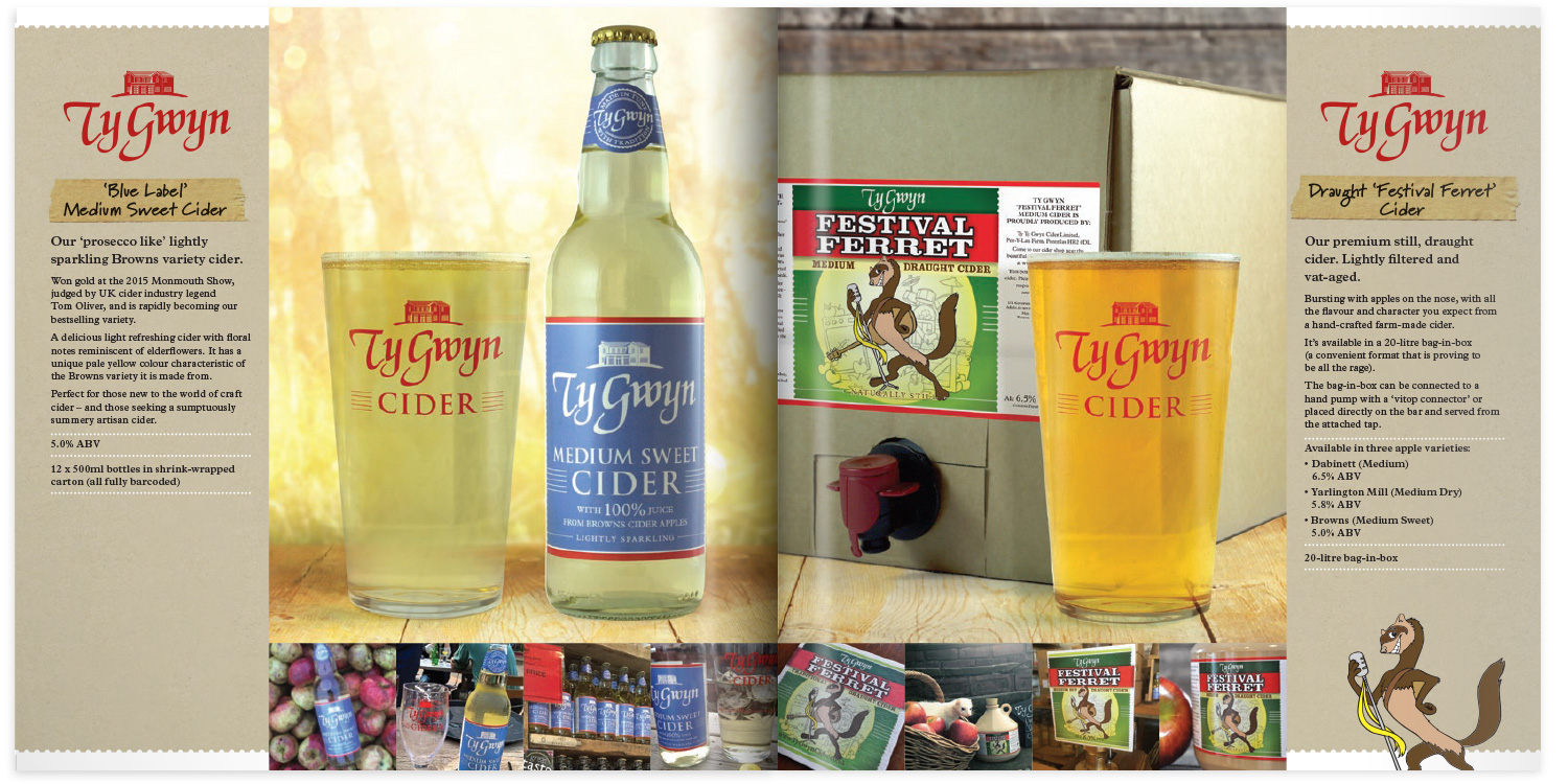


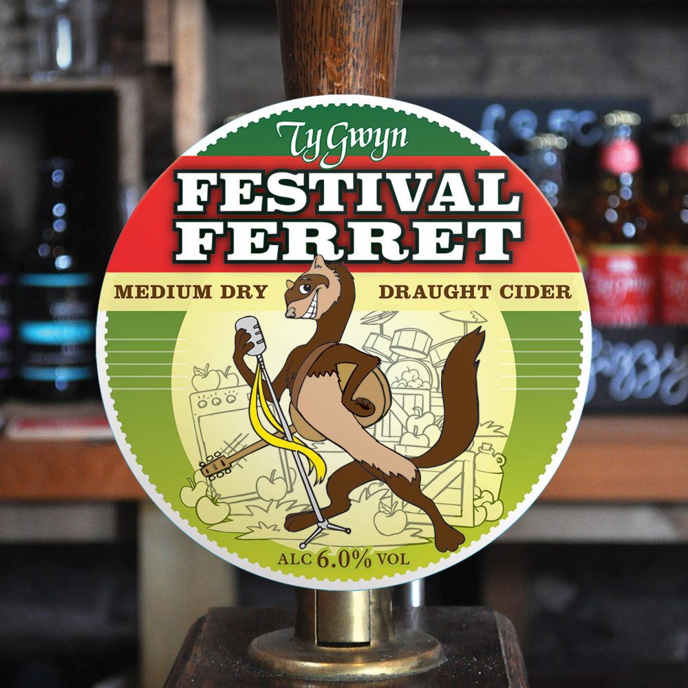
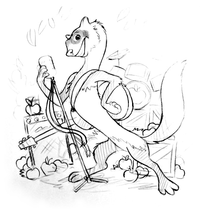
Bringing the festival to the ferret!
Festival Ferret is Ty Gwyn’s brand for their draft ciders. It’s a fun, memorable name that conjures up thoughts of savouring a cider or two on a summer’s day while watching your favourite band perform on stage in a field somewhere.
While the ferret itself was full of character and surrounded by apples, the visual presentation lacked impact and… well… a festival!
Together with illustrator Daniel Howarth, I developed a new festival-ready version of the ferret. With a guitar on his shoulder – and accompanied by an amp, drum kit and mic, a few cases of apples, some brighter colours and stronger typography – Festival Ferret now looks much more like a headline act!

The old pump clip