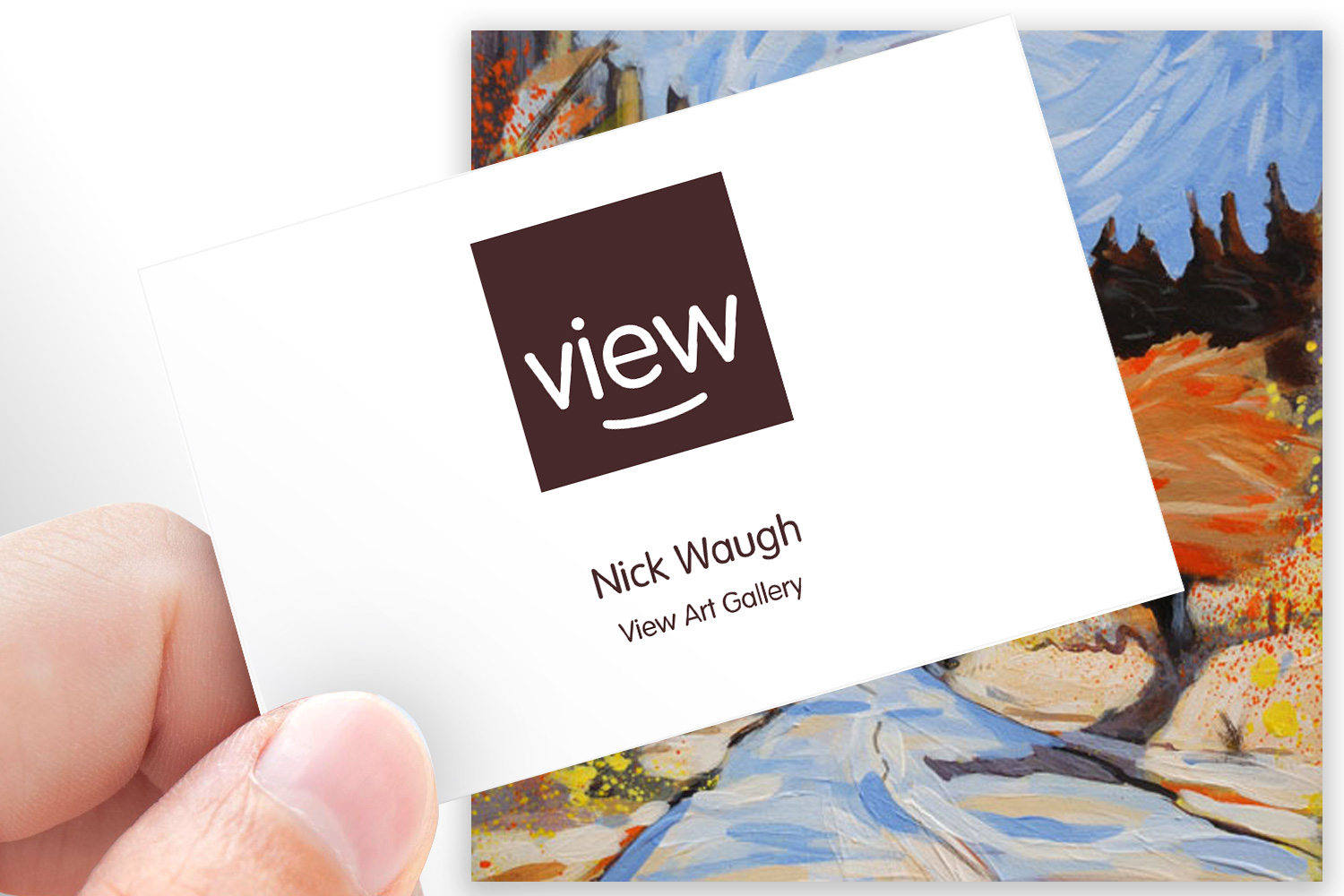
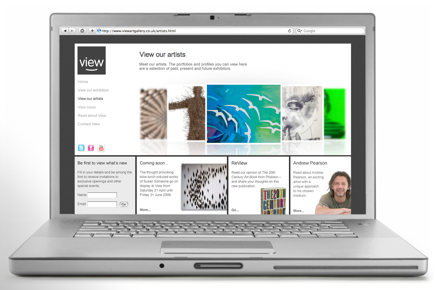
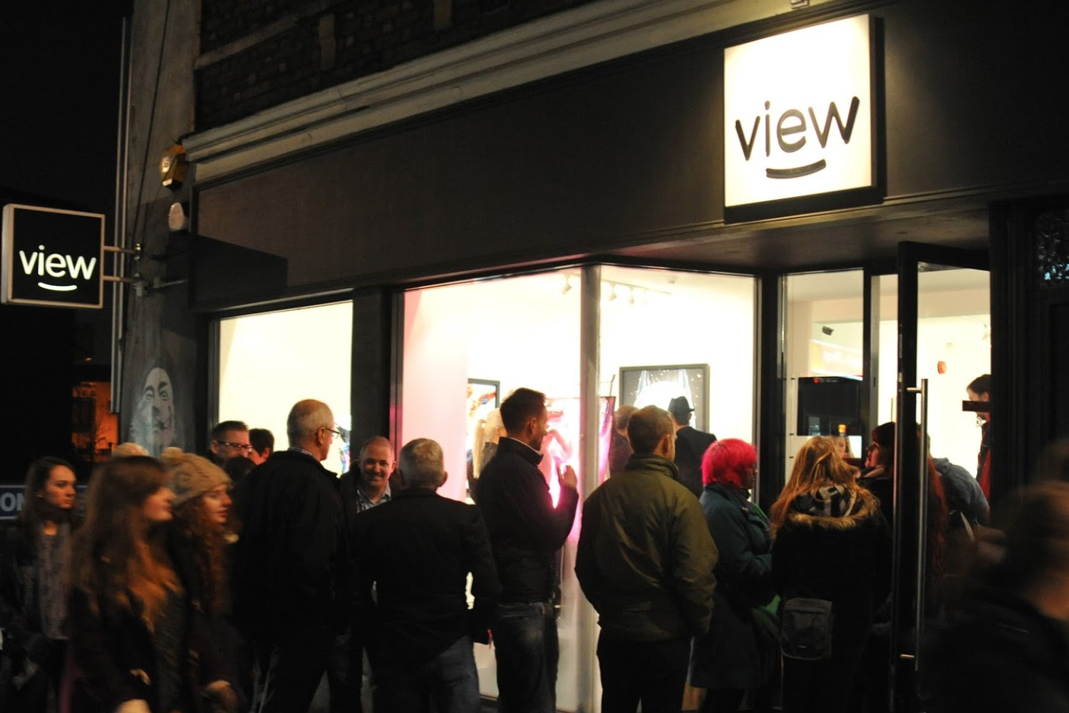
Brand name, identity, website and signage for a new contemporary art gallery in Bristol.
2008
“I engaged Jeff to help with the visual identity for my art gallery, but the first thing he did was challenge the name I’d chosen (Taste). He felt that while it was good, there was scope for something better so I agreed to explore this. Jeff demonstrated an excellent understanding of what my brand needed to say and created a diverse range of options. After discussing the benefits of each, View became my favoured option. I continue to be really pleased with the brand, visuals and narrative that Jeff created.”
Nick Waugh, Owner, View Art Gallery

Stepping back and starting with a blank canvas
As Nick mentions above, at the outset of the project he came to me with a name for the gallery that was pretty much ready to go. He listened to my perspective on it and the merits of exploring other names, and View was selected from those I subsequently presented.
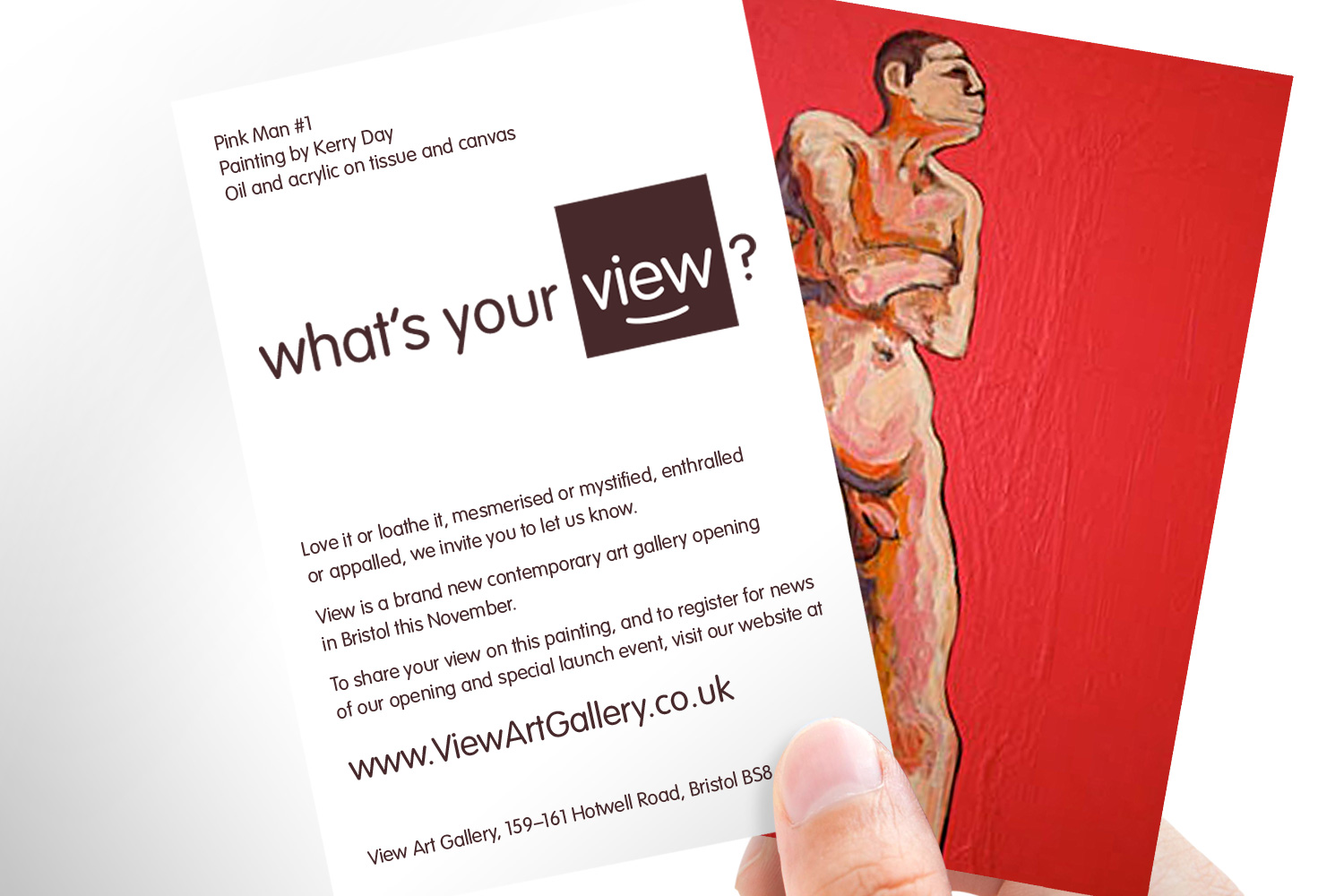
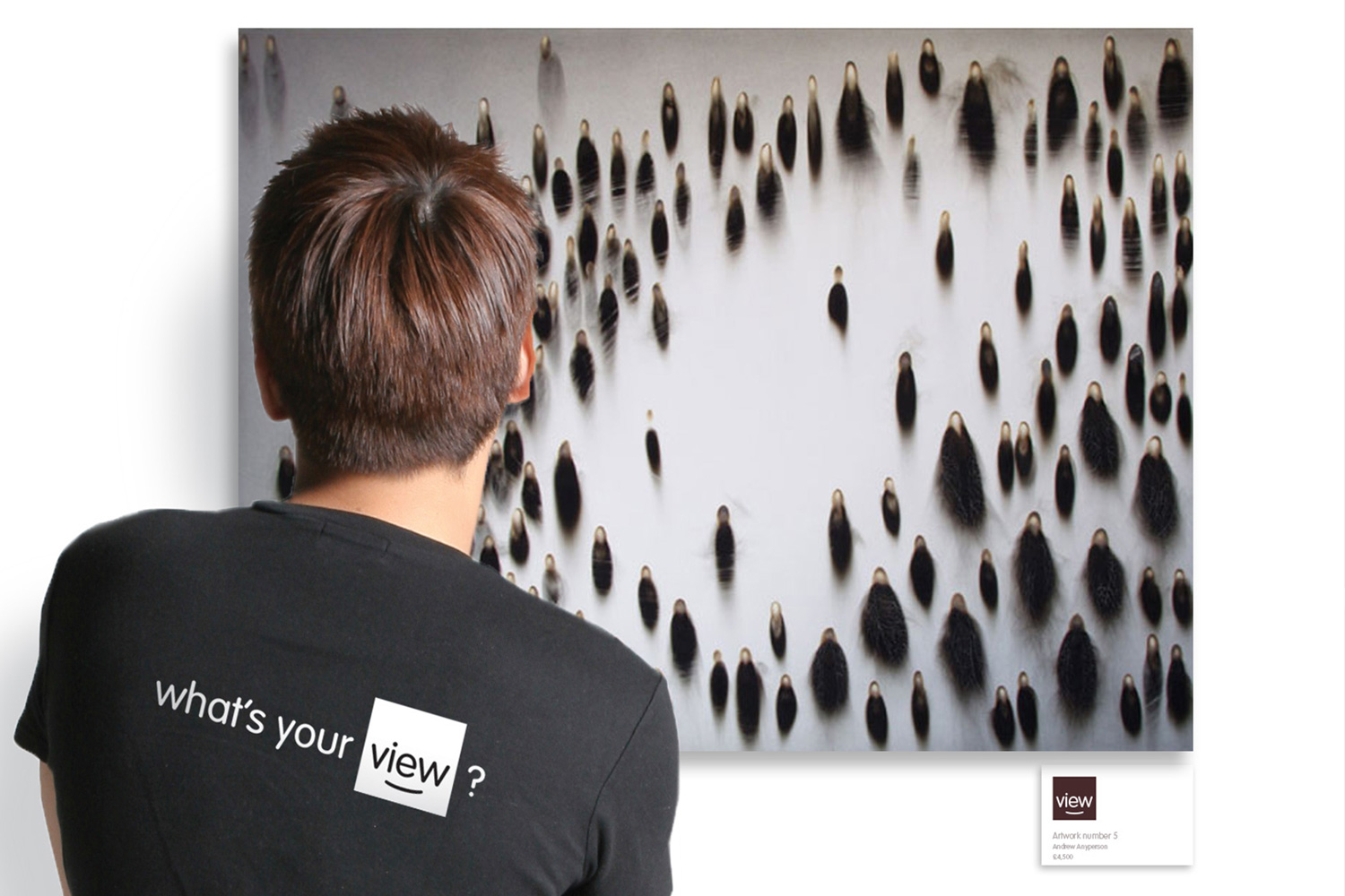
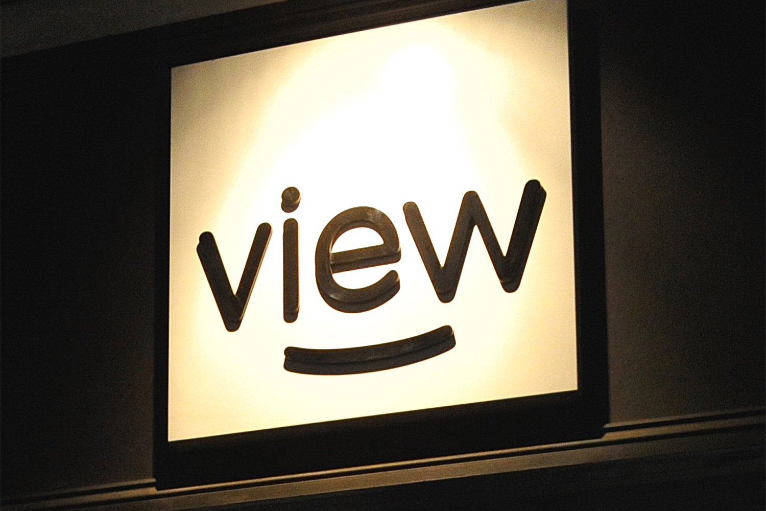
Next I created several distinctly different options for the logo. The one chosen has a friendly but neutral feel. The smile within it is contemplative rather than just-won-the-lottery happy. It was designed to complement the brand’s thought-provoking tagline of ‘What’s your view?’ (which I’d created to articulate Nick’s vision of making the gallery a welcoming and egalitarian place, where one person’s perspective is as valid as the next).
Simple, smart and effective signage
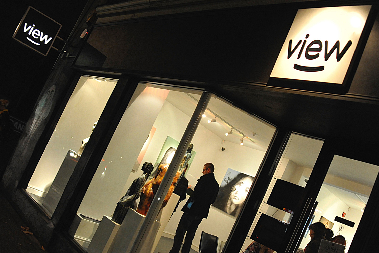
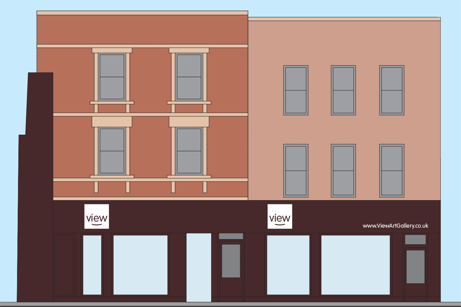
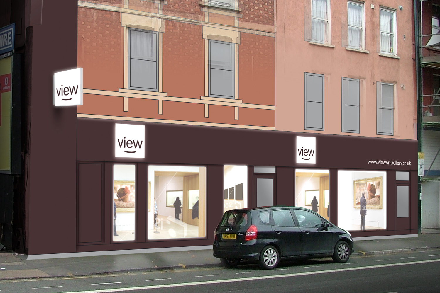
The gallery was being created in what was previously two separate shops, and Nick had commissioned extensive renovation and refurbishment works to make this possible. As part of this, the existing windows and doors were being removed and smart new full-height glazing installed, which would allow passers-by to see the work being exhibited inside.
I therefore felt that the signage (and window frames and the entire gable end of the building) should be the brand’s charcoal black. This would help ensure that it was what was on display inside the gallery was what caught people’s attention, not a brightly coloured fascia panel. Also, as neighbouring businesses had fairly bright but basic colour schemes (both white and blue) View’s dark signage would stand out in contrast.
The view logo and web address were the only graphic elements on the fascia. The two logos were both lit by spotlights at night. An additional lightbox-style sign was added, protruding from the wall and visible to passing traffic.
