Evolution of the labelling, packaging, point-of-sale and merchandise for Wye Valley Brewery’s award-winning premium lager.
2019
“Jeff is as close as it comes to having a full-time designer sat in our office. Unlike the usual set-up with most design agencies, working with Jeff, we are not beholden to rigid studio slots and a monthly retainer that never seems to cover everything we need it to. As well as being efficient and a master at producing effective above-the-line communication, Jeff is also versatile, proving that he can adapt to the new directions we have taken our business and our brands in.”
Abbie Gadd, Sales and Marketing Manager, Wye Valley Brewery


Evolution, enhancement and refinement
I’d inherited the 1985 logo and although the visual concept was sound, the execution lacked a little refinement.
To a typographer’s eye, the gap between the 1 and the 9 really leapt out. And a closer look revealed a number of other elements that were not quite in alignment. Addressing these points made the logo feel more solid and considered.
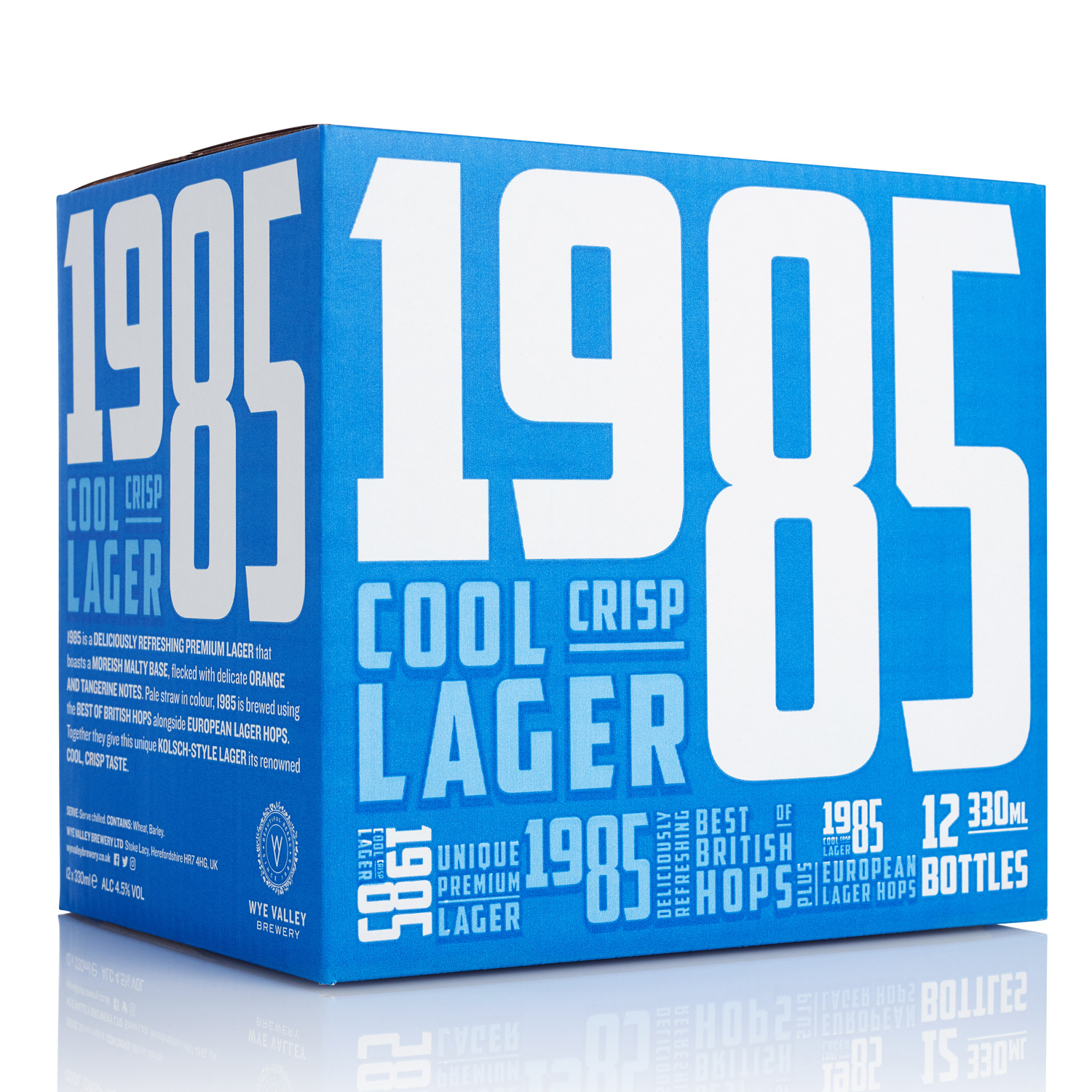
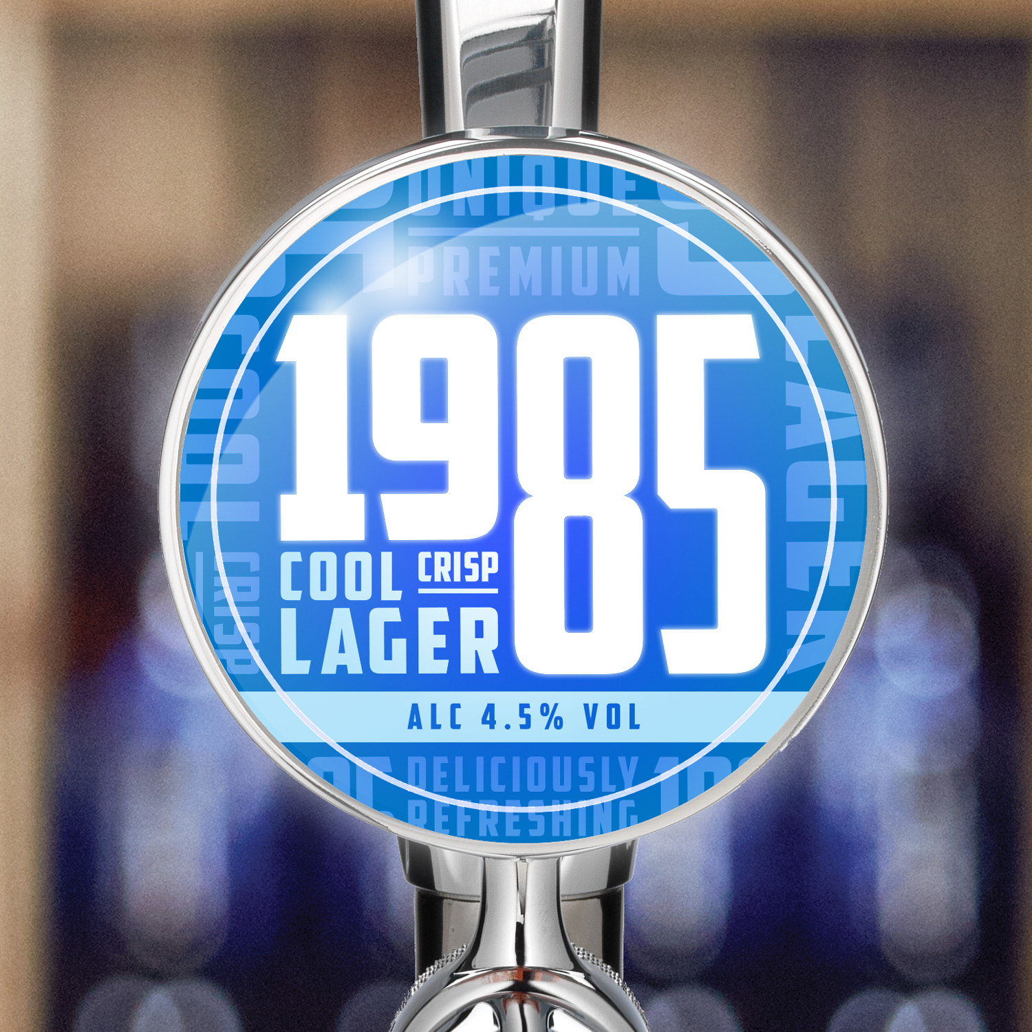
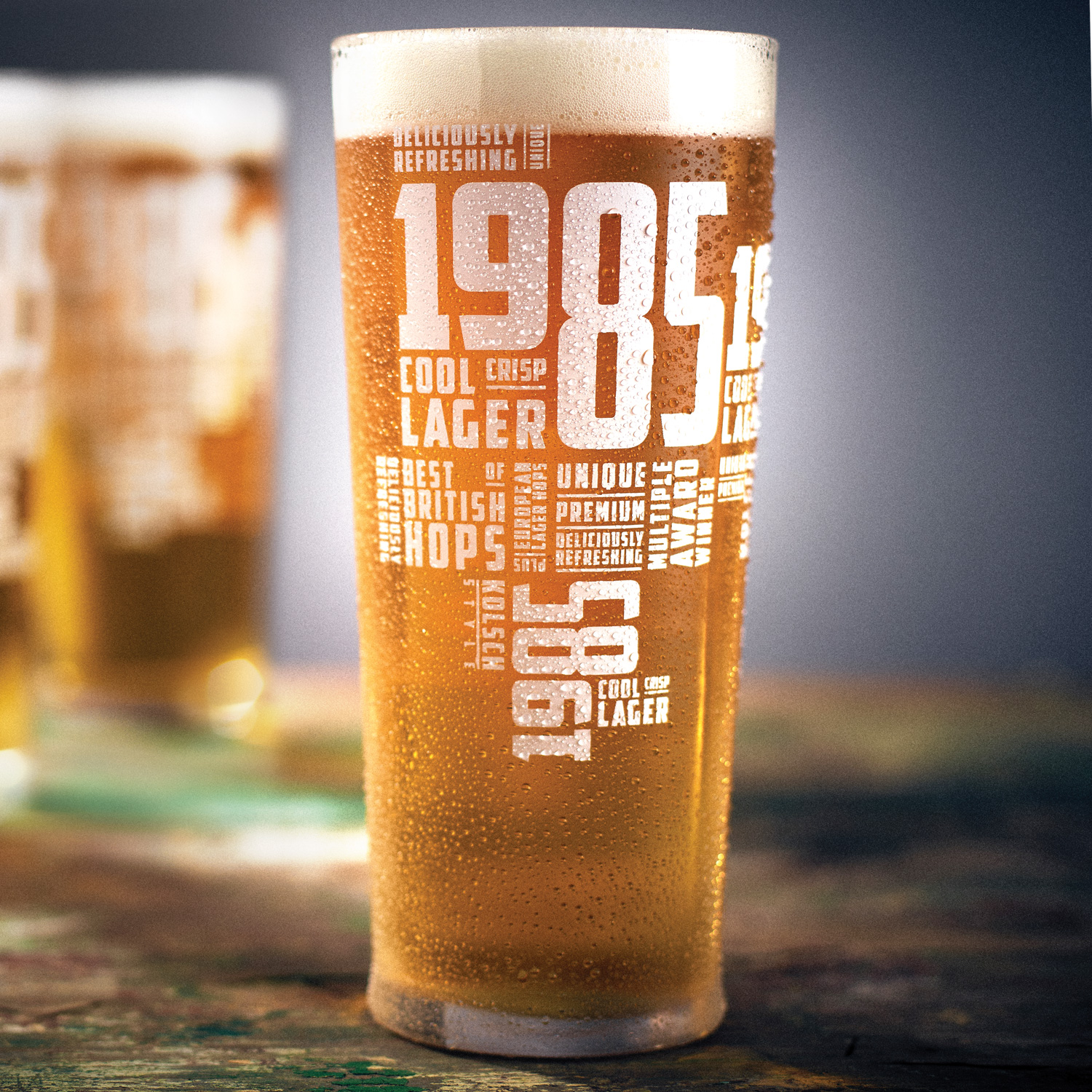
I’d worked with Abbie previously to change the brand’s core colour from orange and black to blue and white. The new colours are far more in-tune with the beer’s positioning as ‘Cool, crisp lager’.
This latest stage of the brand’s evolution saw the introduction of an energetic and eclectic typographic pattern, which I created using a variety of statements about the beer.
This fun, flexible and distinctive approach has been applied to a wide range of packaging and POS.
Refinement of the 1985 logo

The original 1985 bar font

The new 1985 bar font
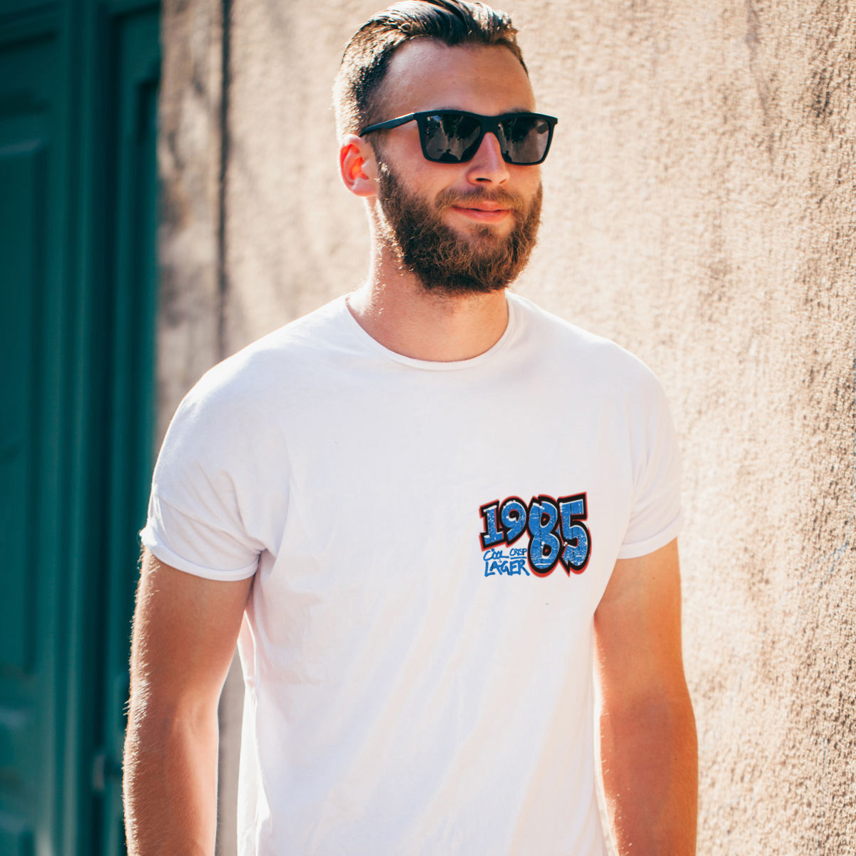
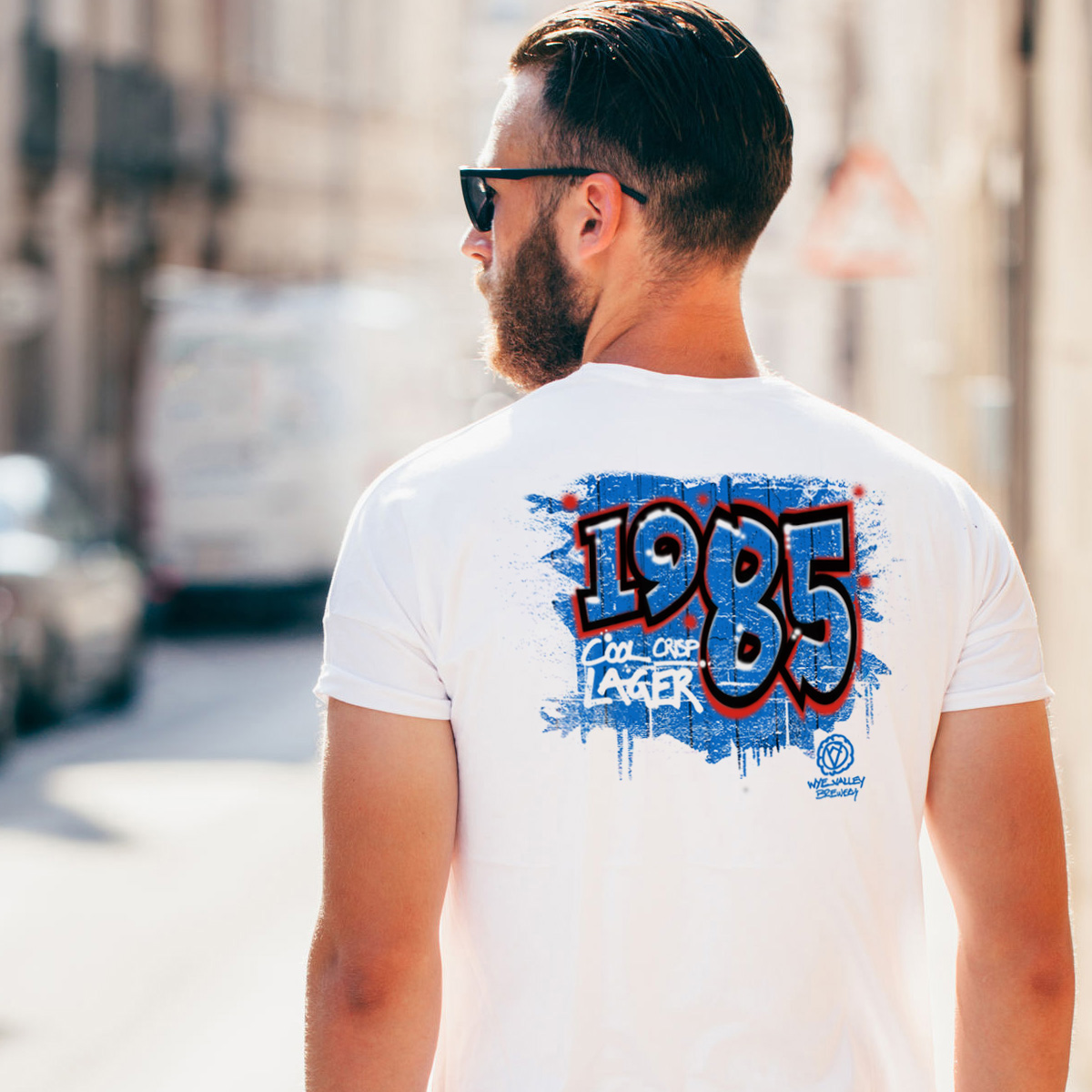
Cool, crisp T-shirts
Wye Valley Brewery had commissioned a street artist to create a piece of 1985 spray-can art and wondered if this could be used as the basis for some 1985 T-shirts. I redrew the artwork to make it T-shirt friendly and sharpened up the typography to bring it a closer to that of the actual branding.
The hand-drawn version of the Wye Valley Brewery logo has since been evolved into an edgier version of the company’s main logo for use in a tactical way within the brewery’s marketing.
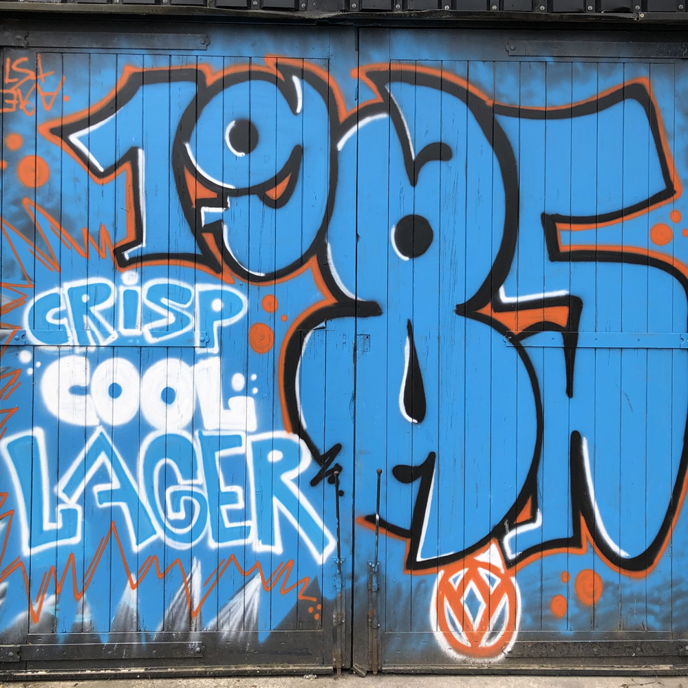
Original street art
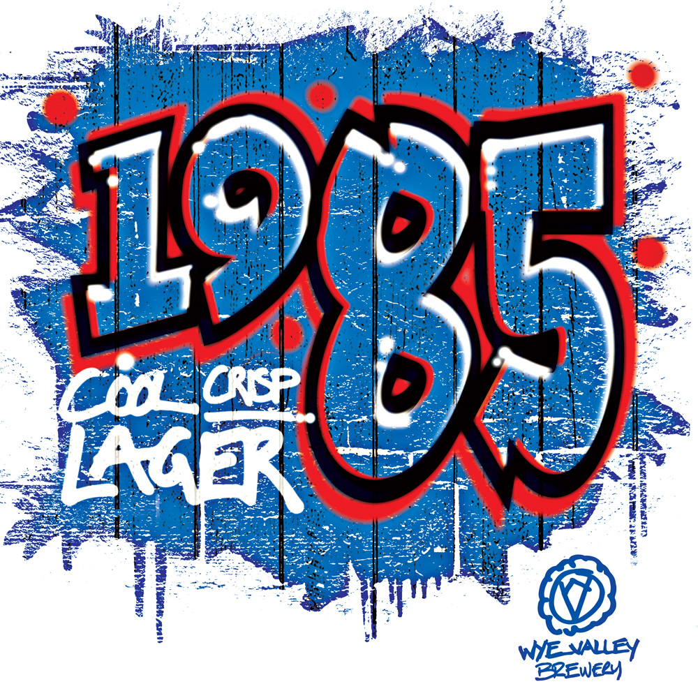
Redrawn street art