Brand repositioning and new marketing materials for the owners of the world’s largets lubricants database.
2009 (On behalf of Brand New Way)
“Jeff has provided design, corporate identity, copywriting and branding support for my clients since 2005. He creates hard-working visual and written communication that conveys the right messages in a compelling and convincing fashion. We have a great working relationship where we each seek and value one another’s input. This allows my clients’ projects to fully benefit from our combined experience and expertise, leaving them (and me) very happy with the results.”
Peter Hawtin, Director, Brand New Way


The old logo and marketing materials
OATS originally stood for Oxford Advertising and Technical Services. Over time, as the company specialised and focused on its world-beating database of lubricant products, they changed the meaning of the acronym to Oil Advisory Technical Services. While this ‘does what it says on the tin’, it did little to set the business apart from – or ahead of – it’s competitors.
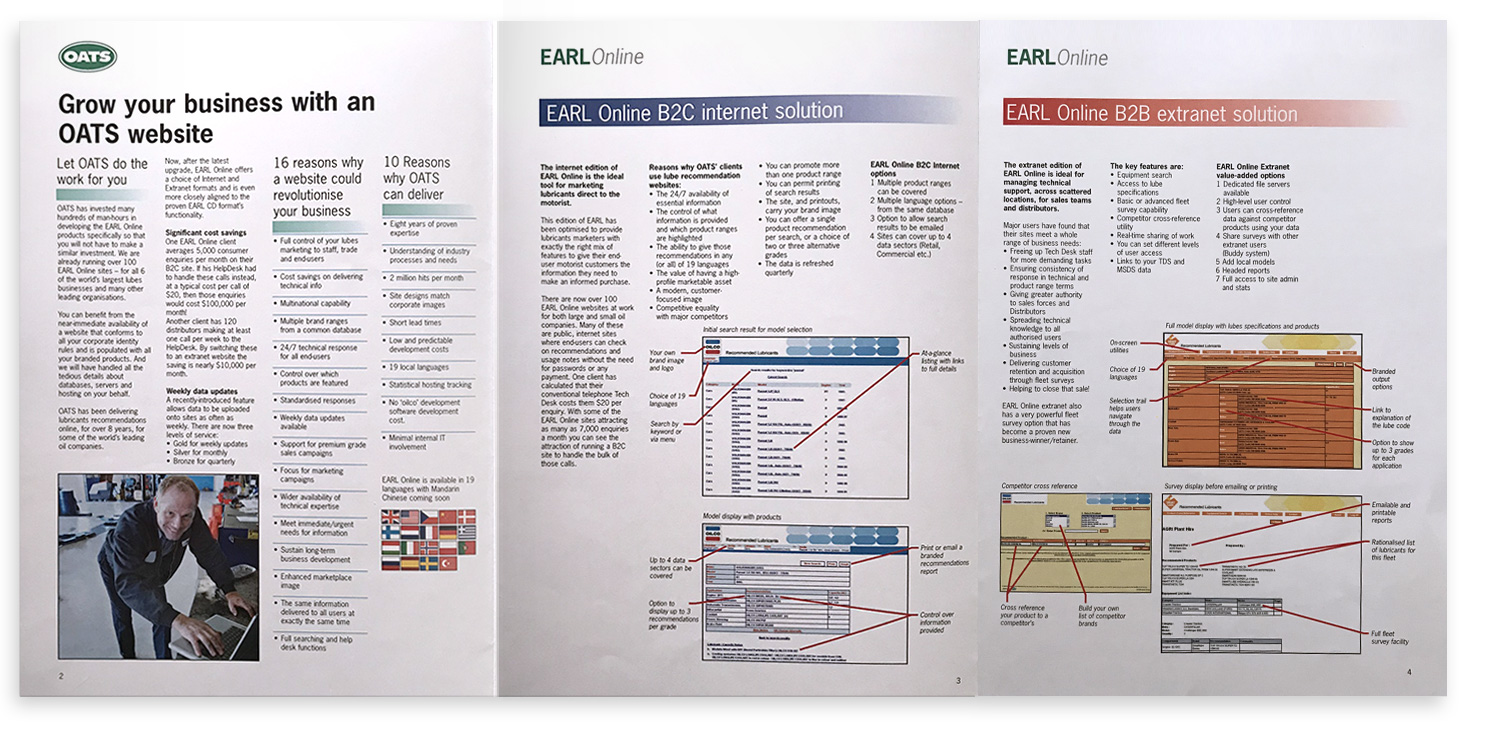
OATS’ marketing materials were disparate and dated. They lacked style, refinement and attention to important typographic details. In addition, the communication within them lacked structure and focus. For example, one brochure featured ‘16 reasons why a website could revolutionise your business’ and ‘10 reasons why OATS can deliver’. Such lists are unwieldy, unmemorable and best avoided.
Importantly, OATS’ materials also lacked any kind of consistent branding thread to link them together. All of this made OATS feel like an also-ran supplier of commodity services, not the innovative industry leader it actually was.

The new brand positioning and marketing materials
The new positioning is an clearer articulation of what OATS is as a business. At the same time, it gives them definitive ownership of a piece of the marketing landscape. (While many can provide oil advisory services, only one company can be ‘The lubricants database experts’.)
To support the new positioning, I proposed some minor changes to the logo: a switch to a punchier green and removal of the serifs on the lettering (which tended to disappear at small sizes and on screen in any case). While OATS chose to stick with the old green and the serifs (partly as changing the logo was not their focus for this project) I feel it’s always good to give clients a view of what lies beyond their immediate horizon.
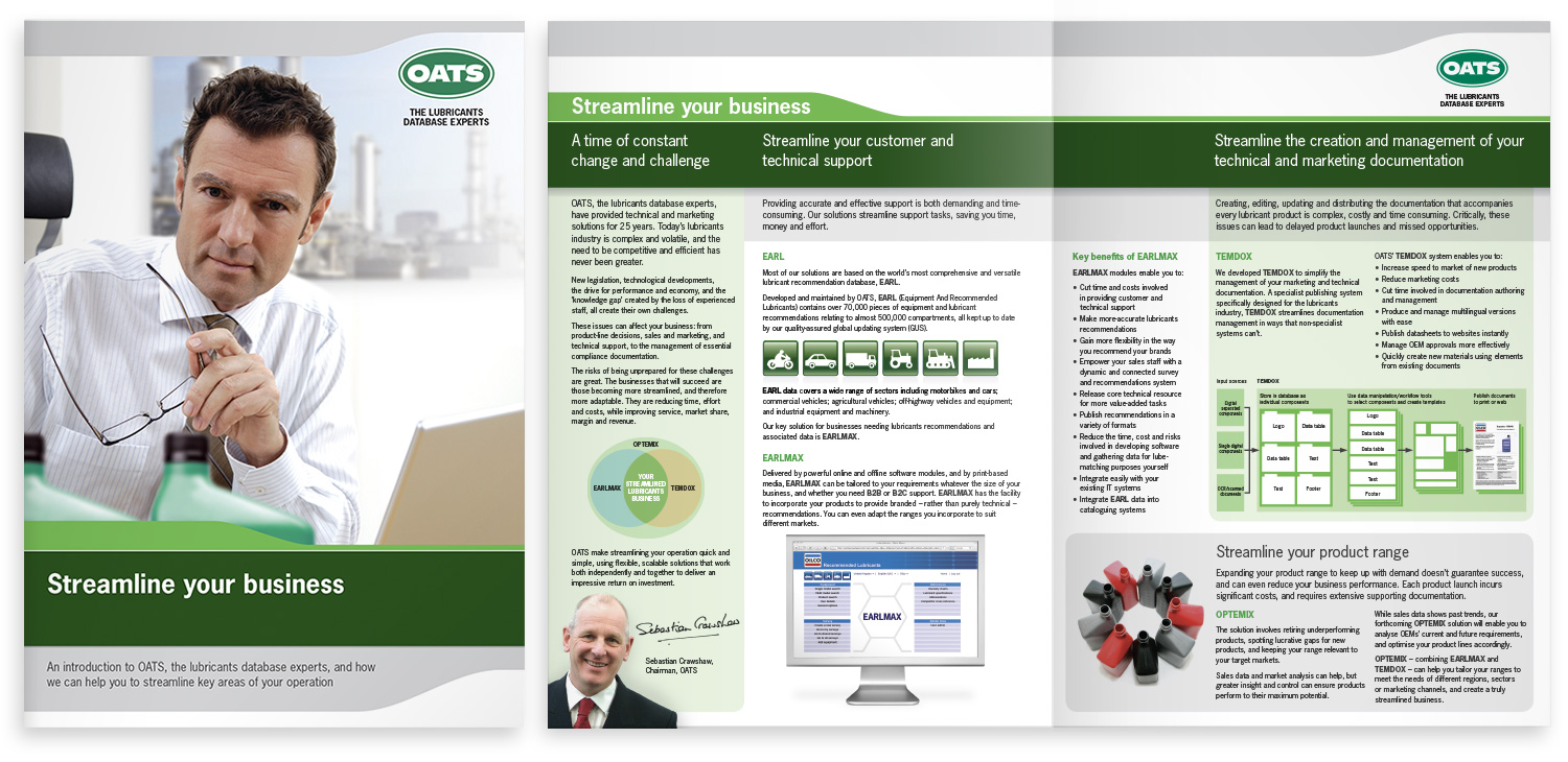
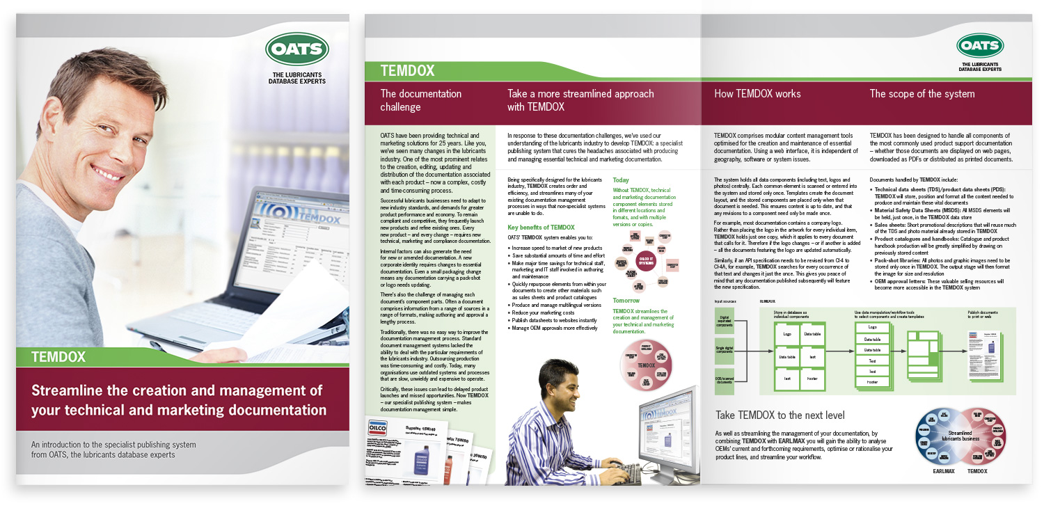
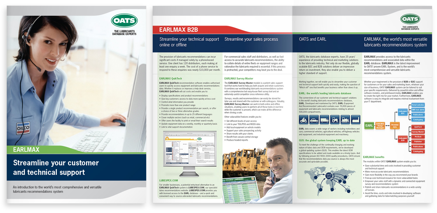
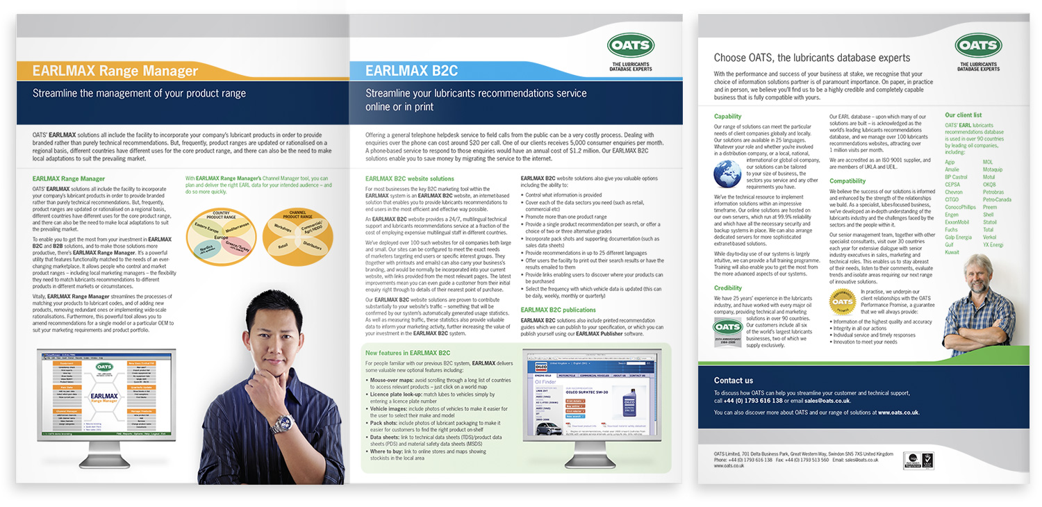
OATS’ suite of brochures were completely redesigned and rewritten. Conversations with the client had revealed a core idea that related to all of their products and services: each one helps customers to streamline an aspect of their business. This concept became a strong, compelling and relevant cornerstone of OATS’ communcation.
The ‘10 reasons OATS can deliver’ (together with a number of other key reasons that people choose OATS) were distilled and reworked into a new simple and memorable three-part structure on the back page of each brochure.